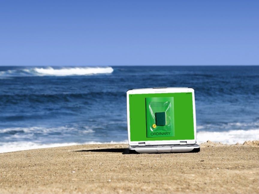
Behind the scenes: Ordinary magazine
Published quarterly out of Amsterdam, Ordinary magazine challenges photographers from around the world to create extraordinary images from the most mundane everyday objects. The first issue was dedicated to disposable plastic cutlery, and the second issue’s muse is the humble kitchen sponge.
Co-founder Max Siedentopf is a difficult man to pin down, but I caught up with him via email to learn more about the concept, and the design choices that come from seeking the extraordinary in the ordinary.

How did the idea for Ordinary come about?
In the shower.
Who makes it?
I came up with the concept, and Yuki Kappes does the design. And of course 20 extra-ordinary artists from around the world.

How do you choose the objects that you theme the issues around?
We look around the house and usually the most obvious one is also the one we choose. We collaborate with artists all over the world, from the Netherlands, UK and Sweden, to Mexico, Japan and South Africa, and we feel like the objects we choose should be ones that you can find and look similar in each country so that everyone has the same associations to them.

What’s your brief to contributors, and how much editing do you do?
We don’t do any editing. The contributors are free to do whatever they want. Usually they only receive the object and information about the magazine; they are asked to take this ordinary object and put some extra into the ordinary. We try to keep the brief as open as possible so that they can really push the limits of what can be done with such a dull object.

The result is brilliantly intriguing! How did the final magazine compare to how you’d envisioned it when you first picked the theme?
We try not to envision what it should look like beforehand – it’s much more exciting to be surprised in the end at what it turned into. However, of course, you can always guess a little bit at what it ‘could’ look like in relation to the different artists’ styles. For example this current issue felt a lot rougher and rawer than the first one, which I think is great. The most surprising contribution was by André Thijssen who decided to completely ignore the brief and instead photographed a towel with Spongebob on it. It was perfect. You’ve got to buy the magazine to see it ;–)

It’s quite a modest design – what are the thoughts behind the art direction?
There’s actually quite a lot of design going on. Or rather we did try to make a strong concept for the design. Just as the name of the magazine, the entire design tries to be as ordinary as possible. The font of the magazine we use is Arial, the format of the magazine is A4, the colours we use are the ones that are preset in the InDesign palette, and so on. And full-bleed images also feel more ordinary than making a fancy layout or grid for them.

Why have you chosen not to include any text?
There’s a lot that could be written about the objects, but in Ordinary we want the photos to do the talking. The photographers’ approaches to the objects are quite different from each other, and every photo tells its own little story. I think text would influence it too much. Instead, you should decide for yourself what the photos are about.

You work as an art director at design agency KasselsKramer – are they involved in Ordinary in any way?
Apart from free coffee and staples in the evenings, KesselsKramer isn’t involved in the magazine. We occasionally use the space, but that’s it.
What is the aim of the magazine? What do you want readers (viewers is probably a better word in this instance) to be left with?
I want them to open their eyes towards their surroundings. However, if you don’t feel like getting inspired to look at things differently, that’s fine. In any case, you’ll have a free new sponge to clean your dishes with.

The video review we did of issue 1 is one of our most viewed ever – why do you think people are so fascinated by the concept?
In my opinion, design and art magazines often love to be over-complicated. They become so hyper intellectual that the concepts go all over the place and it’s difficult to get to them. Ordinary doesn’t try to be too smart. We want it to be something everyone can understand immediately and have fun with.

One of the comments we got on the video was concerned with sustainability and the wasteful nature of plastic cutlery and sponges. What are your thoughts on this?
Yes that’s very true, I couldn’t agree more. A blog on the internet would be a lot more sustainable, easier and cheaper. But where’s the fun in that?
Can you reveal the object of the next issue?
In September, yes :–)
—
Stay up to date with the best independent magazines – sign up to Stack and we’ll deliver a different magazine to your door every month
—
Photos courtesy of Ordinary magazine and (top to bottom) Bianca Pilet, Thomas Nondh Jansen, Putput, Harmen de Hoop, Mauricio Alejo, Kostis Fokas and Jacob Haupt


