EDCH 2017: Jonathan Barnbrook, the Pitchfork Review, and more
We have been waiting on images from the conference, but finally, here are the highlights from the last day at Munich’s Editorial Changes. On this day, any sign of conference fatigue was drowned out by the cheerier, more relaxed mood as faces became familiar and claps and cheers (drunken or just enthusiastic) were give out more liberally. Before everyone headed off to more German beer at the closing party, we enjoyed presentations from the following speakers…

1. Digital to print to digital to print
The Pitchfork Review | Noelle Roth
Pitchfork is probably one of the most well-known and successful music review sites for indie music and beyond. Art director Noelle Roth spoke about the decision to transition from digital to print, and the process of making 11 issues of The Pitchfork Review. In 2012, the team launched digital ‘cover stories‘ — an innovative way of presenting in-depth features through interactive graphics and continuous scrolling.
It made sense that their next move was to create actual cover stories in print. Music fans love to collect things, and Pitchfork thought a print magazine would be a good way to create a time capsule of illustration, comics and photography, telling stories that might become lost online. It also allowed the editors to talk about subjects not necessarily appropriate on the website — the history of cunnilingus and black music, for one.
Just as the web informed the magazine, print now feeds into the Pitchfork website. A section called ‘flipbait’, for example, which reviews old albums, is now featured online. They also wanted to keep alive illustrations from the magazine by emulating “The preciousness and quality of print, as something that someone would hold onto forever.” Pitchfork is currently reconfiguring the magazine and has ceased the quarterly schedule, but keep your eyes peeled for future print-related projects from them.

2. As global news takes centre stage, photographers zoom in on the hyper-local
There was a strong underlying theme at the conference of editors, journalists, photographers and designers talking about having to adapt to the rapidly changing political landscape. Some wanted to heed warnings, while others wanted to speak up against forces that threaten the freedom of the press. For the photography session, we heard about projects investigating what’s happening locally, as global news takes over the media. Host Sven Ehmann spoke about the importance of this phenomenon in building the divide by creating an understanding of local specifics.
Bettina Filtner (above) asked the uncomfortable questions in necessary places. She has photographed young men with Neo Nazi insignia on their clothing, walking around the streets of Germany, and asked them why they are right-wing extremists. She also approached men in brothels, asked why they were there, and took portraits of them.
Matteo De Mayda quit his day job to work on projects that use photography for a good cause. This included documenting NGOs working with refugees, and creating a ‘survival map’ with Colors magazine that was handed out to migrants, which showed them routes where they can access jobs throughout Italy, from fruit-picking to selling tourist souvenirs.
We also heard from Natasha Boguslavsky and Boris Fabrikant (below), who make a magazine called Sybaris. It champions local Israeli food and dining culture, by reinterpreting the dishes in surrealist, Toilet Paper-style, tongue-in-cheek photography. Natasha is also the art director of Telavivian, the popular online magazine featuring local art, design, fashion, music and food.

3. Working with David Bowie and subverting culture
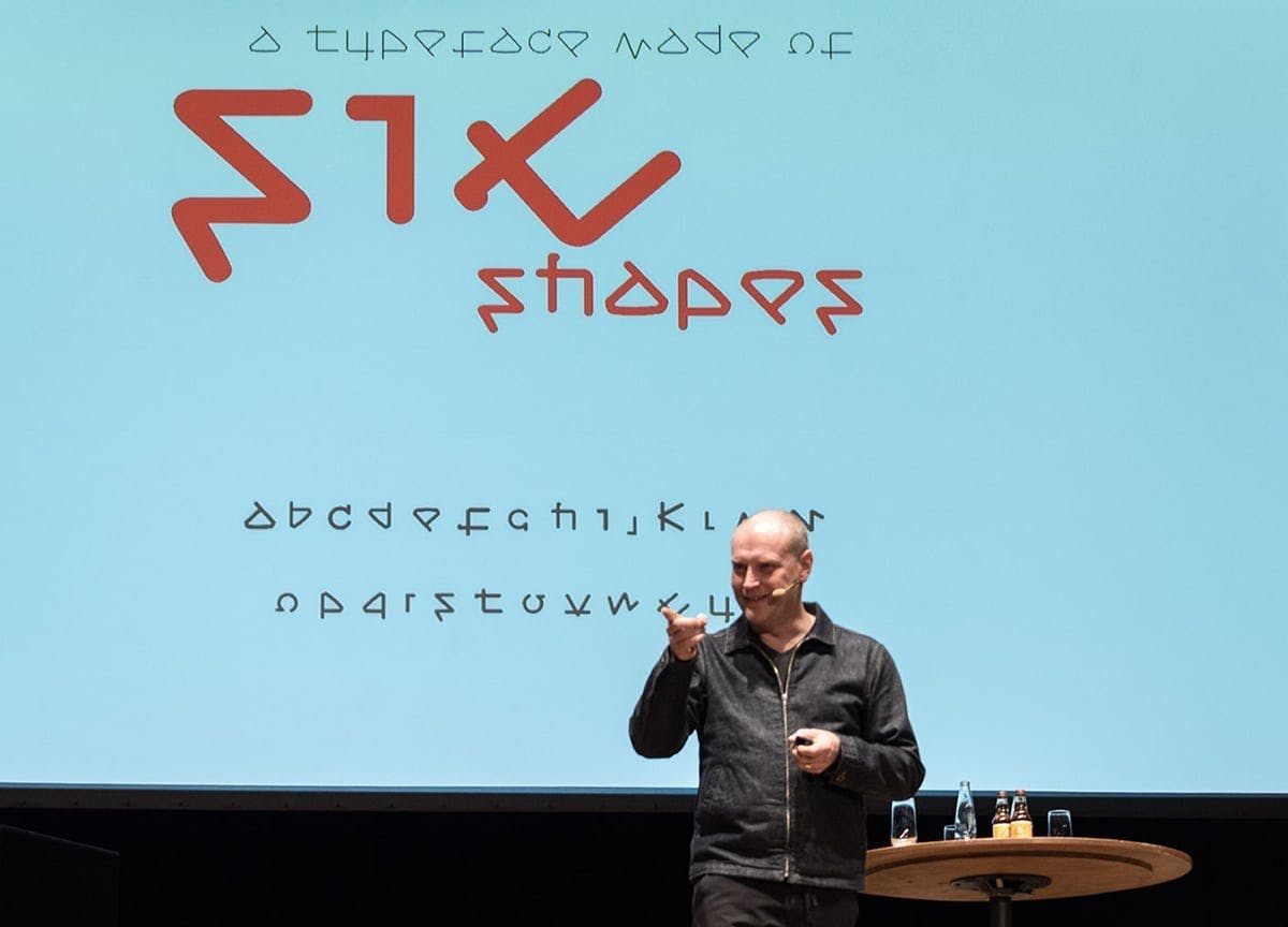
Jonathan Barnbrook is a graphic designer best known for his work on David Bowie album covers. He first spoke about creating the album art for Bowie’s 2002 album, Heathen, in which much like the musician, he wanted to bring the avant-garde of graphic design into the mainstream. “Most people don’t care about design, they think we’re corporate whores, basically,” he explained.
Then came the cover for Bowie’s The Next Day, which featured a white square over the cover of a previous album, Heroes. He did this by looking at every past cover and trying to subvert them, because people always asked if Bowie’s albums would ever be as good as Ziggy Stardust. It wasn’t until it started to simplify that it began to make sense, he explained, adding that however “toxic” the feedback was, the project made people talk about album covers again. A viral marketing campaign started on its own with fans superimposing the white square on themselves (and even their cats). “When a musician releases a new album, it creates a new visual language for the world,” he said.

We then learned about his processes for creating the Doctrine font (based on the North Korean airlines logo), the Prozac font (a rationalised and simplified font, just like the drug), and the Manson typeface, which was named after the serial killer Charles Manson. Jonathan spoke about his collaborations with Adbusters magazine and Banksy’s Dismaland, and finished with his work on the album cover of Blackstar.
“An album cover is not about the album cover,” he said, “It’s about it being a physical and digital presence in the world.” The best record covers, he continued, are beyond logic, and paint an emotional landscape instead. He learned from the cover of The Next Day that fans want to own the music, have a two-way relationship with the musician and have something that they can participate in. He wanted the graphics on the cover to be all sharable, so they are free to download, as is the open-source font he created for the album, called Virus Deja Vu.
—
We’re magazine nerds. If you are too, join our magazine subscription club from £6 a month


