A magazine for getting lost
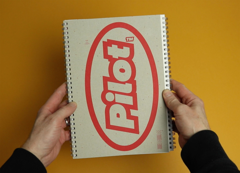
Stack subscribers might know that I’m a big fan of Pilot magazine. We delivered their third issue as our monthly selection in November 2022 – it was themed ‘Play’, and it was conceived as a board game, printed on a giant poster, with the magazine’s articles and photography dotted along the course taken by players.
At that point I said it was the most ambitious and mischevious issue that Pilot had produced so far, and I think that was right. But now the fourth issue has landed, and it takes the weird, avant-garde experimentation up to a whole new level, with a tri-fold structure that separates the text from the images, and encourages readers to flick back and forth between the two.
It’s obviously a strange and awkward reading experience, but I also found that it slowed me down and made me think more about the pairings of words and pictures: Magazine design has evolved over hundreds of years to provide the smoothest, easiest, most compelling ways of presenting words and pictures on the page, and this odd experiment made me appreciate just how powerful and invisible the conventional magazine layout can be.
But Pilot doesn’t stop there, introducing a range of other design quirks that further muddy the waters and encourage the reader to lose themselves. (The issue is themed ‘Terra Incognita’, the term used on maps to show areas not yet explored, and this absence of knowledge is central to the conceptual thrust of the magazine.) Take a look at the video above to see this strange and brilliant magazine in action, and I hope it gives a sense of why I enjoyed it so much.
