Behind the scenes: Cookbook magazine
Published by the Madrid-based design studio Naranjo–Etxeberria, ‘reference magazine’ Cookbook is a conceptual investigation of visual artists’ wide-ranging references.
The third issue is dedicated to the chaotic and beautiful world of Ukrainian artist Sasha Kurmaz. Keen to know more, I caught up with founders Diego Etxeberria and Miguel Naranjo to learn about the magazine’s concept, and the process of creating the new issue.
What’s the idea behind Cookbook?
We believe the process of making art is more interesting than the result – the result is just a conclusion, whereas the process is the real design. So we want to present the references of an artist, letting the reader in on what lies behind the observable and the finished piece of art.
You say in your editor’s letter that this is not really a third issue – it’s a third first issue. What do you mean by that?
The first two issues of Cookbook were focused on creating a metaphor between art and gastronomy, with the idea that ingredients are to the final dish what references are to the final artwork. But now, we have come to realise that our true concept was hiding behind the game.
As we have worked on Cookbook we have started to consider it more as a project of investigation into the process of editing, and a platform for us as an agency to explore new tendencies and take risks that we can’t take when working with clients. It’s also a really fascinating process to investigate the references of an artist, who is in turn a reference for our own work.
Tell me about your new issue!
This issue analyses the references of the Ukrainian artist Sasha Kurmaz. He started out as a graffiti artist, and has continued to work a lot with the public space – hacking it and de-powering power structures. His work is amazing, with a lot of interesting concepts and ideas – and a lot of humour as well.
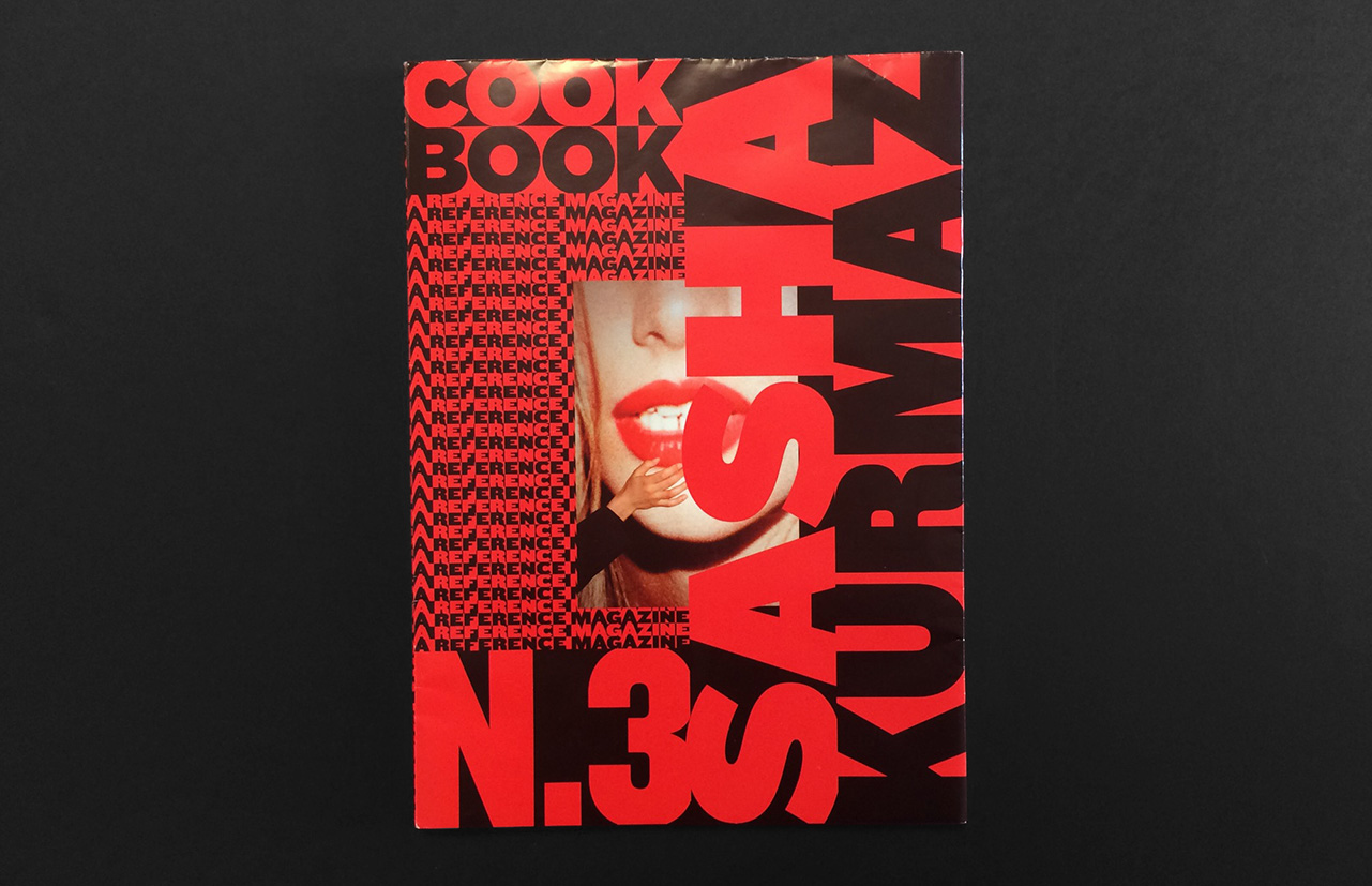
The starting point for the magazine is an interview mapping out Sasha’s references. The interview is printed on the wrap-around cover of the magazine and also works as a sort of table of contents. From there we collaborated with other artists to create original visual content in reference to Sasha’s reference. And finally, in the back section we present some of Sasha’s projects. It’s all about really delving into Sasha’s world.
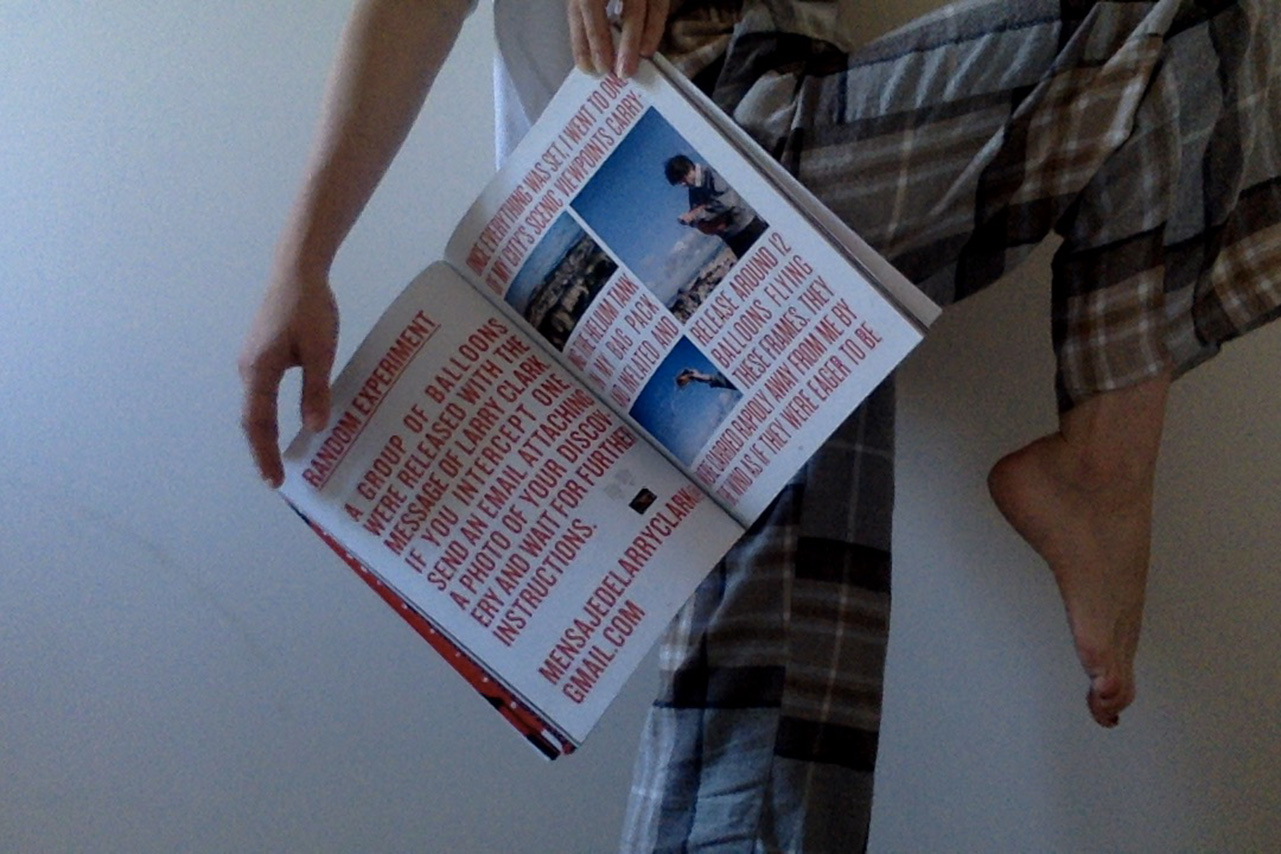
In previous issues of Cookbook, every decision has been influenced by the artist you feature – how did Sasha’s practice influence this issue?
Yes, the magazine is always changing. In that sense it’s a magazine without an identity – and that is its identity. The artist chooses everything; the colours, typefaces, format, paper stock. Everything is informed by his or her work, so it’s created entirely from inside the world of the artist.
Our first issue was on the Spanish painter Ricardo Cavalo and took the form of a fanzine, and the second issue on designer Albert Folch was a ‘bookazine’. This issue, with glossy paper stock and full bleed imagery, references a fashion magazine, which is in line with Sasha’s work.
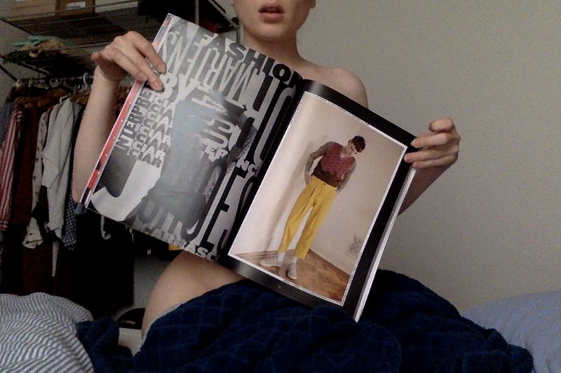
We wanted the magazine to reflect two sides of Sasha’s practice: the wild and chaotic on one hand, and the aesthetically beautiful on the other. In order to illustrate these two sides, the magazine has two sections: The first presents original content created as a response to Sasha’s references, and uses a classic layout of images, and a chaotic layout of the text. In the second part, where we present Sasha’s projects, we have done just the opposite: using a classic layout of texts, and in contrast, the images are placed disorganised and accidentally.
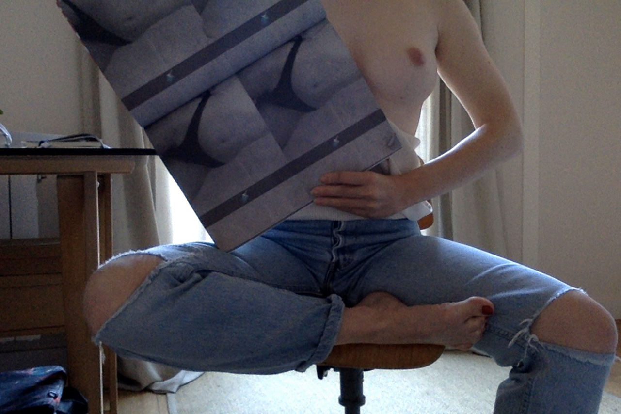
What’s the idea behind the webcam images of the magazine?
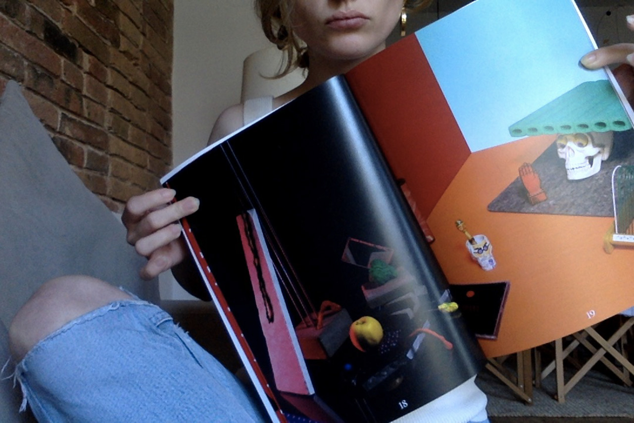
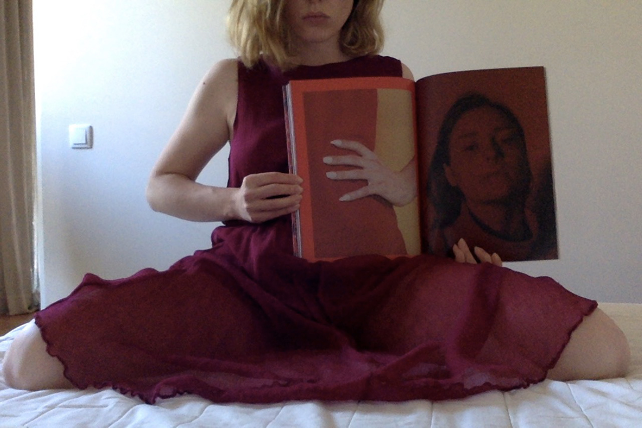
One of Sasha’s projects is an exchange of erotic webcam pictures with a Russian girl; and Pablo Curto’s contribution to this issue explores a similar idea of voyeurism. We wanted to reflect this theme in the photo shoot of the project, so we gave the magazine to a friend, Carla Camprubi, and she photographed herself with the magazine.
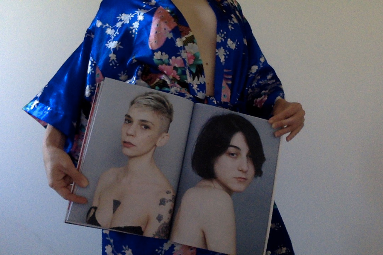
How do you want readers to approach the magazine?
While our second issue was made to read, this one is made for looking. For that reason, all of our contributors are visual artists and there’s not really any text. We want Cookbook to feel like a very personal magazine with a conceptual approach. And we also like it to be a magazine in which the design helps us to break the usual layout of the page, giving more importance to the content and to the artist’s world.
–
Stay up to date with the best independent magazines – sign up to Stack and we’ll deliver a different magazine to your door every month
