A guide to letterpress printing, by Double Dagger magazine
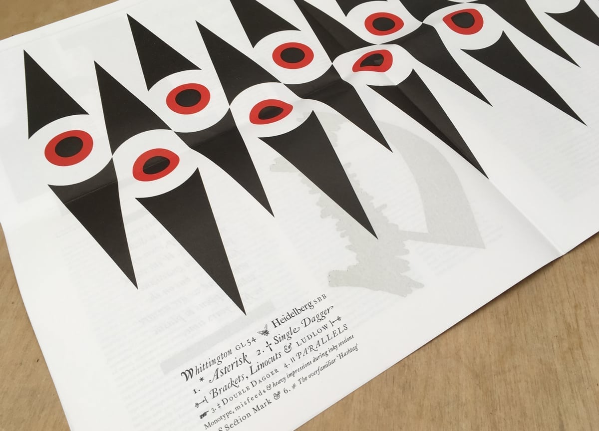
Working with a defined set of limitations — like the dimensions of a magazine — is what spurs unexpected creativity in a lot of publishers we speak to. For Pat Randle and Nick Loaring, the founders of Double Dagger magazine, this mantra is the backbone of their letterpress printing project. “Having to make constraints work to your advantage for me is what design is about,” Pat says in our chat below.
Their beautifully handcrafted, 16pp newspaper is the latest magazine to join the Stack lineup — read on to find out more about their masterful technique and process, and if it piques your interest, they have an open day on Saturday 2 September at their base of Whittington Press near east Cheltenham.
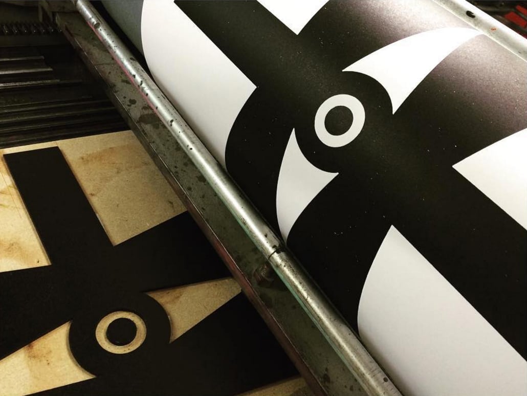
Double dagger is printed on a Heidelberg Cylinder SBB — can you tell us about this 1970s machine?
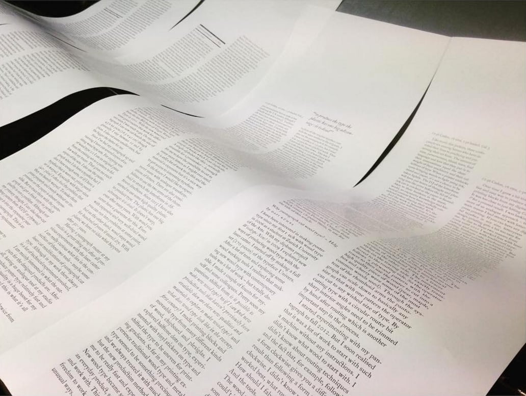
The Heidelberg Cylinder (57 x 82cm), which in the UK succeeded the Wharfdale Cylinder Press, became known as the Rolls Royce of letterpress printing machinery for its ability to run up to 4500 sheets per hour with a pinpoint accurate register, and with an instantly responsive ink duck. Our press is 50 years old and even now, touch wood, it rarely needs to be seen by a Heidelberg engineer. It was built at a time machinery was built to last. To compare the mechanics with those of today’s printing machines mirrors much that is produced nowadays — they are driven by nylon cogs and designed with a short life expectancy to maximise revenue for the companies that manufacture them.
What are hot-metal characters, which Double Dagger uses?
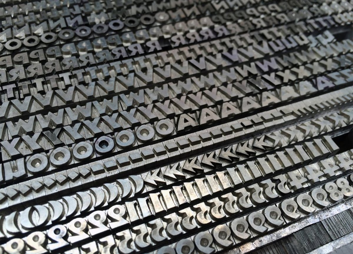
Printing from hot-metal type suits the medium we are representing. The artwork we print from, whenever possible, is printed from the original piece of lino/wood that has been engraved by the hand of the artist. In the same way, the matrices we use to cast Caslon type have been made from punches cut by William Caslon over two hundred years ago (though it’s true some broke over the years and needed replacing). The point is that there is an integrity to the process. We are not arguing that all technological advances in print should be reversed 50 years, but, when printing from original artwork there is no better companion than to use type which has been cast in hot-metal.
Are most of your layouts designed on the screen or is the process purely analogue?
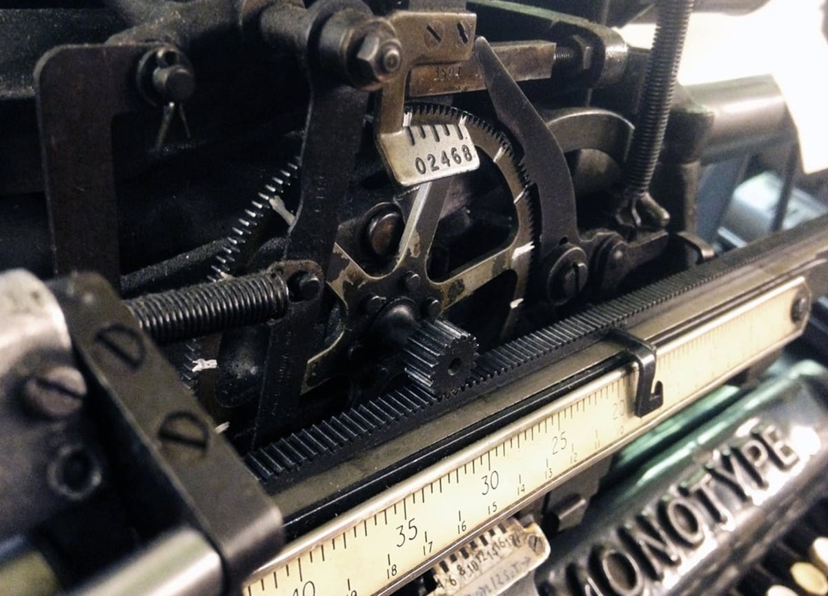
All of our layouts are designed by hand — cutting and pasting up ‘galley proofs’, which are printed directly from the galleys of type that come off the Monotype machine. A galley contains around 100 lines of type and we take three pulls — one for the paste-up, one that goes to the contributor for proof reading (the text is re-keyed here so corrections are frequent) and one for our own proof-reader. We are not averse to using the screen — all of the designs resulting from laser cutting come with the aid of the screen — it’s just that we prefer to design the layouts without.
Could you talk us through the particularities of the actual printing process, as I imagined it to be a extremely precise and delicate undertaking, from selecting the font size, to lining everything up so it looks neat on the page…
Well I find letterpress to have an inbuilt discipline — you have a self-imposed grid as a result of all the columns being the same width, so once the first spread has been decided on the rest tends to design itself to an extent. For the first issue we went with the typeface Caslon and for number two we have chosen Walbaum — we only have certain sizes of the Walbaum in the larger sizes, and have a mass of the 48-point bold italic used on page one. This perhaps would not have been my first choice if designing with the endless options of the computer, but it was all we had here in the metal so we had to make it work. The process is full of constraints — but that appeals to me, having to make constraints work to your advantage for me is what design is about.
And lastly, what do you love most about working on Double Dagger?
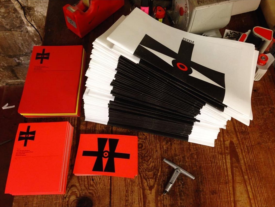
The thing we enjoy most is that we are in charge from start to finish, from publishing the material we like to feeding the sheets through the press. If we decide, half way through a print run, that a 6-point lead needs adjusting we can stop the press and make that adjustment so the design stage is fluid right until the last sheet drops. We don’t always have that freedom in our day-to-day work.
—
Get our favourite design magazines and more delivered to your door each month — Sign up to Stack from £7/month
