Why the best covers always have eyes

Arts magazine Elephant has a fresh design. Moving from four to two print editions per year, the new Elephant has a bigger font and a playful, eclectic feel to its pages: one series, of New York artists shot in their bedrooms, reminds you, deliciously, of the messy intimacy of a shoot in Seventeen magazine. In one intriguing essay in the relaunch issue — Elephant’s 45th — Flora Yukhnovich writes about Jean-Honoré Fragonard’s Renaud et Armide, noting that Fragonard was looking at diagrams of wombs and female anatomy as he worked, in order to build specifically ‘female’ worlds. Reading that piece in the context of Elephant’s redesign made me think about the kinds of worlds you can build in print.
We spoke with art director Tom Joyes to dissect Elephant’s new look, explore the beauty of “low-tech design”, and understand why “something with eyes makes a really good cover”.
Elephant has gone biannual. Why?
Magazines sometimes get to the point where they’re making too many issues and it doesn’t feel like when you get it that it’s this amazing thing. What we wanted to do with the redesign is make every issue bespoke. We want the magazines to be less templated; more collectible.
Intimacy is a theme of this issue. How is that reflected in the design?
We featured five artists living in New York, shot by Alicia Mersy. We used a really intensely stretched-out type-face, by ABC Dinamo, so that the typography would look like street signage. It felt intimate to have the type related to the place the piece was about: New York. Mersy is one of the five artists featured and she photographed herself and the others in their studios or homes. That gave the piece this intentional but unintentional Seventeen Magazine feel. It’s a low-tech approach to design — people in their bedrooms — hopefully something people feel they can tap in to. Teen pulp magazines are something I’m so interested in. Some of my magazine heroes are ID, Fresh Fruits, Sofa magazine. They have that kind of pulpy feel to them; an informal approach to content that never feels pretentious. We’re not trying to create this clean, Swiss-style magazine. Elephant is more relatable and more accessible than that.

The art world can be intimidating. Was opening up that world something you thought about when redesigning the magazine?
The editorial in Elephant has always been on the more accessible end of the art magazine world, but it was important that the design of the magazine kept up with that. We also use graphic elements from comic books. Elephant is called Elephant; we don’t always take ourselves super seriously. Design that is able to laugh at itself is an important progression. Elephant doesn’t focus on long-form pieces; the writing is usually short-form, or conversation-based. We condensed the space text takes up on the page to make room for title pages and large images. When you have a condensed text it makes a more appealing read because you know exactly when the piece will end — and that there will be lots of beautiful pictures to flick through afterwards.
As well as Fresh Fruits, ID and Sofa, what were your other design inspirations?
I think Butt magazine is the best magazine ever made, editorially and visually. Also, I love The Gentlewoman. I like the way they always have portraits on the front. That’s something we will do going forward.
The portraits on the cover of this issue, by Otis Kwame Kye Quaicoe and Kwesi Botchway, are wonderful. Will you stick to painted portraits or use photography, too?
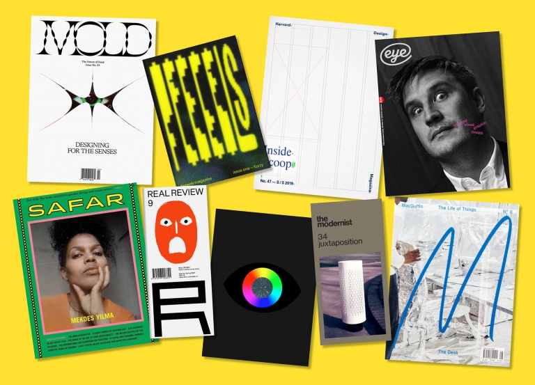
Absolutely. There will be portraits that we actively commission from interesting photographers and illustrators. The Otis Kwame Kye Quaicoe and Kwesi Botchway paintings are self-portraits, selected for this issue. I’m of the opinion that a portrait — something with eyes — makes a really good cover. I’m always drawn to covers with faces on them and a central point of attention. And having portraits of people is something that art magazines don’t really do. If you look at Cura and Kaleidoscope, for example, they mainly use more abstract covers. To mark ourselves as different, portraits are essential. They signal an active departure for Elephant from that situation at the end of the magazine when you’re just looking through a folder of 20 images thinking “What’s going to go on the cover”. Also, portraits are so intimate!
Lead images: 3D renders by Ignasi Casas with art direction by Tom Joyes


