Insider: Cercle magazine
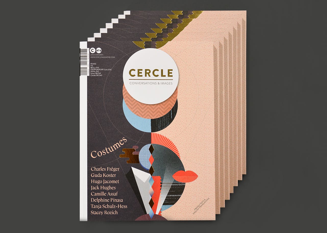
Based in Strasbourg, France, Cercle magazine is a biannual, monothematic magazine co-published in English with IdN. Each issue combines science, conversation and art to better understand its subject, resulting in a magazine that’s as unique as it is beautiful.
Following the release of the new costume-themed issue, we asked publishers and designers Marie Secher, Maxime Pintadu and Marlène Astrié to share their experience of putting it all together.
In the making of this issue we…
Listened to
This eclectic mix:
Used
A flip chart! We bought one for this issue and discovered its huge power. Being able to tear the page apart once a project is done was amazingly satisfying. Plus we wrote a lot of bad jokes on it.
Were sidetracked by
A Halloween party. We went to Hamburg to interview a costume designer and she invited us to a Halloween party set in the basement of the town hall. We were dressed up and face painted especially for the event. It was a haunting experience!

Argued about
Whether or not to print a new run of our first forest-themed issue, which was out of stock. We discussed it back and forth: should we, or should we not? Will there be enough people to buy it in order for us to pay the printers? In the end we decided to do it, and we’re all happy with the decision!
Went to
Paris, Hamburg, Moulins, Biel, Barcelona… But we spent most of our time at our favourite bar terrace in Strasbourg.
Learned
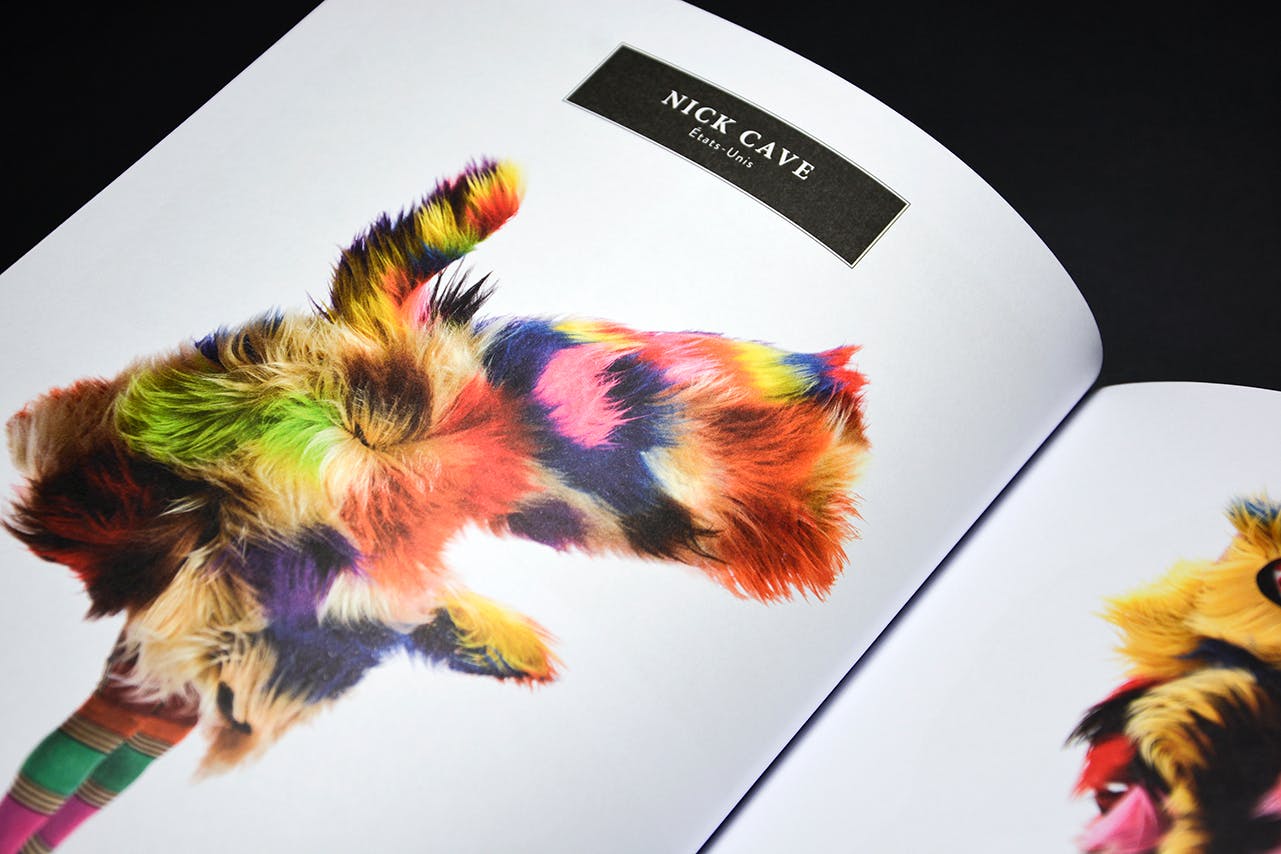
Almost everything about costume of course! But we’re still not sure how to dress properly…
Were excited about
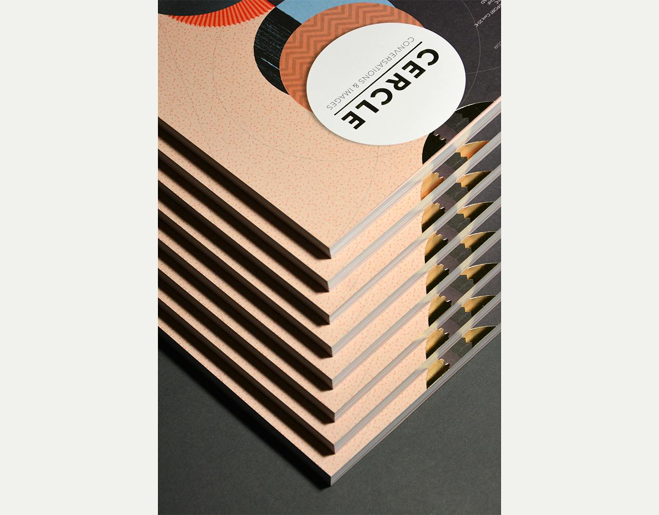
The gold foil on the cover! It’s so shiny.
Lost sleep over
As with every issue, the design of the cover. It’s always one of the most tricky parts. We made around 15 different versions before we were satisfied, and the fine-tuning was exhausting.

Couldn’t stop laughing at
The special edible costumes (above) created by food designer Sonia Verguet for our release party. Three of our friends were dressed in lycra suits and is was lot of fun. For us, maybe not for them…

And everyone should buy a copy because
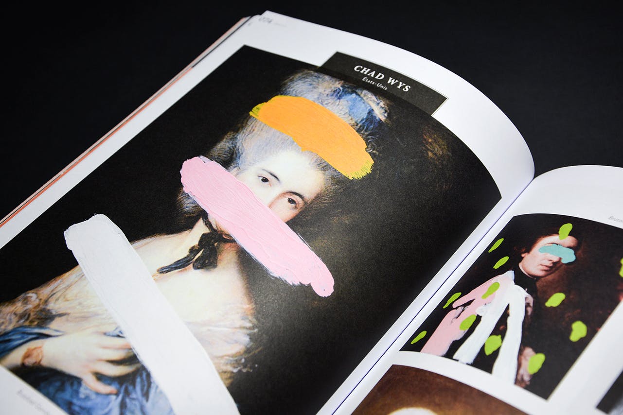
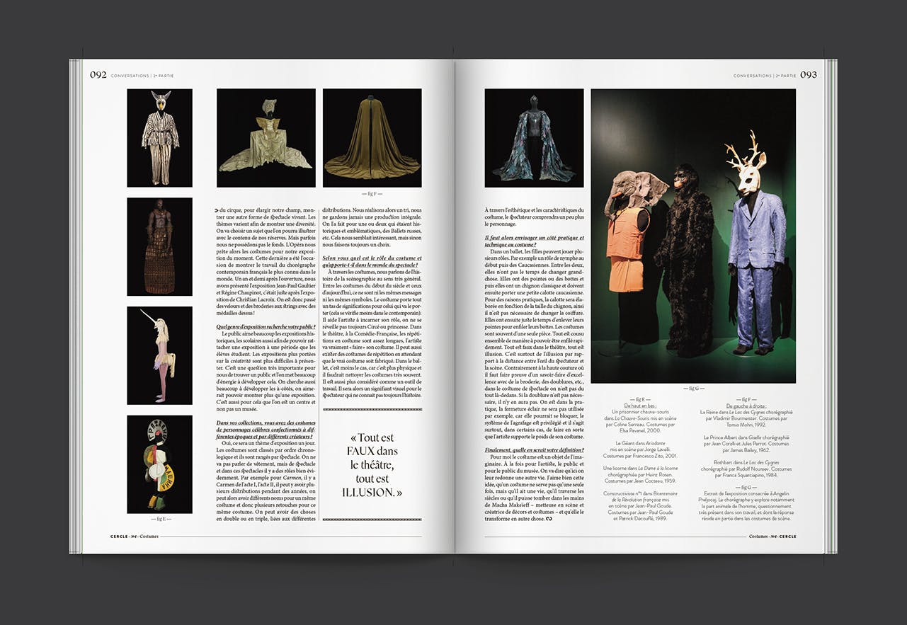
We think it’s our best issue ever. It’s at the intersection between fashion and art, sociology and history… The portfolio is amazing and the typeface especially created by Thomas Bouville (above) for the issue is really neat. And because there’s gold on the cover!
–
Love independent publishing? Sign up to Stack and receive the best independent magazines direct to your door every month


