Making the ordinary extraordinary
Independents are often loved for their authenticity. Whereas mainstream glossies sell their readers a fantasy, independents are more likely to form a close and meaningful relationship with their audience.
But of course that doesn’t mean they’re just full of ordinary people doing ordinary things. So instead we see independent magazines that create their own version of fantasy through everyday materials, or provide a critical analysis of the world around us, and in doing so help us to see the ordinary with fresh eyes.
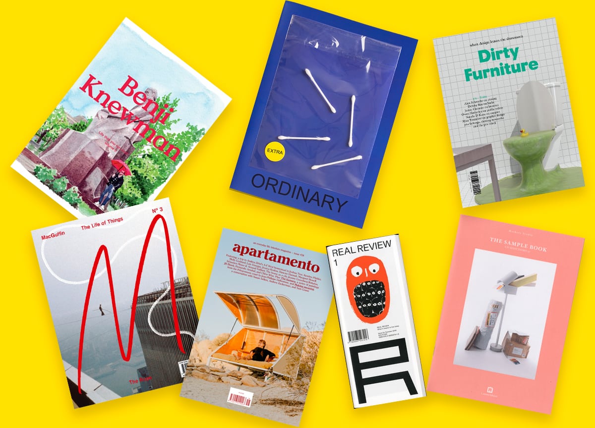
From Apartmento’s iconic photography, to MacGuffin’s meticulous study of objects and Ordinary’s mischeviously overblown approach, we roundup our favourite independent magazines that specialise in making the ordinary extraordinary.
1. Apartamento
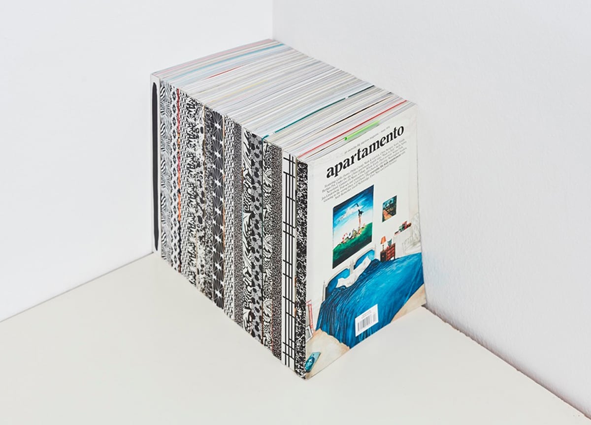
Apartamento is the godfather of the current crop. Built on the idea that pristine interiors are dull and lifeless, it celebrates the beauty in the messy beds and crowded shelves of real homes. But of course all this messiness serves to create its own fantasy existence of bohemian cool through the exemplary photography and insightful interviews. (Our houses do not look like the places they cover!)
2. Dirty Furniture
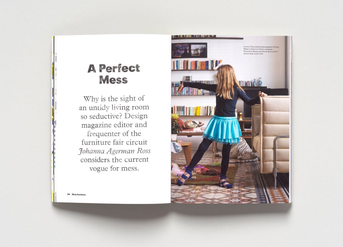
Dirty Furniture also looks at the ‘typical’ home, but in a different way. It’s interested in design once it leaves the showroom, so again, taking it out of the pristine showroom environment and into the messy world. But rather than creating its own fantasy, Dirty Furniture tries to provide a critical understanding of it. In fact, in their first issue they published an essay asking why the Apartamento-style messy room is actually so appealing. (below)
3. MacGuffin
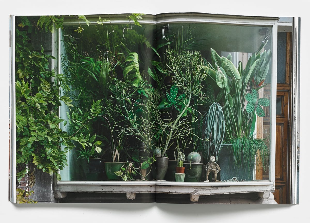
Like Dirty Furniture, MacGuffin takes a different object as the basis for each issue, but its treatment is more whimsical — it asks why we find these things interesting, but also indulges in the fantasy itself. For example, in the ‘Green Curtains’ feature (below) in the Windows issue, Labadie Van Tour painstakingly prepared windows to overcome the glare and reflections that come with photographing glass, in order to create images that look like casual photographs.
4. Benji Knewman
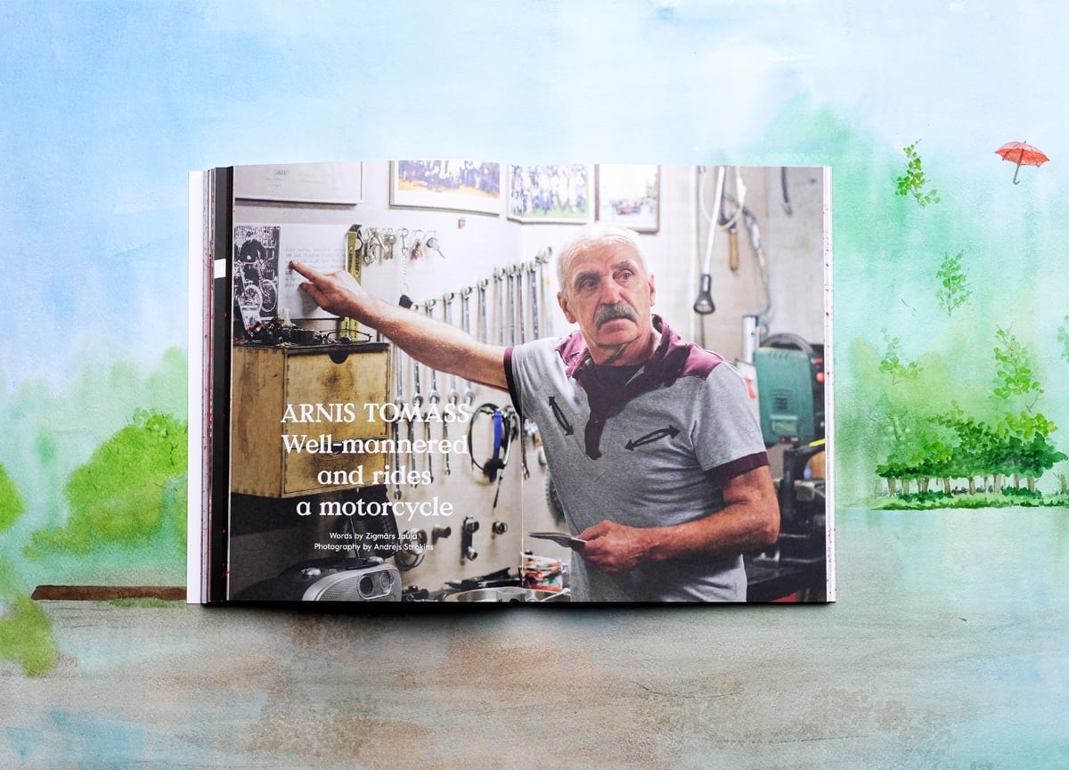
Benji Knewman shows the phenomenon moving away from the design magazine. Again it takes a whimsical approach, but focuses primarily on people to give a very close and intimate picture of people’s real lives. In the new issue, for example, they speak to Arnis (above), a chauffeur for the Latvian government who also runs a vintage motorcycle garage in his spare time. At first glance there’s absolutely nothing remarkable about this older man, but Benji digs deeper and brings its fantasy of ordinary to him.
5. Real Review
Real Review shows that ordinary isn’t just about subject matter, but also production. The thick, luxurious paper common amongst independents was a response to the mainstream cutting costs and using cheaper, thinner paper. But as the thick stock has become ubiquitous, a group of independent publishers are challenging that new status quo and choosing to print on thinner, cheaper alternatives. Real Review adds an extra fold to the magazine, elevating the cheap materials and signalling that its considered design parallels its excellent content.
6. The Sample Book
This satirical magazine by design agency Mathery Studio is one of the more literal approaches of making the ordinary extraordinary. Using only samples given out for free by businesses, the team produces beautiful, quirky objects, and showcases them in the magazine through great photography. Watch the video above to see an aquarium built out of samples of concrete and textured glass, or a pyramid made out of astroturf.
7. Ordinary magazine
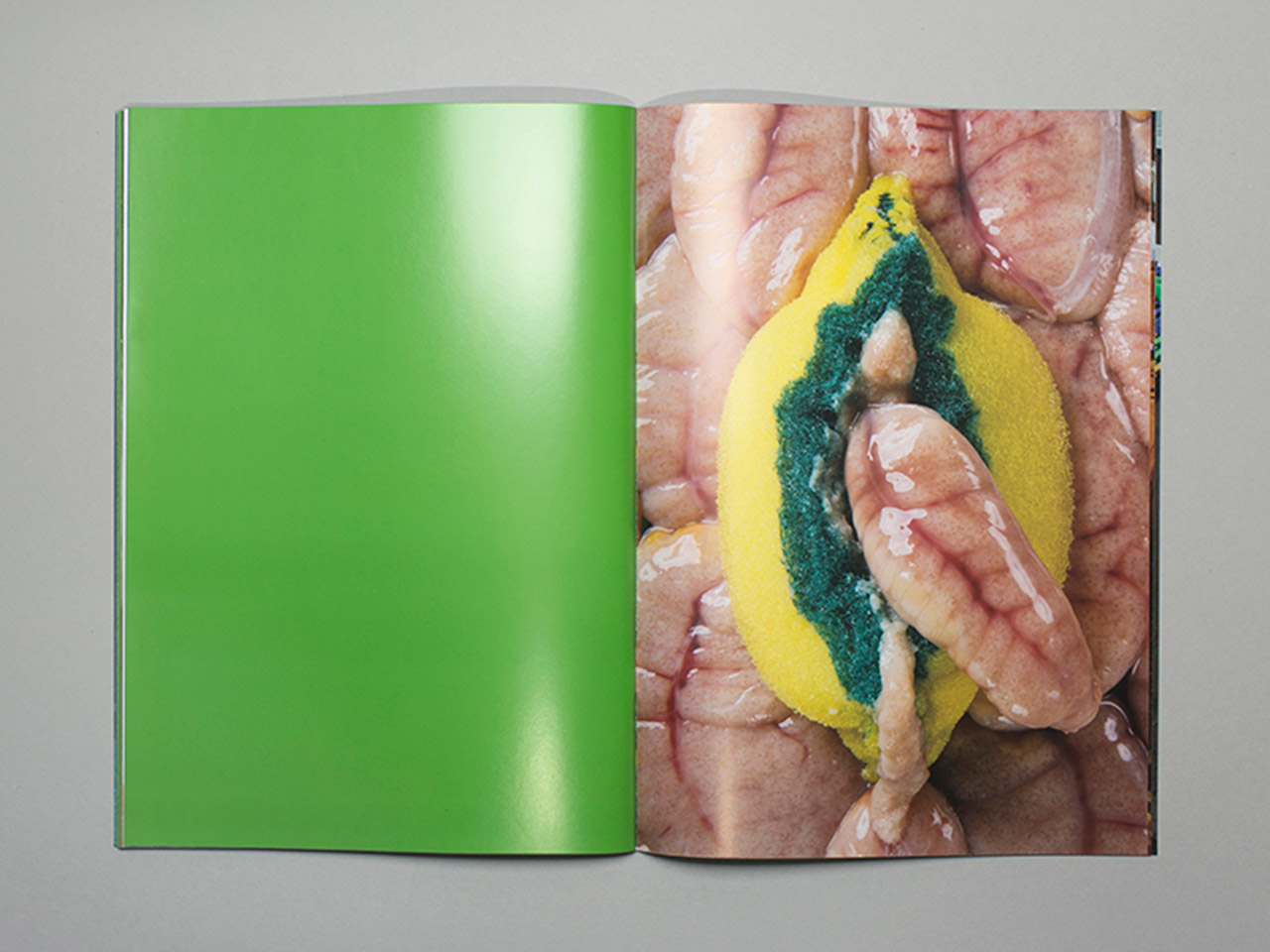
Ordinary magazine synthesises all of these approaches to ordinary. At first glance it’s a bit of a joke, a bathetic take on art for all. But look closer and you’ll see that they create the most fantastical images from ordinary everyday objects, and in doing so encourages us to think about the way we see the world. In his interview with Stack, Max Siedentopf noted that they use ordinary objects because virtually any viewer, anywhere in the world, will be able to view the images and understand what’s going on. They also use regular glossy paper, A4, staple bound, with the standard Photoshop presets, and no text, to strip away everything about the object and make it all about the images on the page.
But the question is, what will be the response to the ordinary? Can we expect to see a new wave of luxe, fantasy lifestyle magazines coming out of the independents in the next five years? We’re looking forward to finding out…
—
Like our selection? Subscribe to Stack for £6/month and get an independent magazine, handpicked by us, delivered to your door
