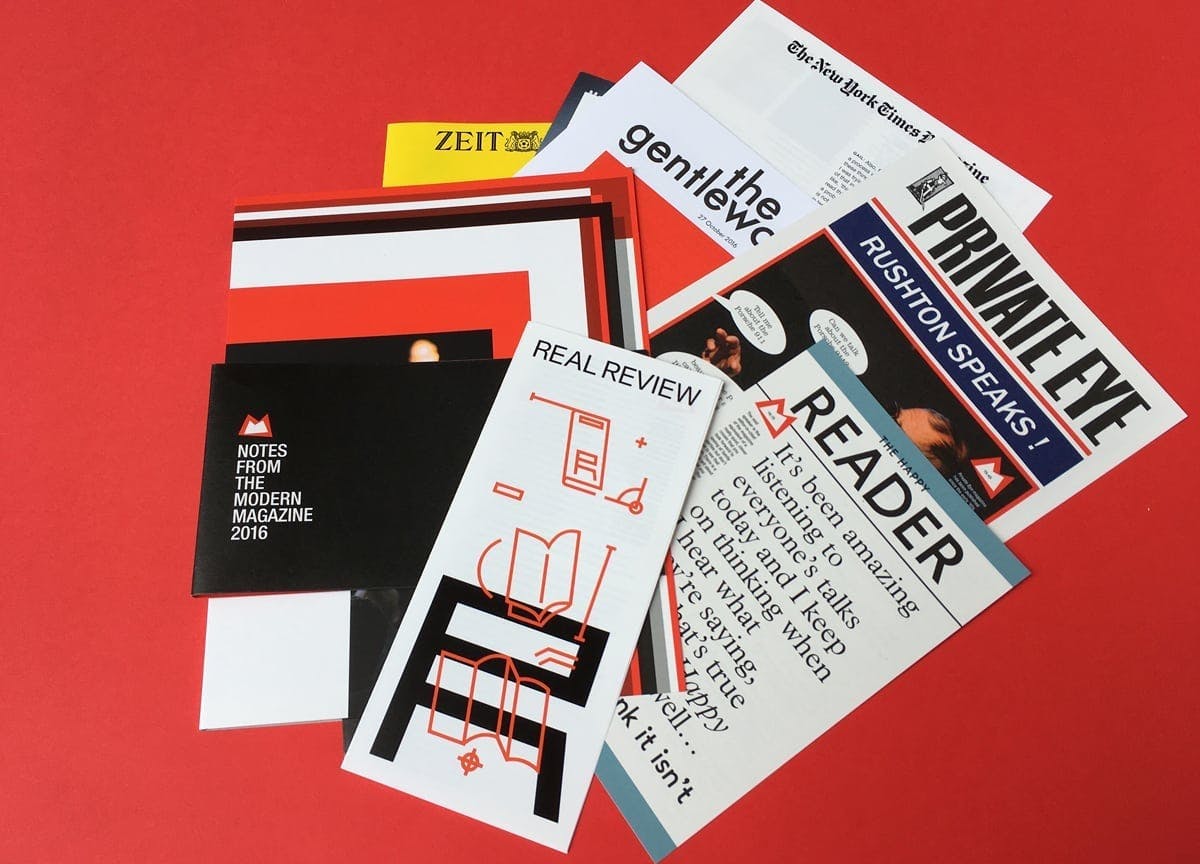
Miniature magazines in magCulture’s conference notes
The other week we received a slim package from magCulture containing notes from their 2016 Modern Magazine event. The yearly gathering of magazine makers, where a diverse range of editors and publishers speak on their experiences was one of our highlights last year, so we were excited to relive the day.
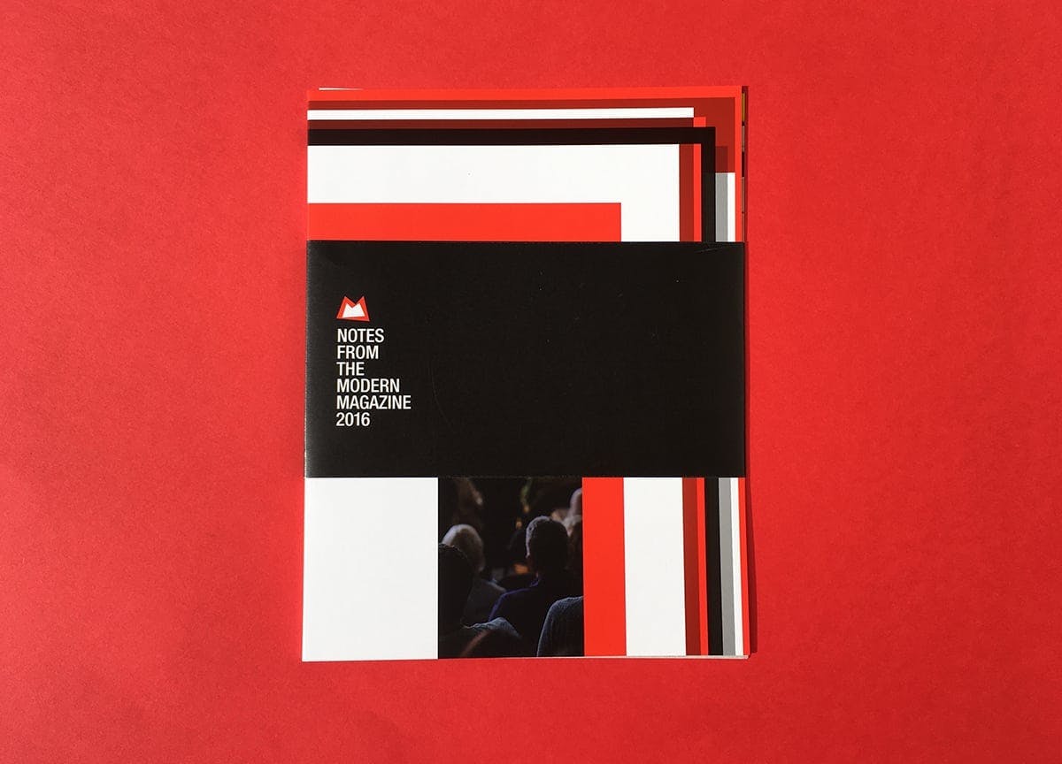
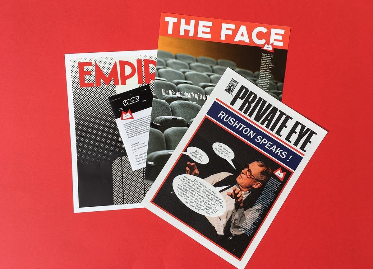
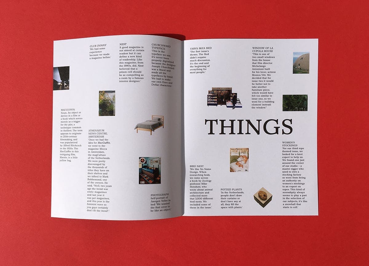
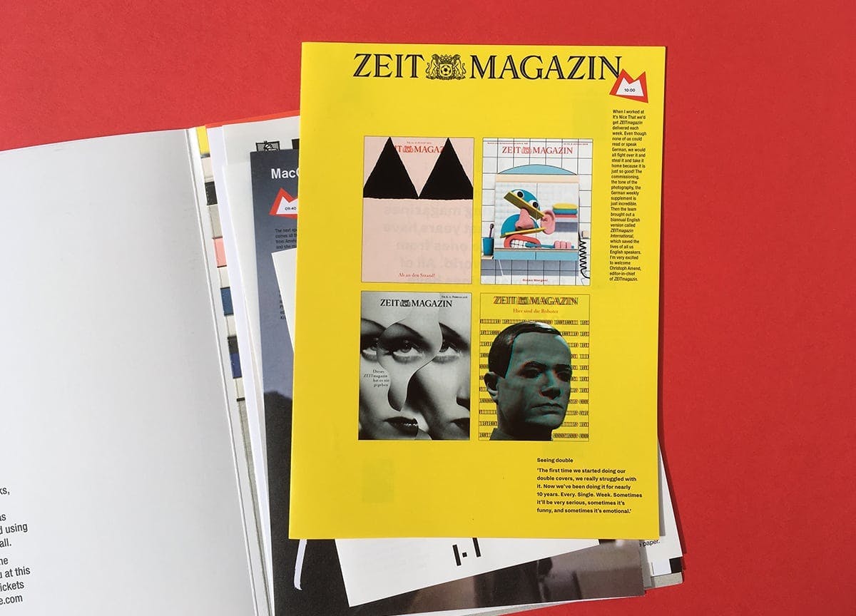
But to our further delight, the booklet opened up to 12 small pamphlets, each designed to mimic the shape of the publication that presented on the day. From the long and narrow Real Review, to The Happy Reader’s coloured borders, each was carefully designed to pay homage to its forebear, incorporating its defining fonts to communicate the most memorable quotes and talking points from each speaker.
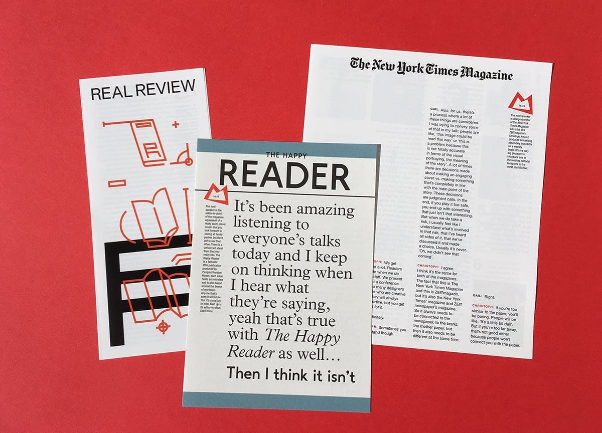
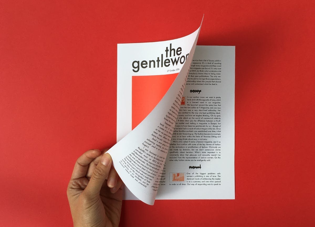
Even the design inside the individual mockups reflected the actual publication’s layouts — The Gentlewoman, for example, saw their pictographic footnotes replicated with editor-in-chief Penny Martin’s key points.
Private Eye was printed on an off-white paper to mirror the newsprint, while The Face’s iconic header blazed across the top of its tiny doppelgänger.
It was a lovely way to reminisce last year’s ModMag, a day packed with informative and inspiring talks from some of the world’s best publications. This year’s event promises to be even bigger, so make sure to book your ticket so you don’t miss out. See you there!
—
Stay up to date with the latest independent publishing — sign up to Stack and we’ll deliver our favourites to your door each month
