Stack Awards 2018: Art Director of the Year shortlist
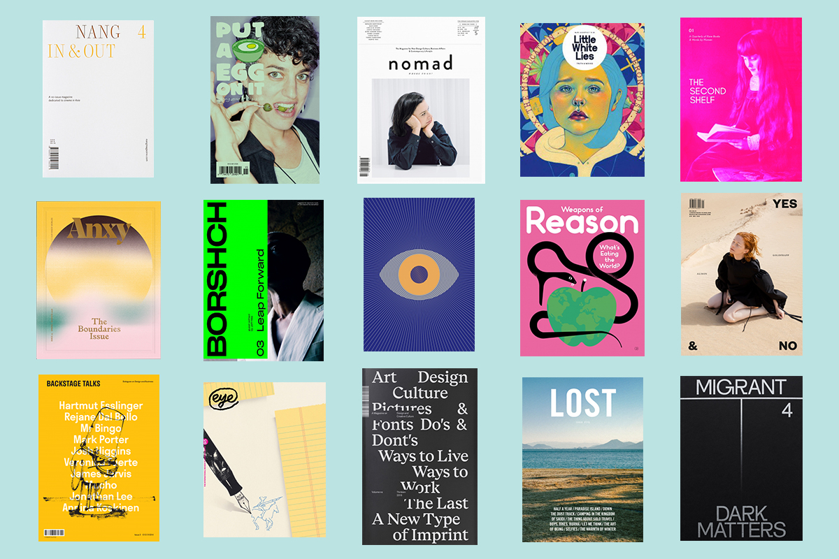
Without a strong visual identity, a magazine is hard pressed to stand out from the crowd. That’s why this category of the Stack Awards wants to recognise the brilliant work of art directors to help their magazines look fresh and unique.
Joining forces to judge this category are Will Hudson, founder of It’s Nice That, and Debbie Millman, the host of Design Matters and author of six books on branding and design. Read on to find out more about the 15 magazines shortlisted…
A New Type of Imprint | Oslo
Published by design agency ANTI, A New Type of Imprint is a beautiful magazine that connects the world with Norwegian creative culture.
Anxy | Berkeley
From their gradient covers to their eye-catching typography, Anxy magazine dives into mental health through mesmerising, dream-like design. As if moving through different moods and mind spaces, each chapter is characterised by its own unique colour palettes and shapes.
Backstage Talks | Bratislava
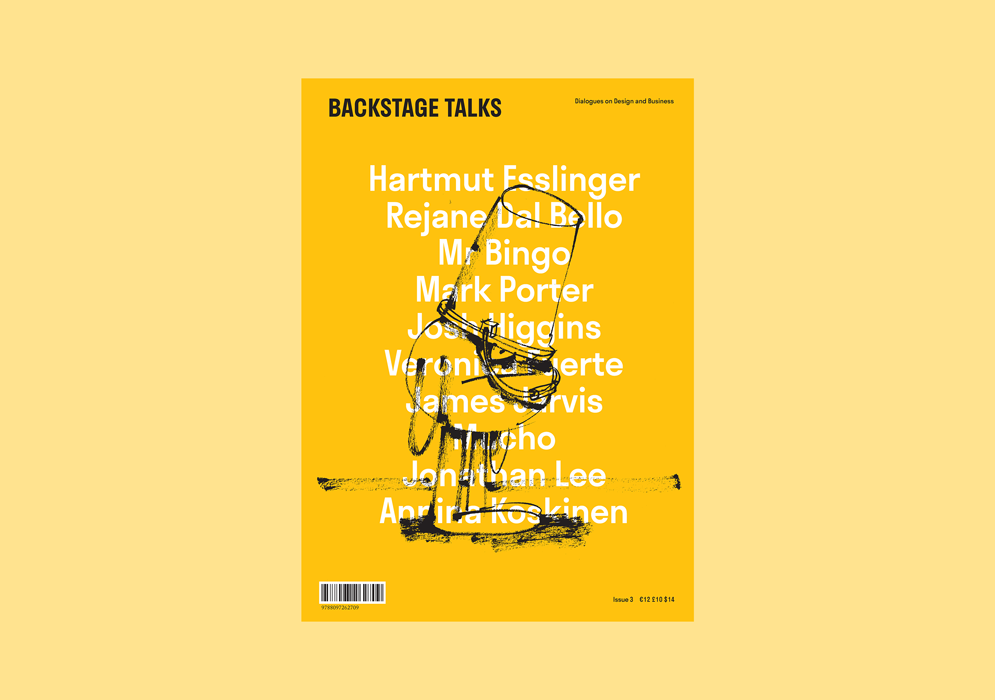
Under the auspicious backdrop of a design conference, Backstage Talks corrals the conversations recorded off-stage with speakers and presenters. By Design Conference takes place every year in the Slovakian capital, and has welcomed speakers like Malika Favre and Mr Bingo.
Borshch | Berlin
With Jeff Mills as its guest editor, this issue Borshch investigates dance music and its purpose in the wider culture. With full-bleed spreads and quarter-size pages, it offers an immersive reading experience.
Eye | London
Eye magazine is a quarterly journal dedicated to graphic design, featuring critical, informed writing on visual culture. From fellow magazine makers to veteran art directors, they speak to people creating fresh, original work to provide insight into the publishing industry and beyond.
Eye on Design | New York
Published by AIGA, Eye on Design seeks out the most exciting and innovative design. This issue is themed Psych, and packs in shimmering paper stocks, optical illusions, DayGlo ink, laser cut pages, and a volume of delightful print surprise.
Little White Lies | London
Through characterful illustrations and personal perspectives, Little White Lies sets itself apart from other film magazines. Carried by a unique visual identity, each issue offers a different side to the season’s most talked about blockbusters.
Lost | Shanghai
Lost gathers first-person writing on self discovery through travel. Each chapter brings its own typography and colour schemes to tell a spectrum of human stories, while the English and Mandarin texts are artfully placed so that they always feel pleasingly balanced.
Migrant Journal | London
Migrant Journal is a six-issue exploration of migration. Through scrupulously constructed maps and accessible infographics, they break down big stories that can be hard to digest. It’s also hard to miss their striking custom typeface.
Nang | Seoul
Exploring Asian films and filmmakers, Nang is a thoughtful title honing in on one cinematic technique at a time. Its laser-cut covers, stitch binding and printed spines make sure it stands out on the newsstand.
Nomad | Munich
Nomad views design as a process of shaping the future, and as a catalyst for social developments and individual lifestyles. It connects the dots between business, politics, and personal affairs with the world of design.
Put A Egg On It | New York
Standing in cheeky defiance amongst pristine food magazines, Put A Egg On It is a noisy, tasty zine celebrating the joys of eating, cooking and communal feasting. The attention-vying layouts, buzzing with illustrations that spread to the edge of each page, sit alongside personal anecdotes of food-filled adventures and images of messy meals, all printed on their signature green paper.
The Second Shelf | London
Book dealer AN Devers started The Second Shelf to champion women authors in a hugely unbalanced rare books market. The magazine aims to counter the historical exclusion of women in first editions, manuscripts and rare publications.
Weapons of Reason | London
Tackling some of today’s biggest challenges, Weapons of Reason wants to inspire readers to take action. Through colourful infographics and cheerful iconography, they break down overwhelming information so it’s easier to understand.
Yes & No | London
With clever placing of typography and a playful attitude towards editorial design, Yes & No shares stories of the arts, technology, business and science.
