Stack Awards 2018: Cover of the Year shortlist
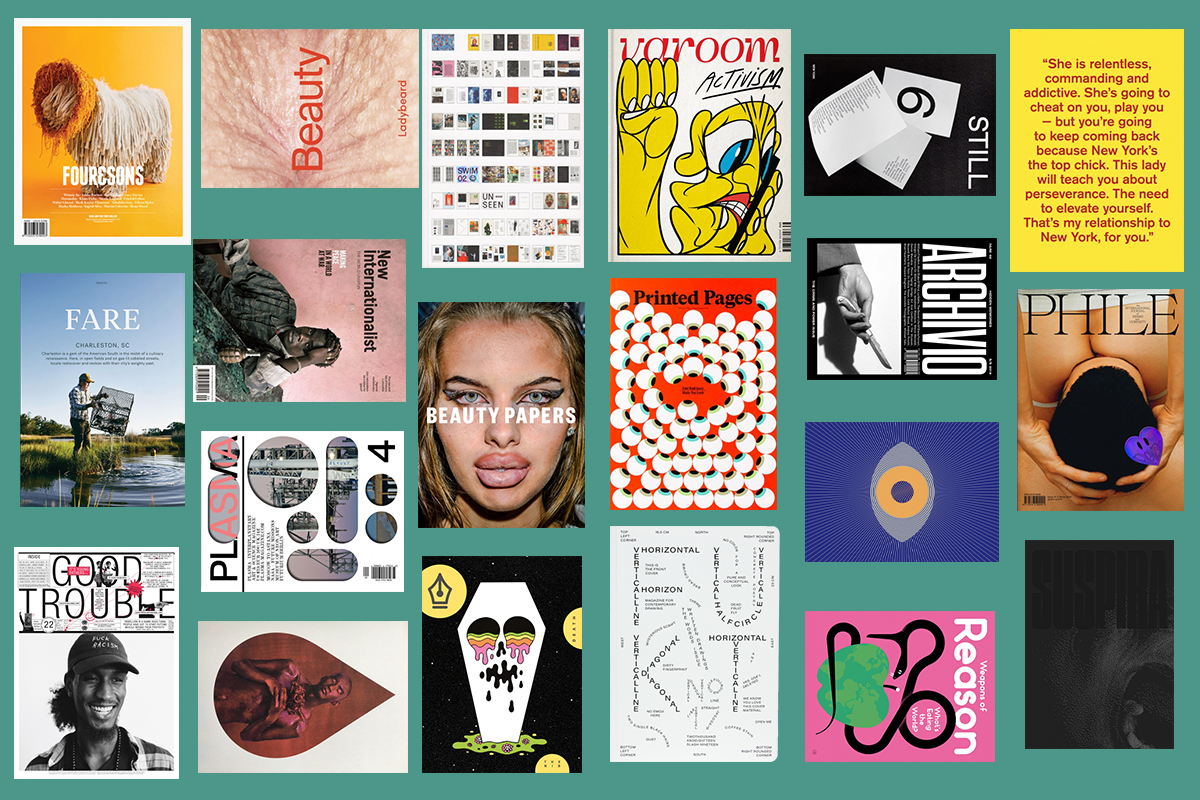
The point of a cover is to make people pick up a magazine, and this category at the Stack Awards wants to find the best, most inventive and enticing face of a publication. One of our judges, Jaap Biemans, has already shared this year’s most memorable covers for him from his site Coverjunkie, and we’re looking forward to hearing his verdict with co-judge Steven Heller.
Read on to see the 20 shortlisted covers in this hotly anticipated category…
Archivio | Turin
For their Crime and Power issue, Archivio poses a dramatic knife-in-hand shot next to the heavy typeface of the magazine’s name. You’ll find hidden memories from personal and institutional archives around the world inside this hefty volume.
Beauty Papers | London
Beauty Papers fills its oversized pages with stories to do with beauty, yet it exists in vehement opposition to the pseudo glamour and conformity that saturates the industry. Magnum street photographer Bruce Gilden walked 38.6km of the streets of New York, capturing close up portraits of people using a flash gun to produce ‘Faces’, the confronting, bare-all photo series inside this issue and on this cover.
Eye on Design | New York
The design brief for Eye on Design’s covers inspires imaginative outcomes through exacting constraints. Guest designer Shira Inbar had to include the eye-shaped logo, die-cutting, and a zero-text rule and came up with the hypnotic lines of this excellent cover.
Fare | Glasgow
Immersing itself in the food, community and history of a place, Fare magazine creates engrossing issues on overlooked cities around the world. For the cover of their Charleston, South Carolina edition, local Peter Frank Edwards captures the practice of crabbing in the region’s unique plough mud.
Four & Sons | Melbourne
Dogs + culture = a four-legged mop.
Fukt | Berlin
Fukt magazine always has some of the freshest designs we’ve ever seen. For this 17th edition, ‘Written Drawings — The Words Issue’, the team stripped the cover of all colour and imagery, using only type to show off their editorial dexterity.
Good Trouble | New York
Donning a cap that says ‘fuck racism’, Darian Agostini shines on this cover of Good Trouble. “In a city that’s made for elites and corporations, really poor people have been able to survive. And not only that, but resist, powerfully.” The founder of Make The Road NY, New York’s largest immigrant organisation, is photographed by Dan Martensen.
Ladybeard | London
What is beauty? This third issue of Ladybeard, a fresh, subversive feminist magazine, dissects what our culture finds ‘beautiful’, and after screaming arguments, this unmistakable bum hole, along with a pair of elderly lips, took pride of place as their strange, fleshy and illicit cover stars.
New Internationalist | Oxford
An unknown rebel fighter in Liberia stares out from New Internationalist’s relaunch issue. Does his expression elicit sympathy, or ambivalence? Do his eyes convey anger or guilt? How do we make peace in a world at war?
The Nib | New York
For the first print issue of The Nib, the website publishing comics journalism and graphic essays, the stories were themed around death. Oliver Hibert’s cover illustration melts icons of immortality into one colourful, weird and dynamic image.
Pan & The Dream | New York
The beauty issue of Pan & The Dream takes inspiration from Jean Cocteau’s 1946 film La Belle et La Bête (Beauty and the Beast). A photograph by Nick Knight, from his series ‘Skin Deep’, is cropped into a drop shape and layered with high-gloss to evoke blood, tears and human skin.
Phile | Toronto
Phile is fascinated by the nuances of sexuality, and all of the shame and stigma that comes with it. The cover, a photography by Zak Krevitt, makes an immediate bum-shaped impact on the viewer and also speaks to a delicate balance of power play, queerness, lust and intimacy, letting the reader know exactly what they’re in for.
Plasma | Berlin
Covering art, science and space exploration, Plasma provides an aestheticised look at conventionally nerdy subjects. This die-cut cover mirrors the round-edged windows of a spaceship, and gives passers-by a glimpse at the SpaceX rocket overleaf.
Printed Pages | London
Known for his many Trump covers for Time and Der Spiegel, Edel Rodriguez is used to communicating his political views with wit and clarity. It’s Nice That, the design journal and publisher of Printed Pages, enlisted his help to produce this eye-grabbing cover.
Suspira | London
Examining the horror genre through a feminist lens, Suspira dissects gory tales and macabre subjects with a sensitivity that it has not been granted in the past. Their launch cover takes inspiration from the poster of Dario Argento’s 1977 film, Suspiria, featuring a stippled graphic that seems ethereal at first glance, but reveals a face contorted into a scream.
Still | New York
Still’s cover for issue six takes a beautifully simple approach, presenting three pieces of printed paper arranged in a clean, minimal layout.
Swim | London
The latest issue of Swim comes wrapped in its own flatplan, giving readers a quick glimpse of what they’ll find inside and also playing into the issue’s theme of Unseen, making previously overlooked work immediately visible.
Varoom | London
Varoom’s yellow, bulge-eyed cover star is raising a fist in protest while quite literally glued to his smartphone. Published by the Association of Illustration, this issue focuses on activist works, and Bráulio Amado wryly depicts a fuming, twitter-obsessed, 21st-century protestor.
Weapons of Reason | London
What’s eating the world? Giacomo Bagnara’s cover illustration for the Food issue of Weapons of Reason is rife with symbols of corporate malice, its firm grip on the entire world, and humans’ never-ending appetite to consume everything the planet has to offer.
