“The cover is the playground for design”
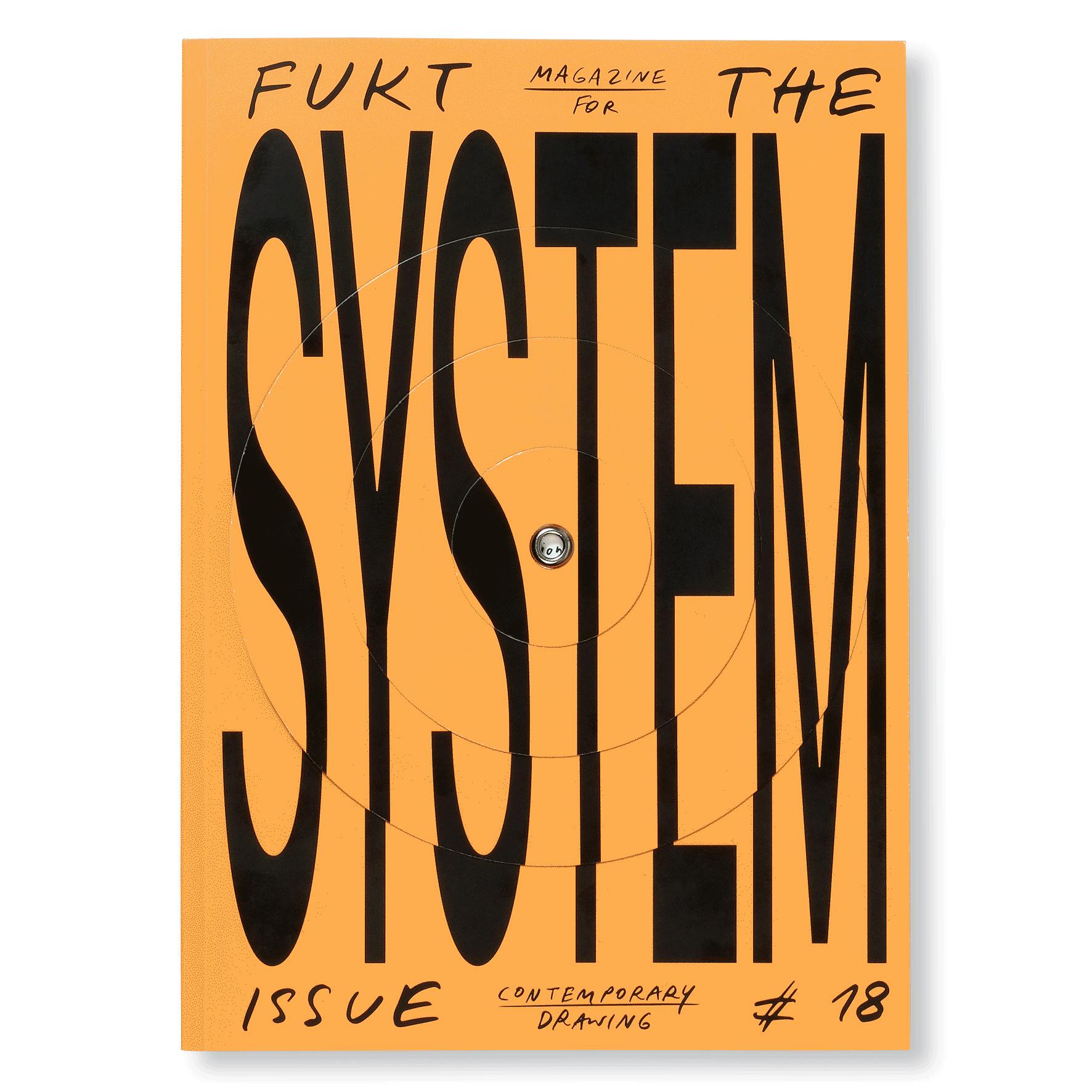
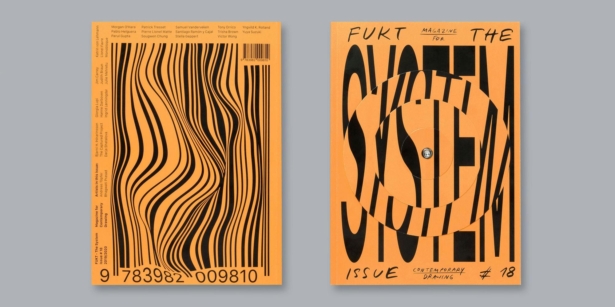
Ariane Spanier is the designer of Fukt, the magazine for contemporary drawing. She makes it it along with her partner Björn Hegardt, and it has become renowned for its fantastically creative, fun-loving covers. Their current issue won Cover of the Year at the Stack Awards last week, and Ariane dropped in at the office the day after the ceremony to speak about the process she went through in creating an eye-catching concept that embodies their take on the theme of systems. In case you haven’t already seen it, the cover is typographic, with the word ‘system’ written in large, clear lettering, but with three concentric discs that you can turn to either scramble or reveal the word. (See below for an animated explanation of that.)
In this conversation she explains why she’s attracted to such a playful design style, why she thinks it works so well for the cover of this magazine, and how this long-running title has changed over the 20 years it has been published. I hope you’ll enjoy this conversation with Ariane, and if you’re coming across our podcast for the first time, please do check our archives in Soundcloud or iTunes or wherever else you get your podcasts, and if you follow us while you’re there we’ll be able to deliver the next episode to you as soon as it’s ready.


