Gail Bichler on designing every issue “like it’s the last magazine on earth”
Gail Bichler is the design director of The New York Times Magazine where she and her team have won numerous awards for their print and interactive design. In 2019 they were named Design Team of the Year by the Art Directors Club, and Brand of the Year by the Society of Publication Designers. In addition, Gail’s work has been recognised by national and international design organisations including D&AD, the American Institute for Graphic Arts, the Type Directors Club and Creative Review.
The unveiling of the weekly magazine’s cover has become something of an international design event. One particularly memorable issue from 2015 included a feature on immigration. The team hired French artist JR to create an 150-foot-tall installation on Flatiron plaza in Manhattan. The installation — which was a huge photograph of an immigrant who had recently moved to New York, made up of 62 strips of paper — took 20 people to install, for 3.5 hours, starting at 4am. It was then photographed from a helicopter, showing pedestrians walking all over it, an extraordinary illustration of the ways migrants can be overlooked and unseen.
Gail is judging Art Director of the Year at the Stack Awards. As we begin the short-listing process, she told us what she’s looking for in a winner.
You’ve described the way you go about designing the New York Times Magazine: “We treat every issue as if it’s the last magazine on earth.” I love that description. Would you give the same advice to magazine-makers?
That was a compliment that Michael Bierut gave us when he and Jessica Helfand discussed the magazine on their podcast, The Observatory. I mentioned it in a talk because I loved it as a description of our ambition. The magazine covers a huge variety of subjects and the staff treats each story as an opportunity to parachute ourselves into a given topic and enthusiastically explore it. On the design side of things, we try to pull out all the stops. And we do it because we love making magazines and we want to do it at a really high level. So, I would give the same advice to other magazine makers. I realise pulling out all the stops means different things in different situations, but the point is, always make the best thing you can within the timeframe that you have and within the budget that you have. It’s about craft and customising your approach to the story being told.
What do you look for in a magazine’s design: is there anything that immediately stands out to you when picking something up?
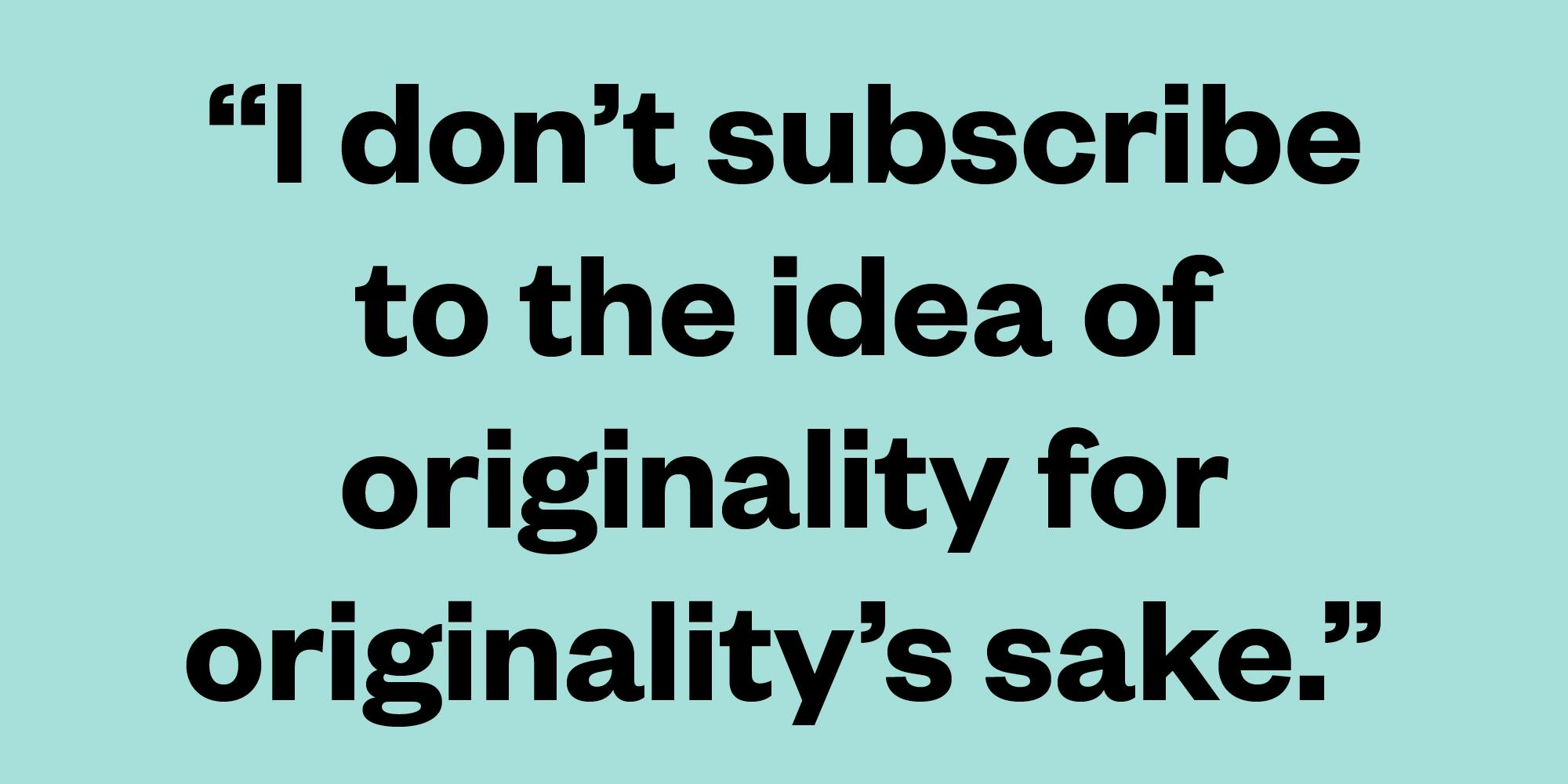
I like things that are bold, idea driven and communicate directly. With so many magazines looking the same, an original vision really stands out. But I don’t subscribe to the idea of originality for originality’s sake. It has to be driven by the content.
Is there a magazine in your life that you particularly love, or which has had an influence on you?
Unsurprisingly, The New York Times Magazine is the magazine I love most. There are very few publications with such a wide-ranging and ambitious journalistic mission where the design plays such an important role in the way stories are communicated. It’s a unique mix. I feel incredibly lucky to be part of the team there.
Entries are now closed for the 2019 Stack Awards. Shortlists coming soon.


