Interview with Chris Ng, director of IdN

We caught up with Chris Ng, director of IdN, to speak about the battle between design and editorial on arguably the world’s greatest graphic design magazine. Read on and you’ll see that the editors might be outnumbered, but they do manage to get their way at least some of the time.
I read somewhere that the magazine started as a way for a printer to show what they could do. Is that true?
It actually started as more of an industry news update. It didn’t really start out as a graphic design magazine – it started more to showcase what the printers could do back then, or what desktop publishing could do back then. Then when desktop publishing moved to more of a graphical base, so too did the magazine.
One of the most obvious things about the magazine is that it’s very unconventional, for example with the cover lines that contain so much information. What’s the philosophy of the magazine?
I guess we started from a printing background. Our publisher started from a printing background and he loves experimenting with what offset printing can do, and the magazine is really a way to show designers these days what is possible and what is not.
So how about the cover lines? On your covers they’re in much smaller type and they’re much more detailed than in most magazines. Does that go hand in hand with your effort to show what magazines can do, or is that a separate issue?
I think it’s a separate issue. The problem with IdN is that a lot of places that sell it really cover it up, like it’s not allowed to be flipped through due to the quality of it and the pricing of it I guess. So it’s a way for us to really tell people what’s going on inside.
When you say they cover it up, what do you mean?
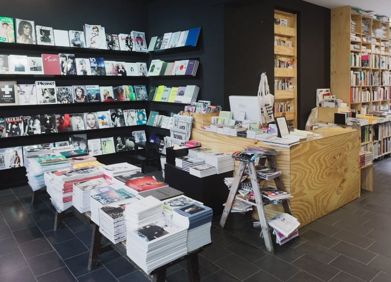
The bookshops often don’t allow people to flick through the magazine and this has been a scenario for us for many years now.
That’s incredible, especially because your magazine really rewards somebody who wants to flick through – it’s so packed with information.
In certain areas in bookshops they seal it off – they wrap it up in a plastic seal and if you want it you buy it with the plastic seal and go home and open it.
When I read a magazine I tend to really read it – I start at the first page and read everything on it and then the next. But IdN makes it more difficult to do that, I think because the text is quite small and the pages are quite busy, and I found that a much more natural way to read it is to flick through, and then your eye finds an image that you like and so you read more about that.
That’s right – our editors and art directors have a constant fight every day about this, and I guess our art directors always win! Everybody from IdN, including the editors and the marketing people, are from a design background, and we appreciate these kind of things. Actually it was maybe three years ago, the magazines did not have any text on the cover page. Not even title, nothing. It was just a plain graphic with IdN on it.
What made you change that?
Well it’s the fight between editors and art directors, and I guess the editors won for once and it just kept on!
The Q&As ask a lot of the same questions, and the answers given can also tend to be quite similar, so it felt to me that sometimes the words were almost secondary to the images.
We try not to be, honestly. We really try not to be. We only have two editors and we have three designers, so I guess the balance is more geared towards the graphical elements, but we are making progress towards making our editorial a little more meaningful. At the moment, yes we have criticisms about the Q&As, about the repetitiveness, at the moment it’s a way to let our readers really feel what the designers featured are up to. We are moving towards having cut down editorial pieces.
What do you mean cut down?
As in criticisms or third party perspectives talking about the thing – more than just the Q&As.
Is this the first time you’ve done a typography issue? Because it seems like you’ve been going so long you must have done typography before.
Yes – I believe so. I know so! It was quite a long time now – maybe three or four years ago – but there are certain themes and topics that are bound to overlap, such as fashion graphics or colours, and type is such a huge thing for designers, and we try not to repeat too often, but every once in a while it’s something you have to do.
Of course – that makes sense. How do you settle on what you’re going to do for an issue then? How do you find your themes?
Our editors sift through a lot of submissions basically. We get thousands of submissions every month on various topics, so we really look at what’s interesting, or what’s the hot trend that’s happening internationally. For example in 2007 we saw that there was a whole lot of black and white stuff coming up the following year, so it was obvious that our magazine needed to have a collection on that to explain what the heck’s going on. So we look for trends like that.
So whereas other magazines will be pitched by freelance journalists for you it’s much more direct and it’s the designers themselves who are putting themselves forward?
Yes, so partly we have people submitting editorial stories, but we have thousands of people submitting what they paint or what they design or so on.
The magazine is so dense and you have all these incredible inks and paper stocks and print processes, but there’s no advertising in there – how do you do it? How do you make it work financially?
We sell subscriptions and we sell through bookshops.
So the magazine literally pays for itself on the cover price?
Yeah. We don’t have a marketing person in house to sell advertising. We’d love some of course, but we just haven’t been looking I guess, or we’re not that good at looking for them. I remember Mike asked me the same question at Colophon, and it was the same answer, you know? We love them! Please give us some if you have them!
So what have you got coming up next?
Our 15th anniversary edition is coming out. We’ve spent too much time on this – it’s almost our 18th anniversary right now.
So you’ve not done your 15th anniversary yet, but your 18th is coming up?
In actual fact it’s our 18th anniversary this year, but our 15th anniversary is coming out at the end of this year. We’re almost finished now – the book is in production and that’s the big thing we’re doing this year.
So that’s going to be one of the books you produce rather than the magazine?
Yes. It’s our biggest book – over 450 pages.
And that’s going to contain the best stuff you’ve done over the last 15 years?
More like a collection of our collaborators over the last 15 years and showing the remarkable stuff that they’ve done. And tailor made stuff for us as well. So it’s really trying to have a collection out there that represents what our generation of creative workforce is about.
Can you summarise what that is?
I would say it’s about the ability to adapt, because our generation at the moment is bombarded with a lot of changes about the way we work, the way that technology is helping us (or not helping us) in the way we work, so all of that is changing the way we work. I guess the difference between this generation and the last generation is our ability to adapt, and people now are always changing to make things happen.
