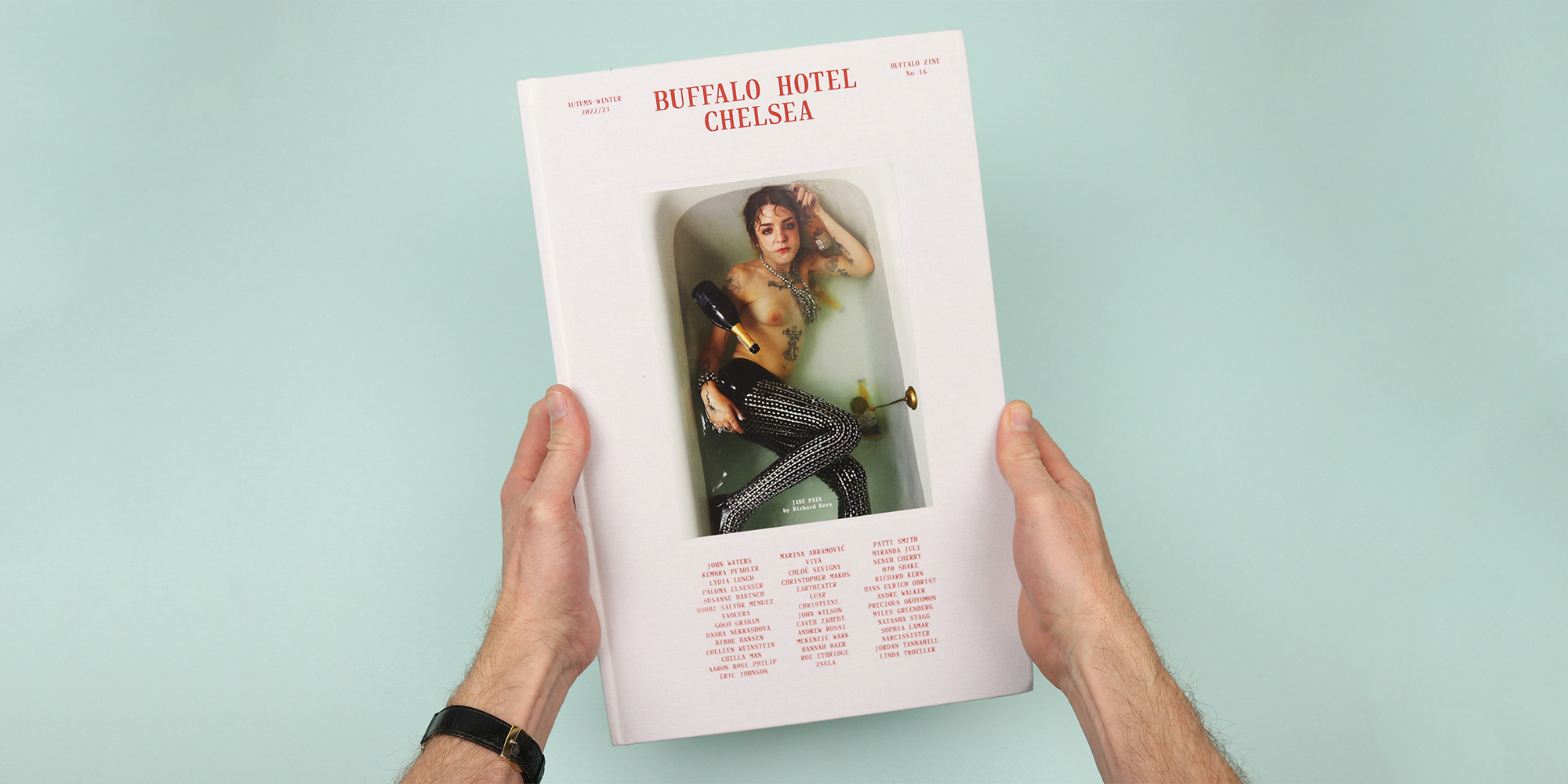
Controlled chaos in Buffalo Hotel Chelsea
In 2017, Buffalo Zine published an issue shot entirely in its east London office. My copy has got Pamela Anderson on the cover, with the building’s security guy / receptionist loitering in the background, and stories in the issue dig deep into the history of Hackney and the people and businesses that built the area before the cool kids arrived. (And of course it features lots of the cool kids too.)
Shooting everything in and around an unlovely office in a grim bit of London was a brilliant way for Buffalo Zine to pull back the curtain on the fashion world and show exactly who they are and where they’re from. They’re repeating the trick of shooting everything in one building in the current issue, but this time they’re not interested in reflecting on themselves; rather the magazine is devoted to the people, the legends, and architectural details that make the building itself.
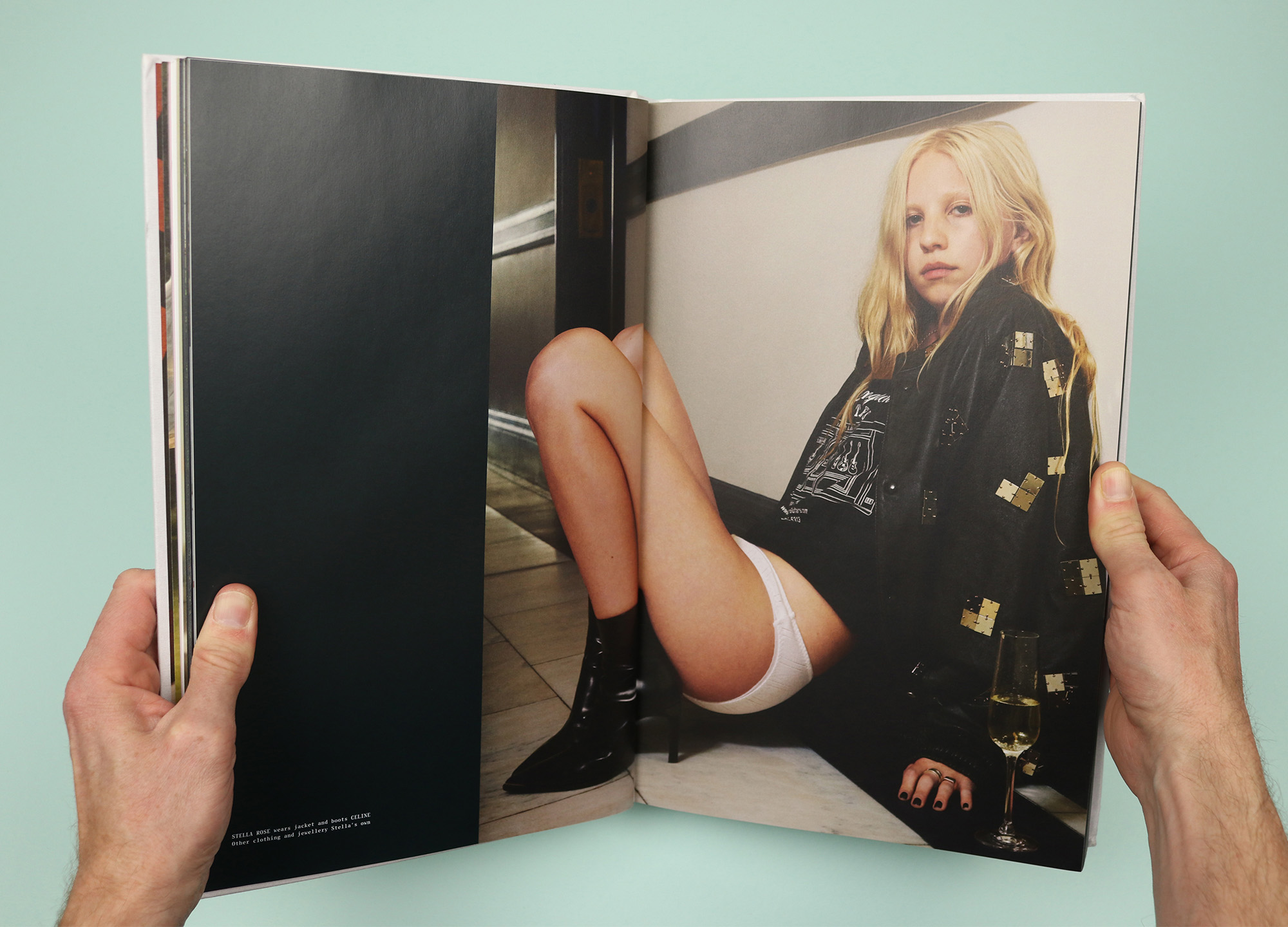
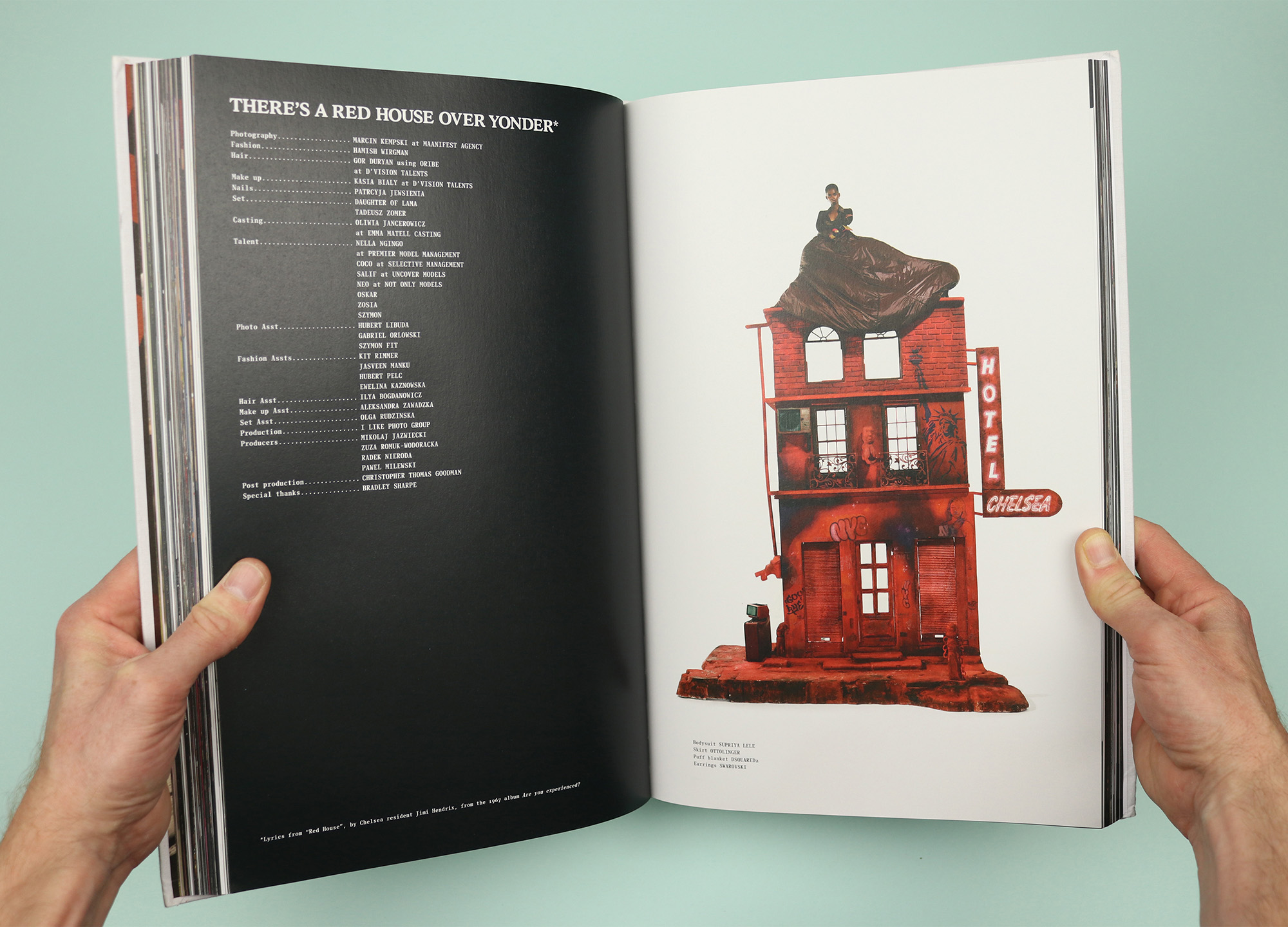
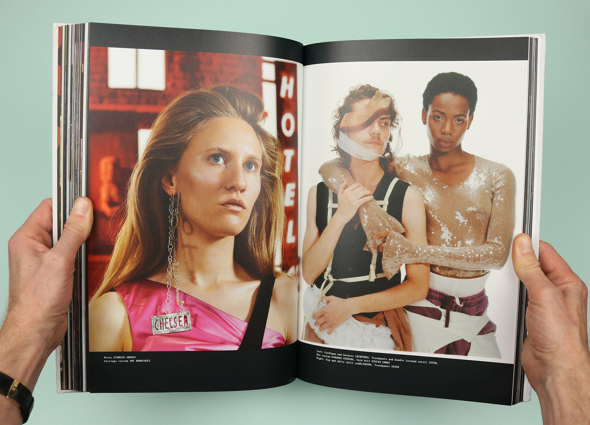
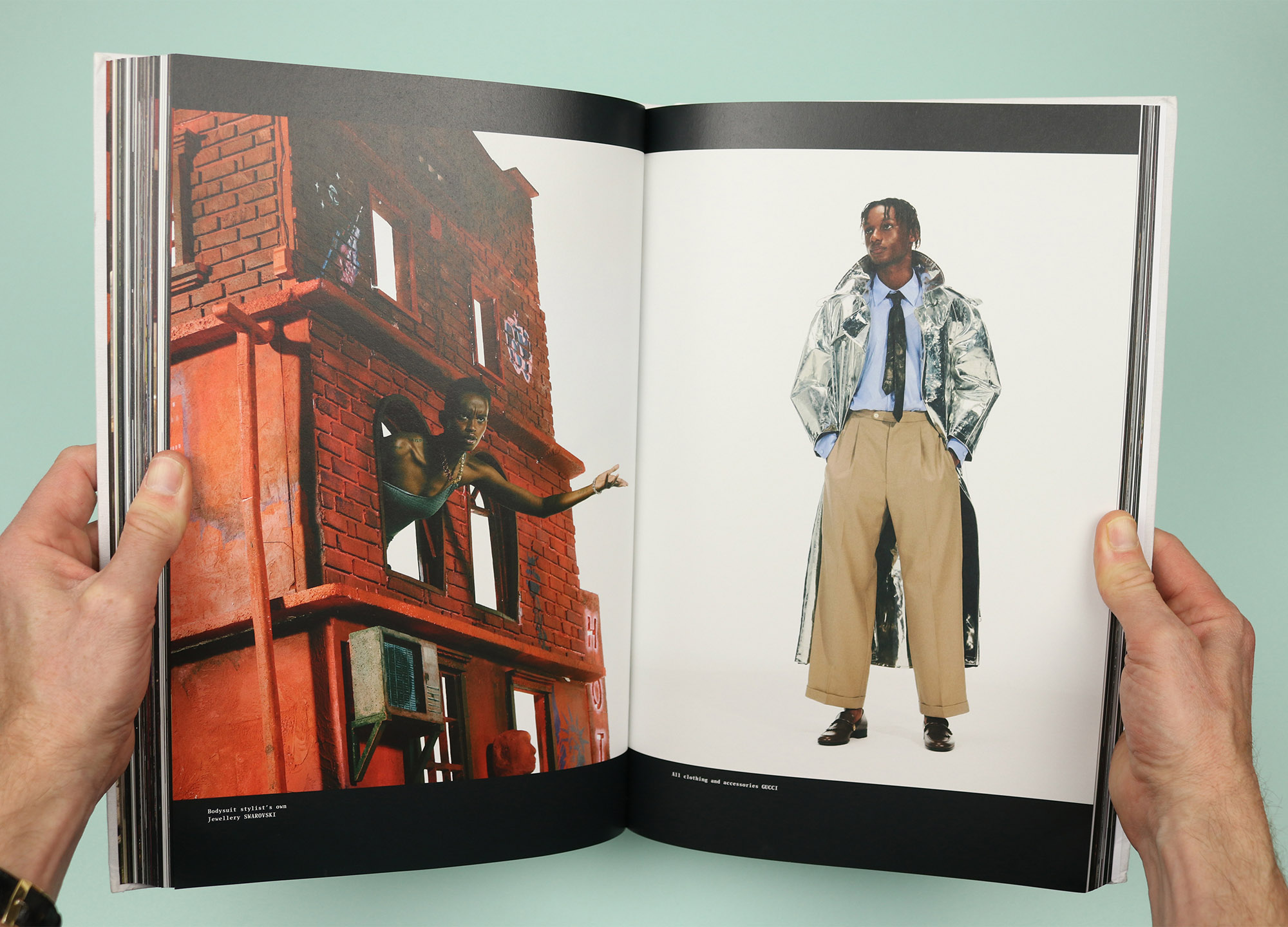
Hotel Chelsea in New York had been closed for 15 years due to controversial renovations, so the team moved in for three weeks last summer, as the scaffolding was removed and the legendary site was reborn as a luxury hotel. We’re told early on that, “It’s always represented some other era, when a scene was truly concentrated to one address, where tortured creative types could crash into each other every day; a hell and a paradise.” And that seems to be the guiding principle for the magazine, as a parade of New York artists and models are plastered across the pages, one story running into the next, a fashion shoot bumping into a photo of a long-term resident’s apartment, leading into a conversation between two artist friends. It’s carefully chaotic, explicitly aware that it’s impossible to ever really capture a ‘scene’ as it happens, and instead leaning into the fun that comes from placing a new generation of artists within the hallowed / haunted walls.
There’s a huge amount to enjoy within the big, hardback covers, but I’ve picked a few highlights to give a sense of how they’ve distilled an essence of the hotel and rendered it in print, so the reader can feel like a guest, wandering from room to room and stumbling across the hotel’s current denizens. Or as editor-in-chief Adrian González-Cohen says in his opening letter: “Buildings are not dead or alive, but people give them life. Thank you for coming, hanging out in the lobby, spending the night, eating paellas at Quijote and drinking tequilas at the bar.”
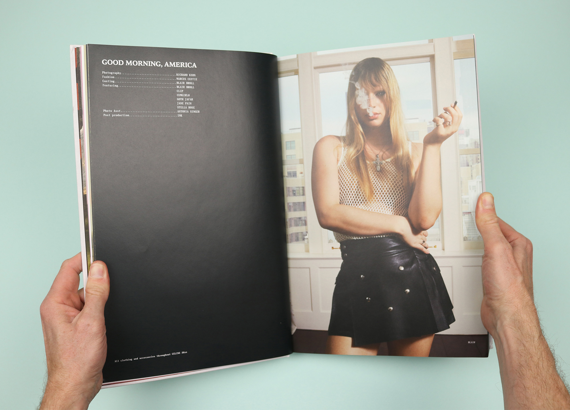
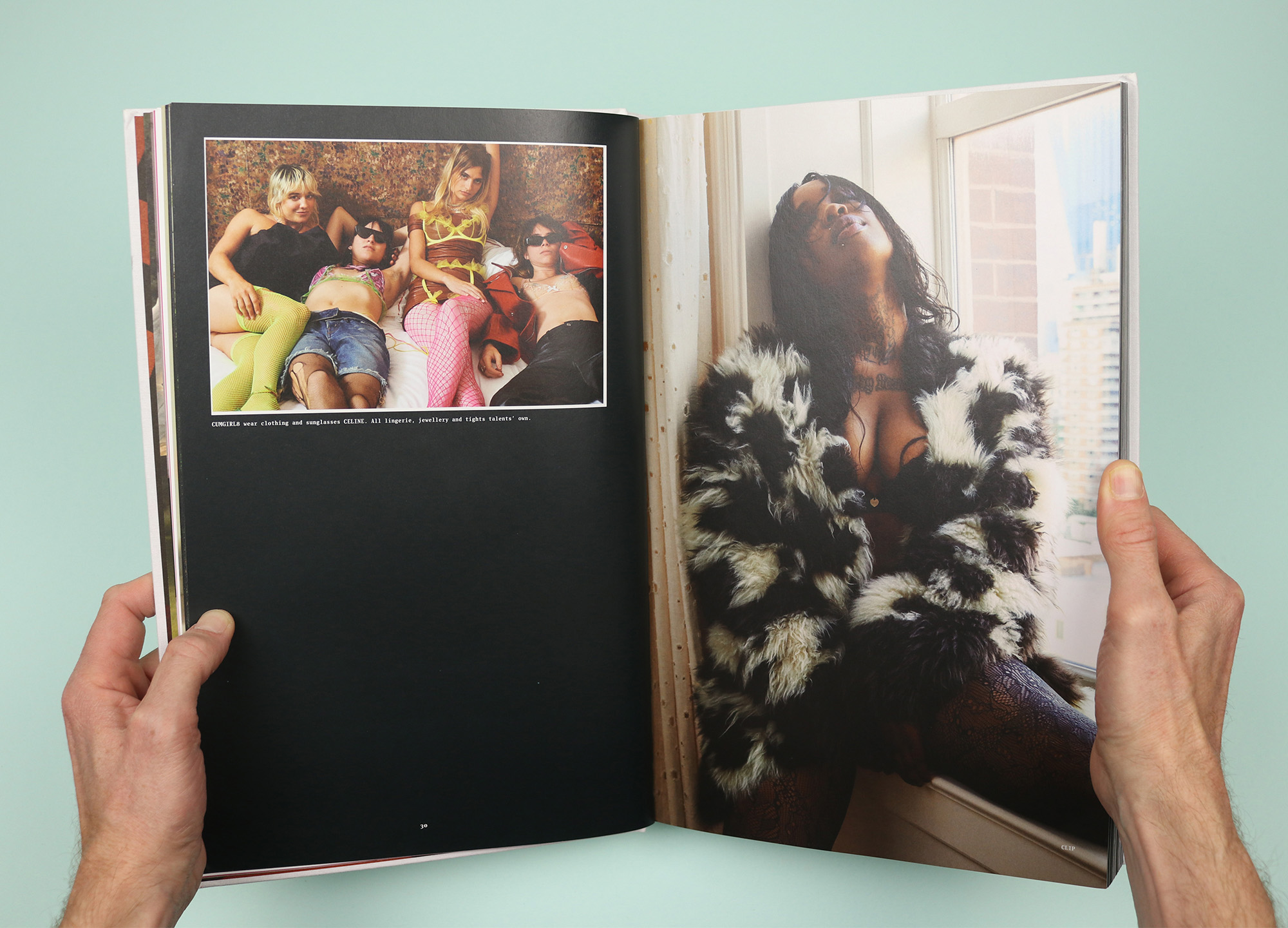
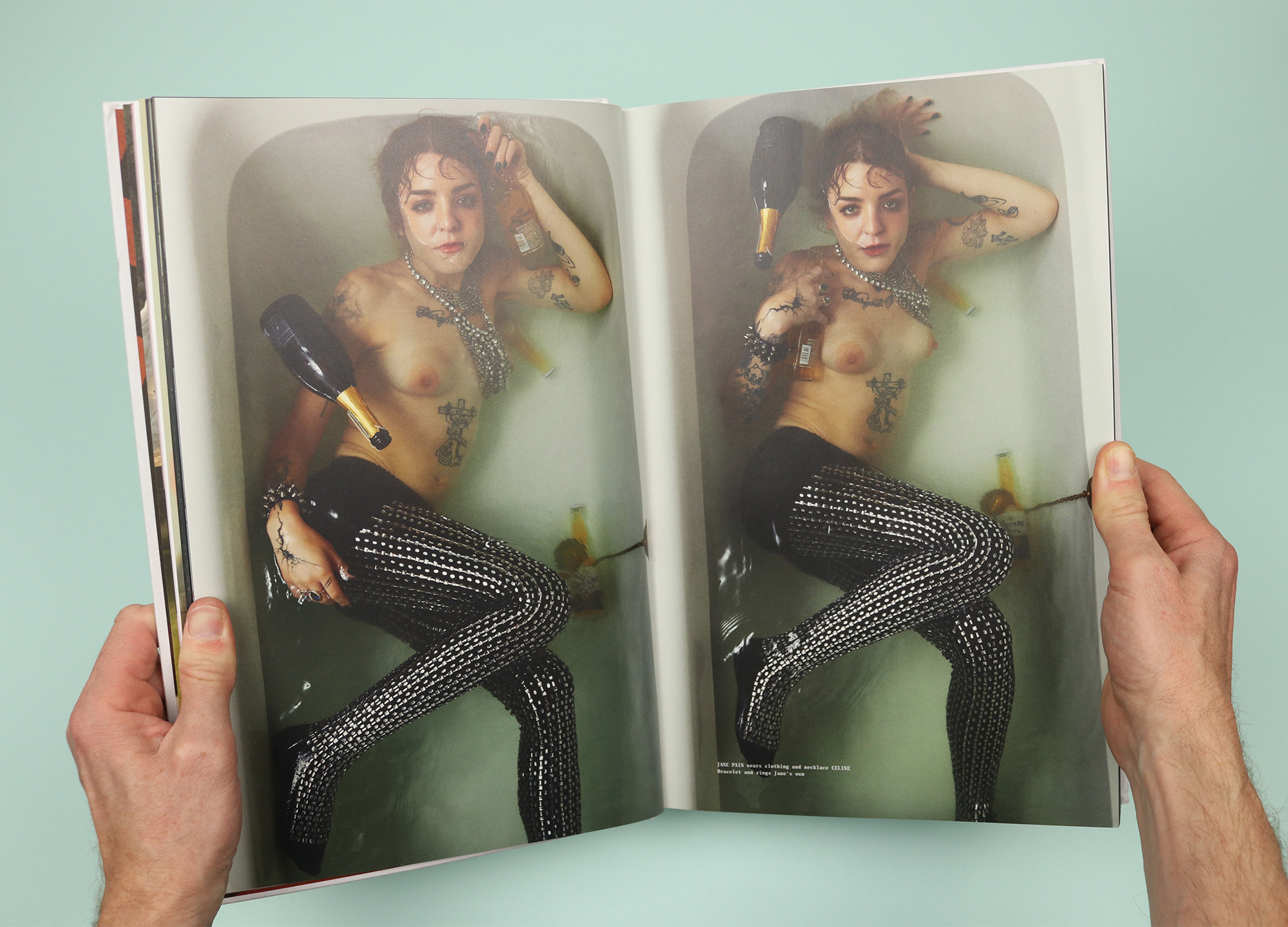
The first shoot, Good Morning, America, is shot by Richard Kern and it’s a classic rock ‘n’ roll party in a hotel room. It’s light, so there’s a sense that this is the morning after the night before, but everyone is still going strong, photographed in Kern’s signature style.
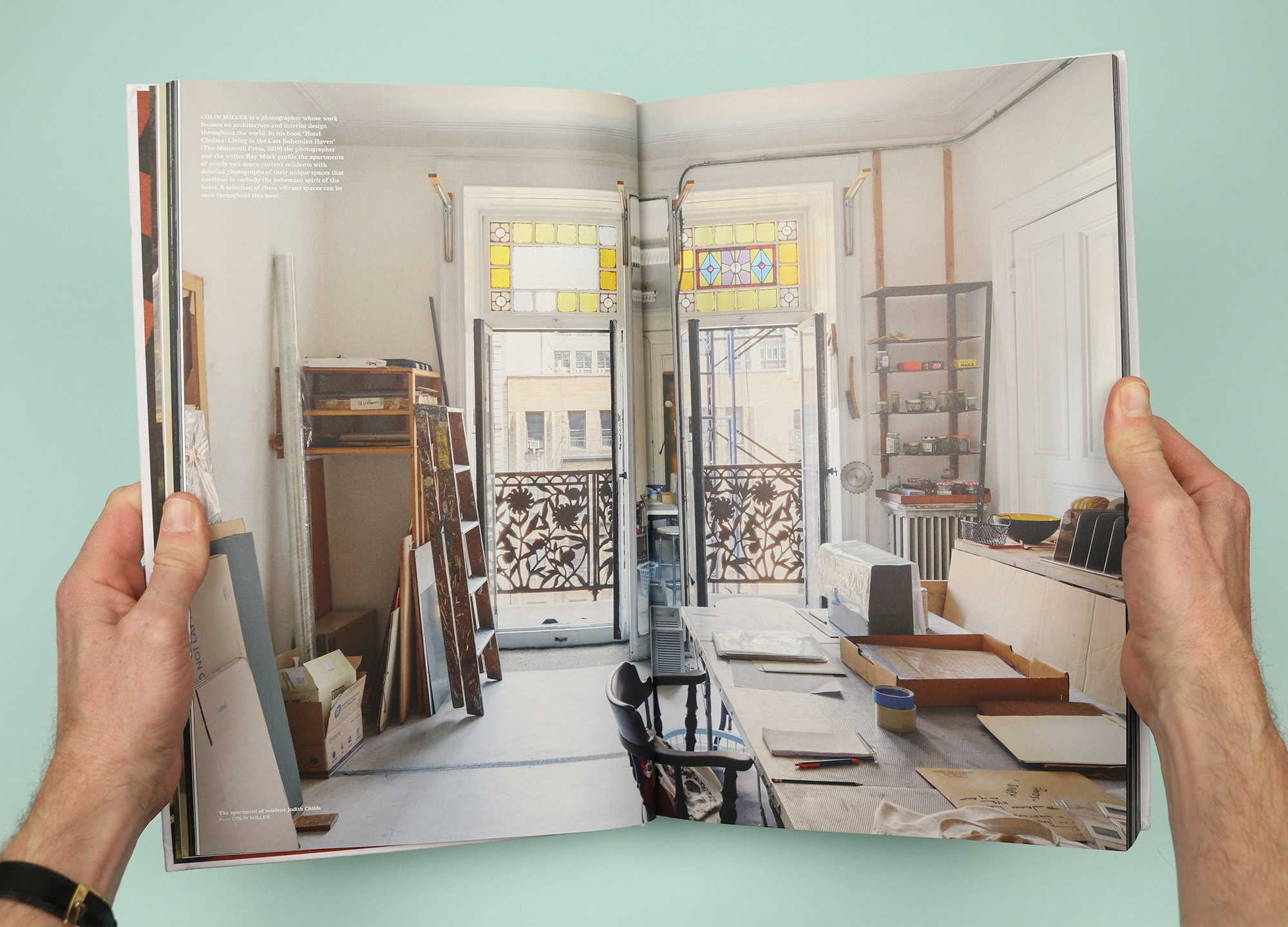
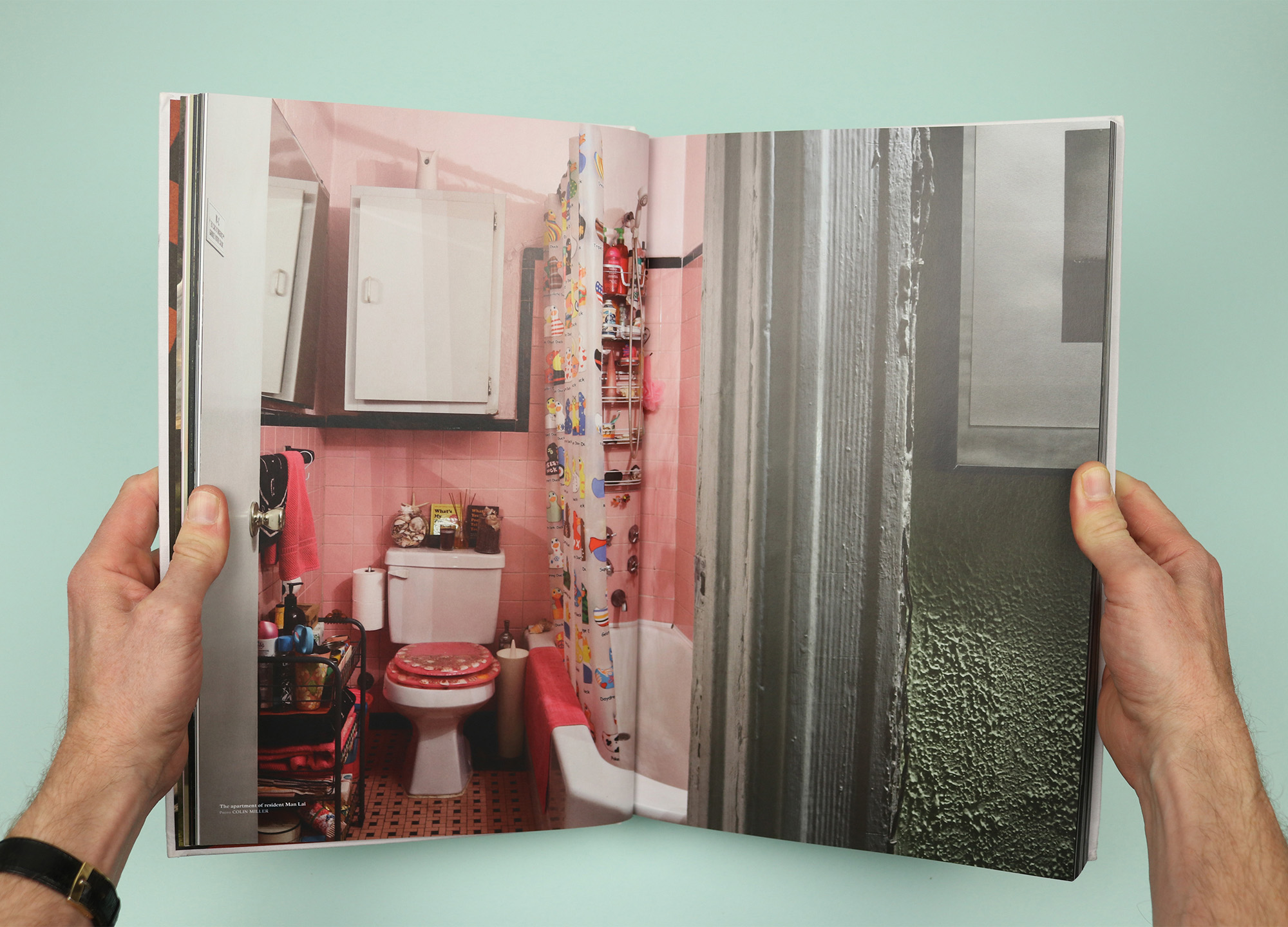
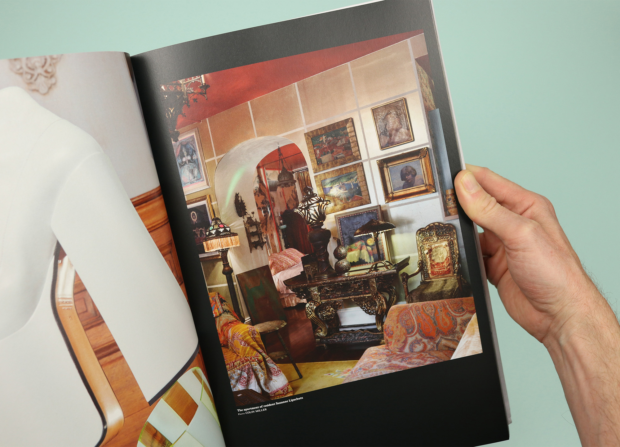
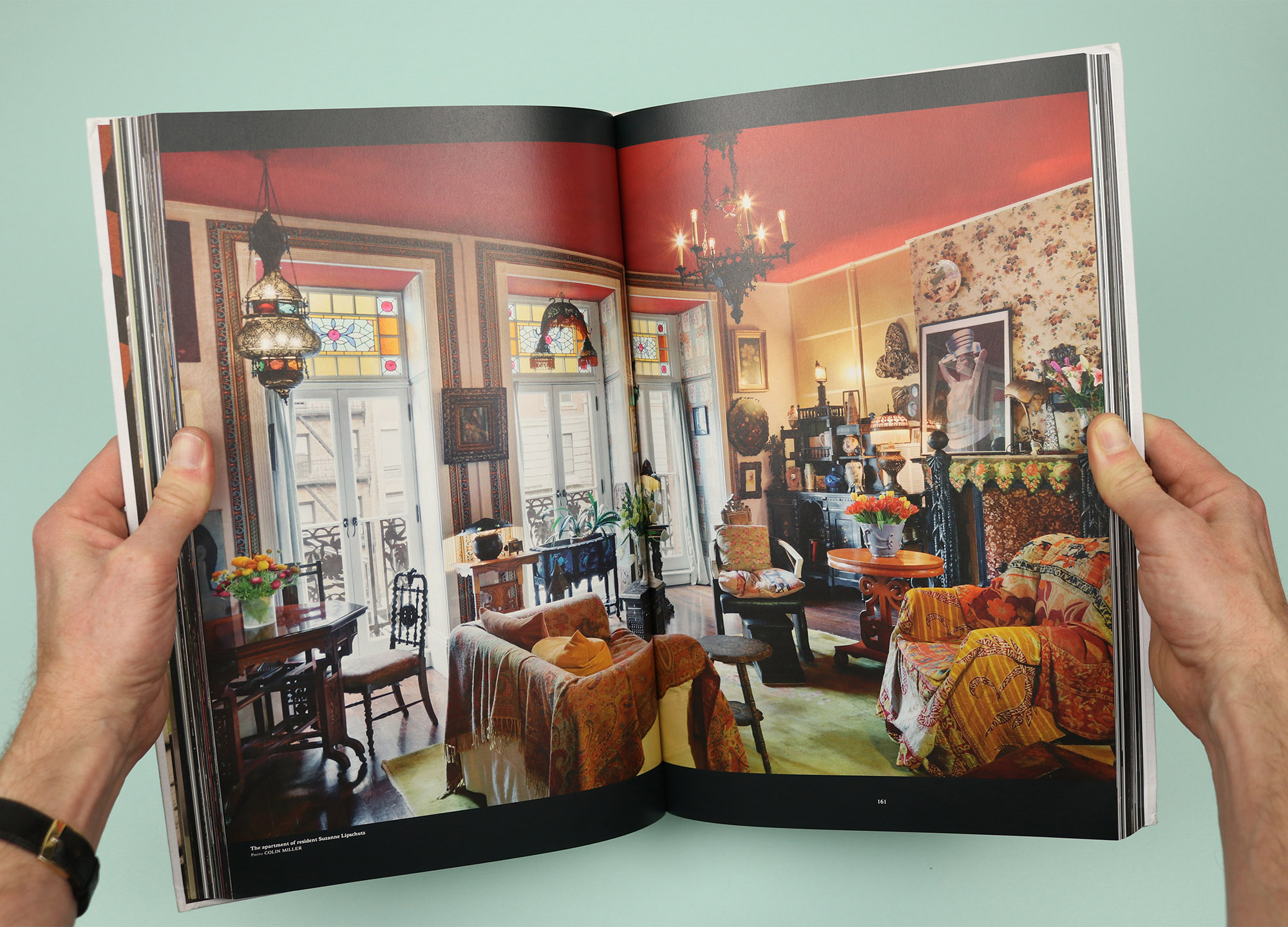
The hotel has long-term residents who stayed put during more than a decade of renovation work, and pictures of their apartments are dotted through the issue, taken from Colin Miller’s book Hotel Chelsea: Living in the Last Bohemian Haven.
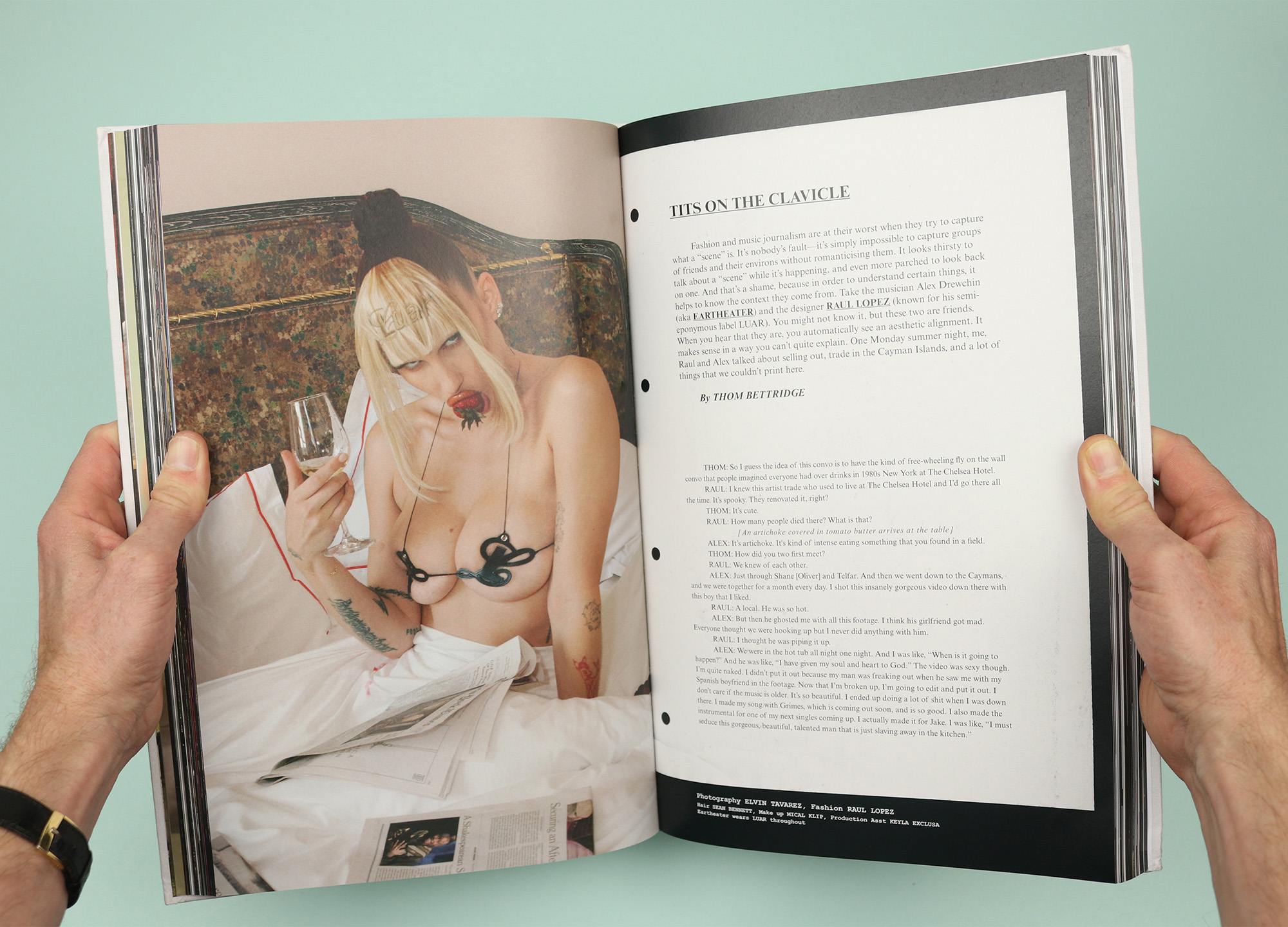
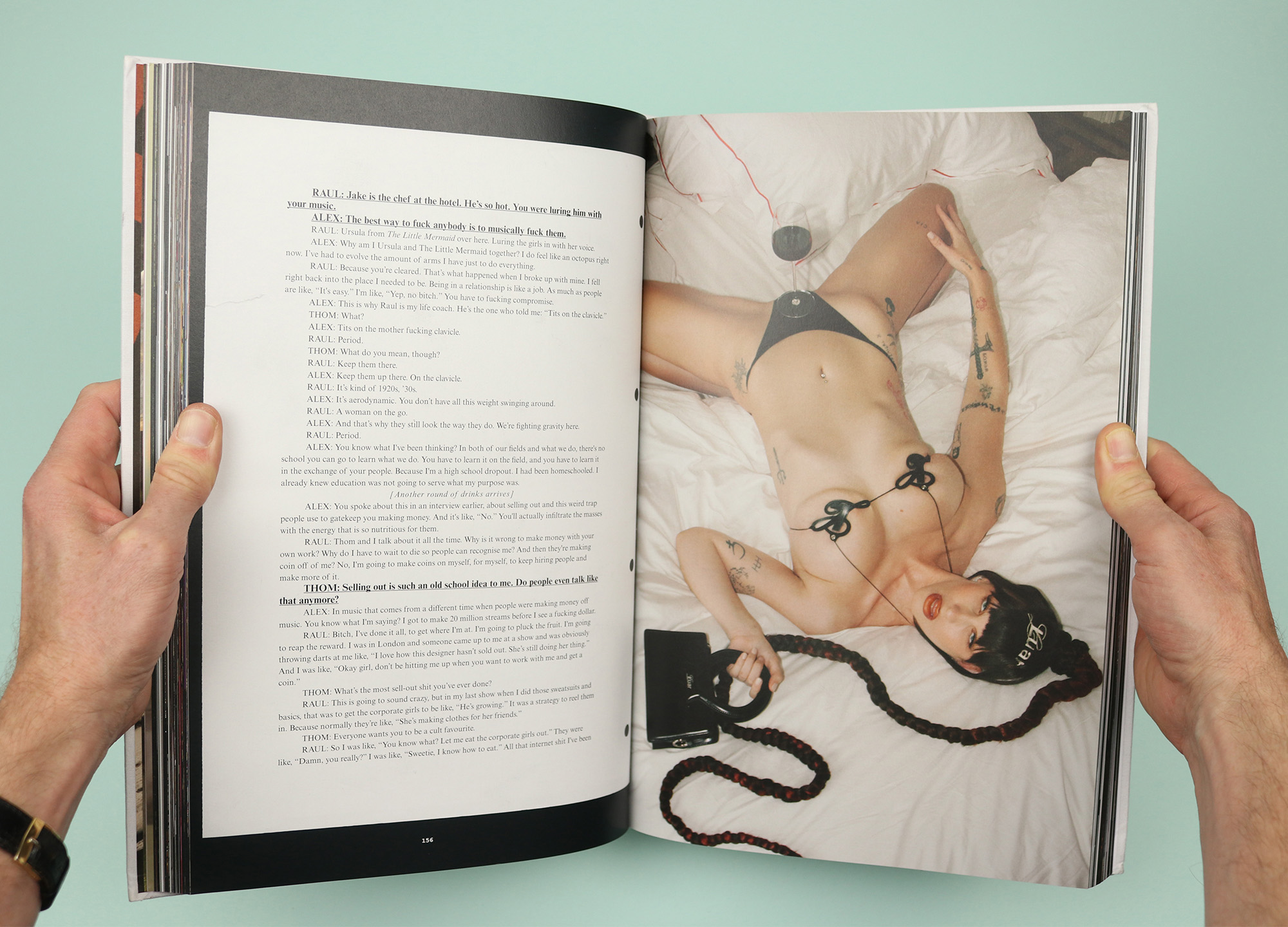
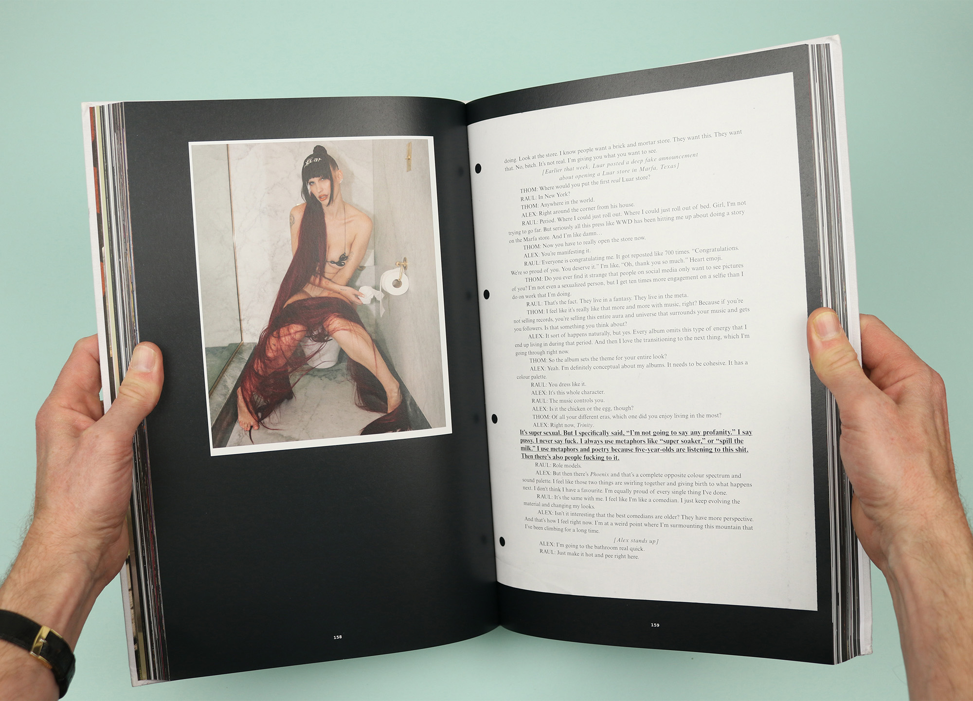
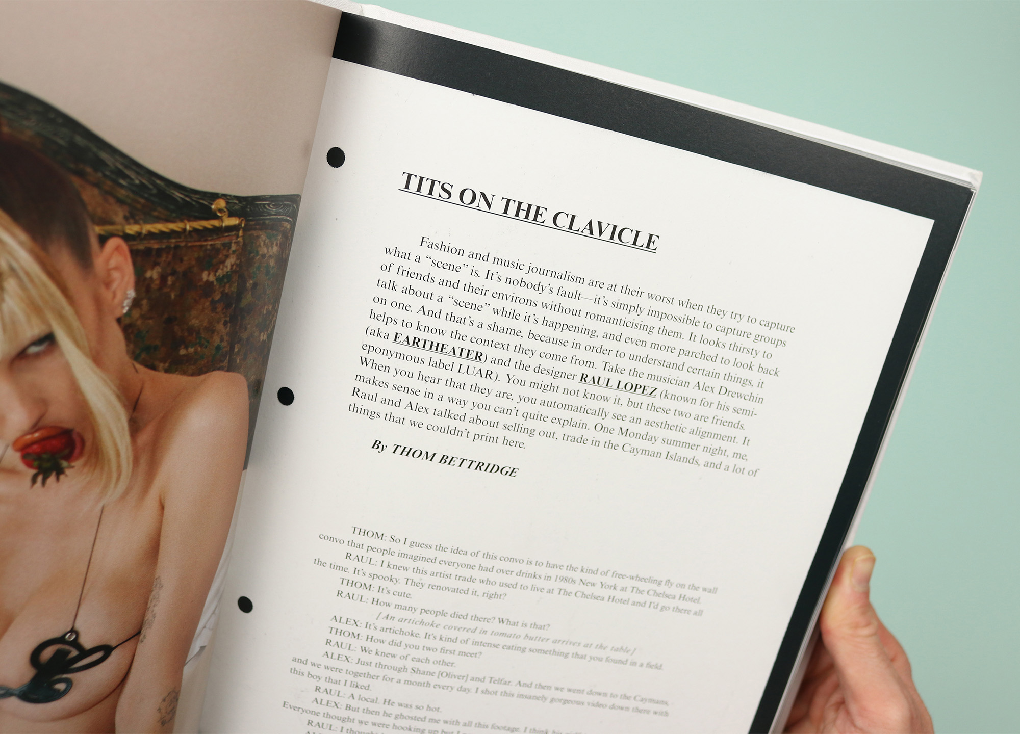
I loved this piece by Thom Bettridge. “Fashion and music journalism are at their worst when they try to capture what a ‘scene’ is. It’s nobody’s fault – it’s simply impossible to capture groups of friends and their environs without romanticising them. It looks thirsty to talk about a ‘scene’ while it’s happening, and even more parched to look back on one.” The conversation that follows, between musician Alex Drewchin (Eartheater), designer Raul Lopez and Thom is definitely not romanticised.
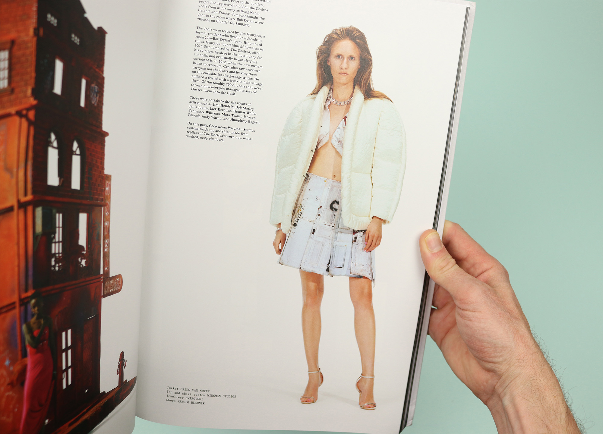
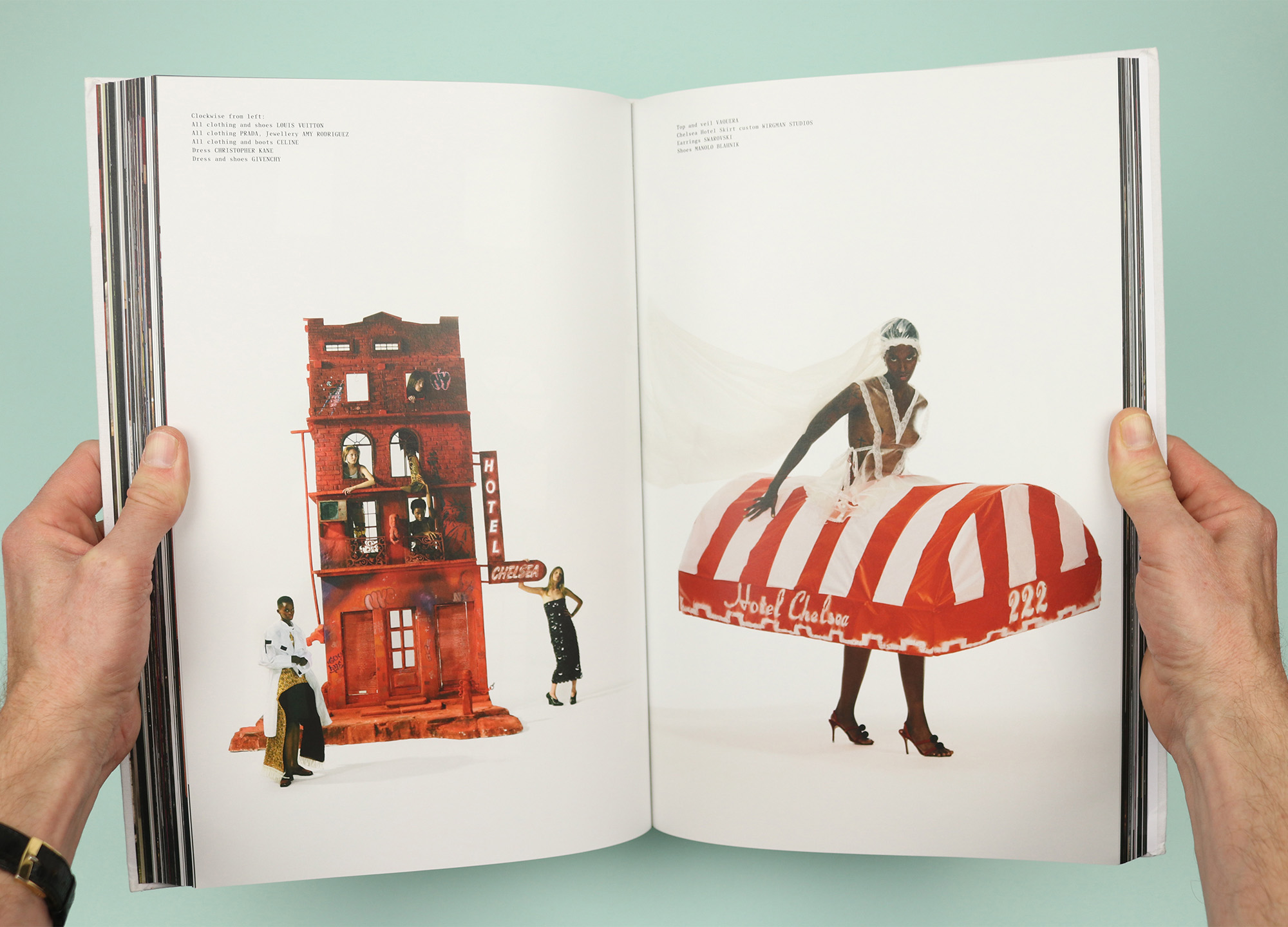
And in one of the stranger shoots, the hotel itself becomes part of the fashion, with clothes inspired by details like the hotel’s old whitewashed doors, and even the awning above the front door.
