Music magazines redesign
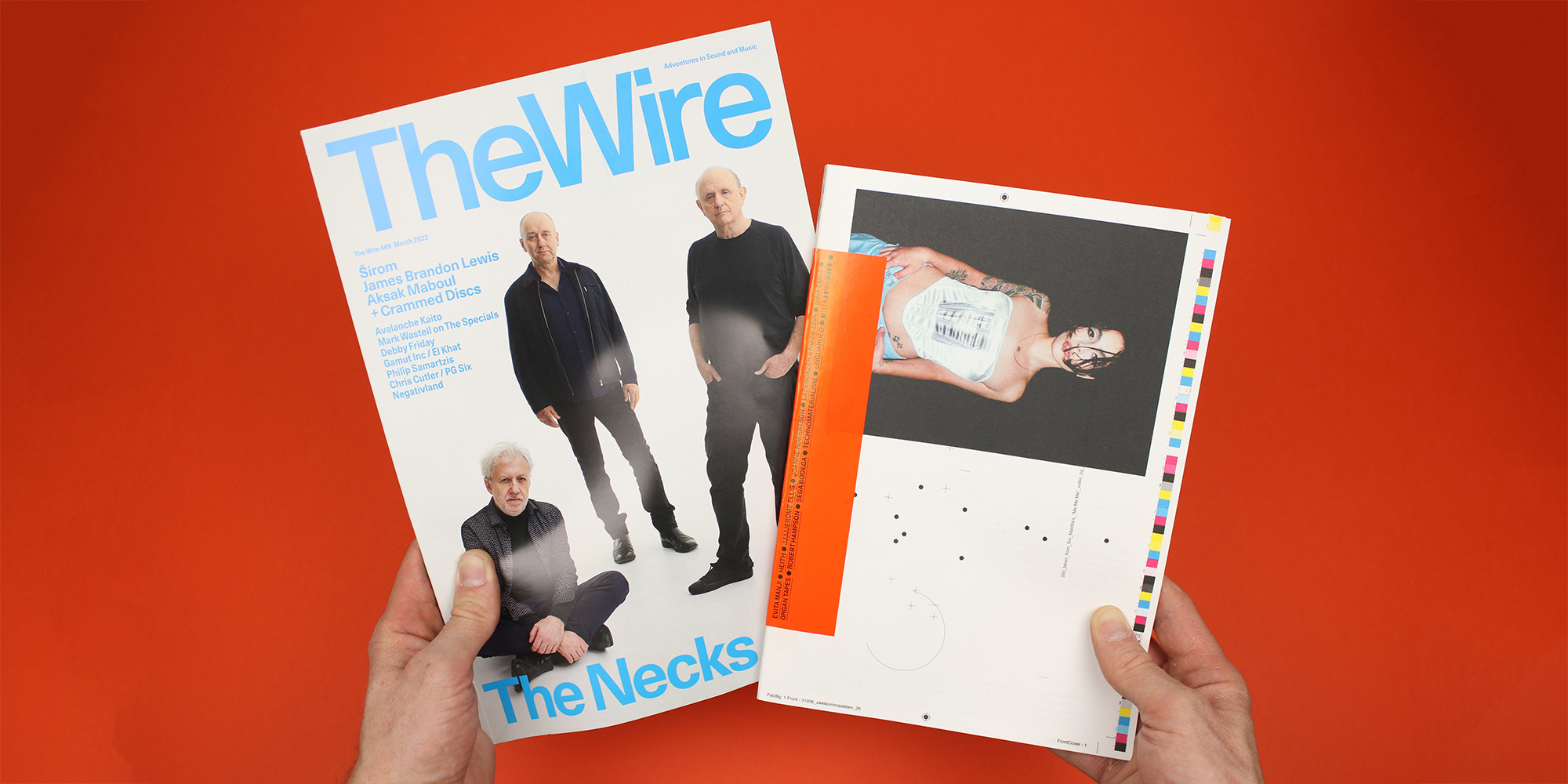
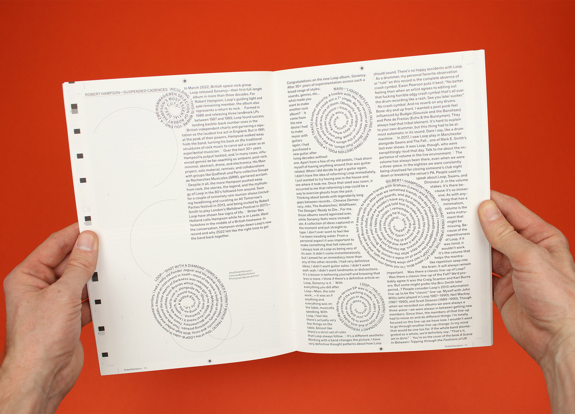
Typical, isn’t it? You wait ages for one independent music magazine redesign, and then two come along at once. Zweikommasieben and The Wire both unveiled new designs recently, both reimagining the ways they cover music from outside the mainstream, and both speaking volumes about themselves in the process.
It’s worth noting that they both also shrank along the way, and there’s probably nothing very surprising about that – paper has become much more expensive over the last couple of years, along with virtually everything else. And it’s notoriously hard to make music journalism pay, so it makes sense that they might take this opportunity to economise. There’s a strong environmental motivation that often goes hand in hand with the financial imperative – using less paper helps to make a magazine more environmentally sustainable as well as more financially sustainable – so I think it’s significant that in speaking about the redesigns, both magazines focus on money, rather than the planet.
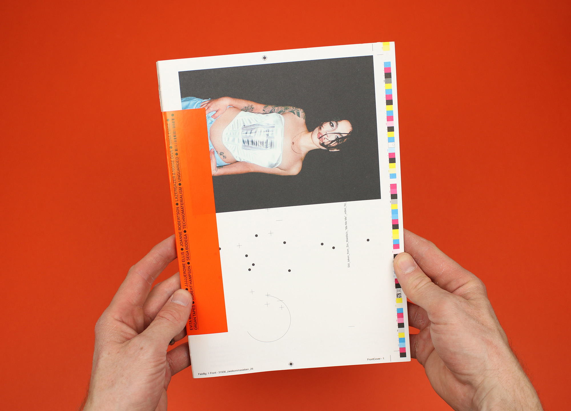
For Zweikommasieben, the situation seems particularly precarious and the response existential: “With continuously rising costs for resources and a global recession looming, the act of publishing in print becomes an economically even more questionable venture that’s prohibitive by design… In an attempt to explore options beyond a black-and-white scenario of continuing and discontinuing, we’ve placed ourselves in a grey zone.”
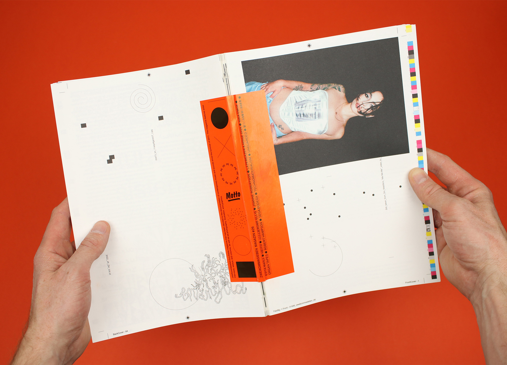
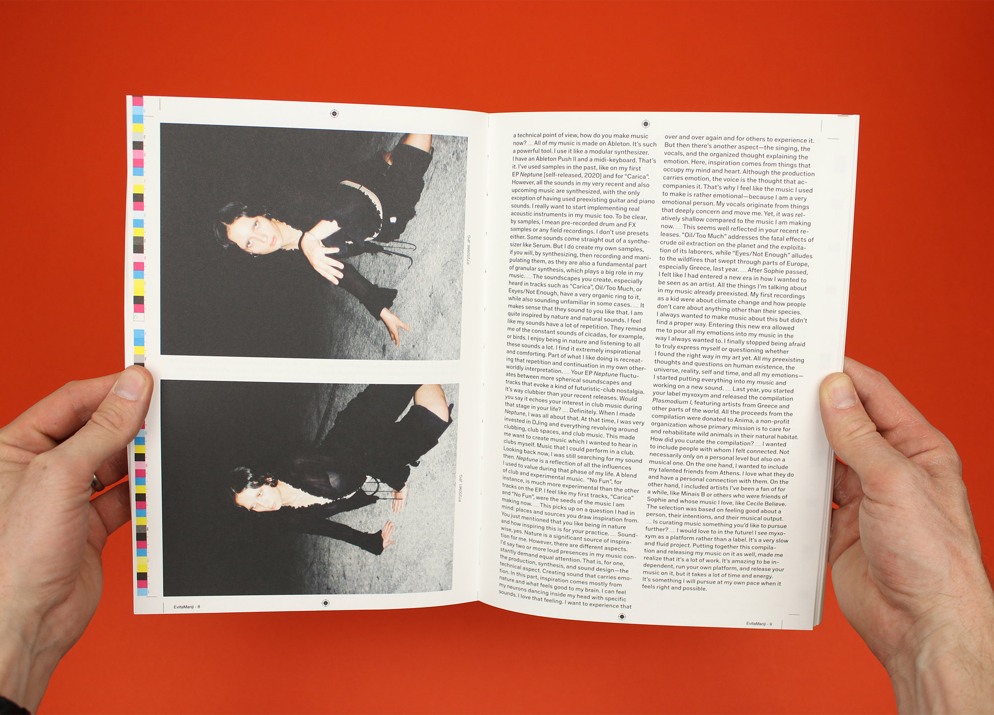
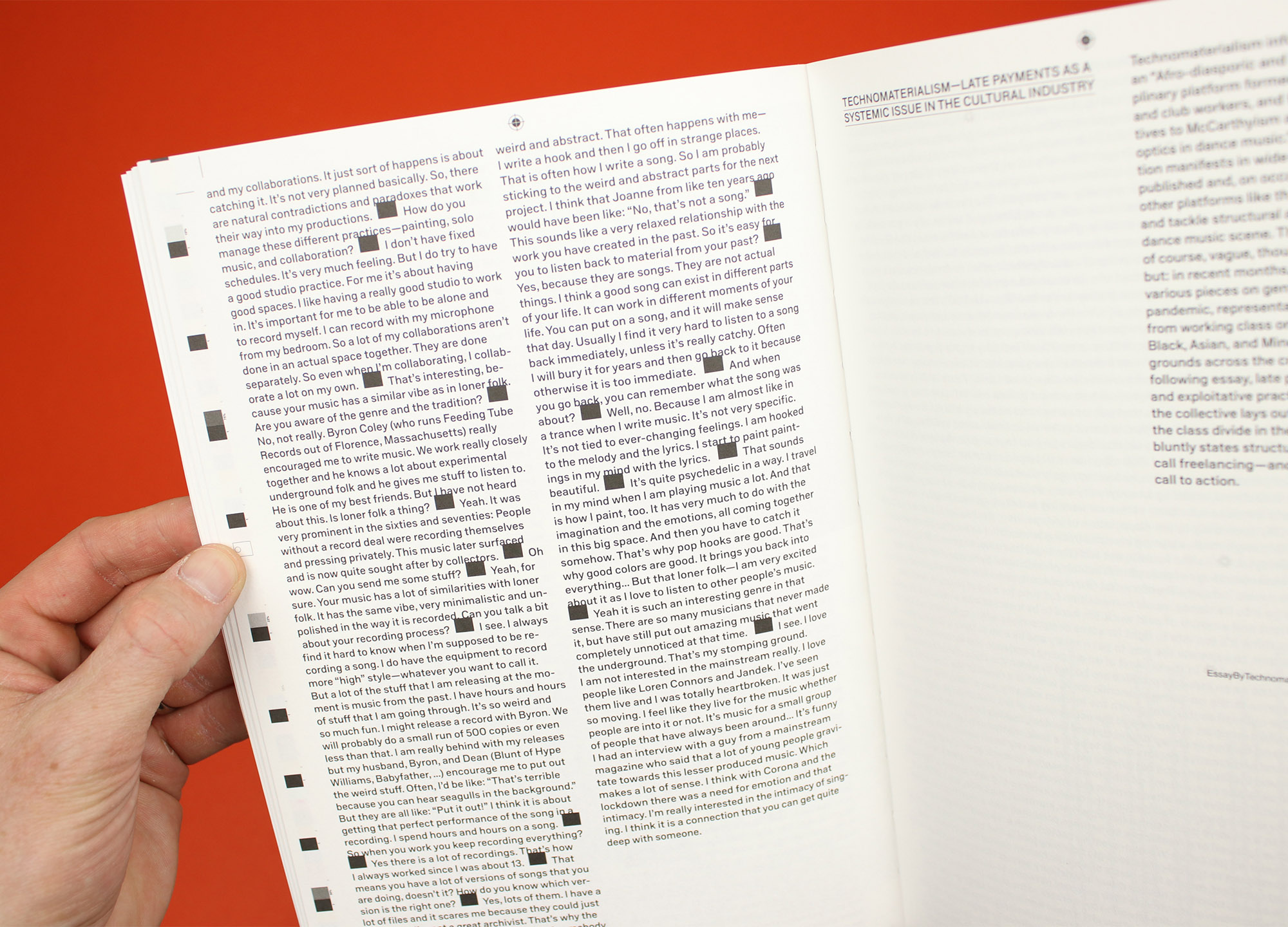
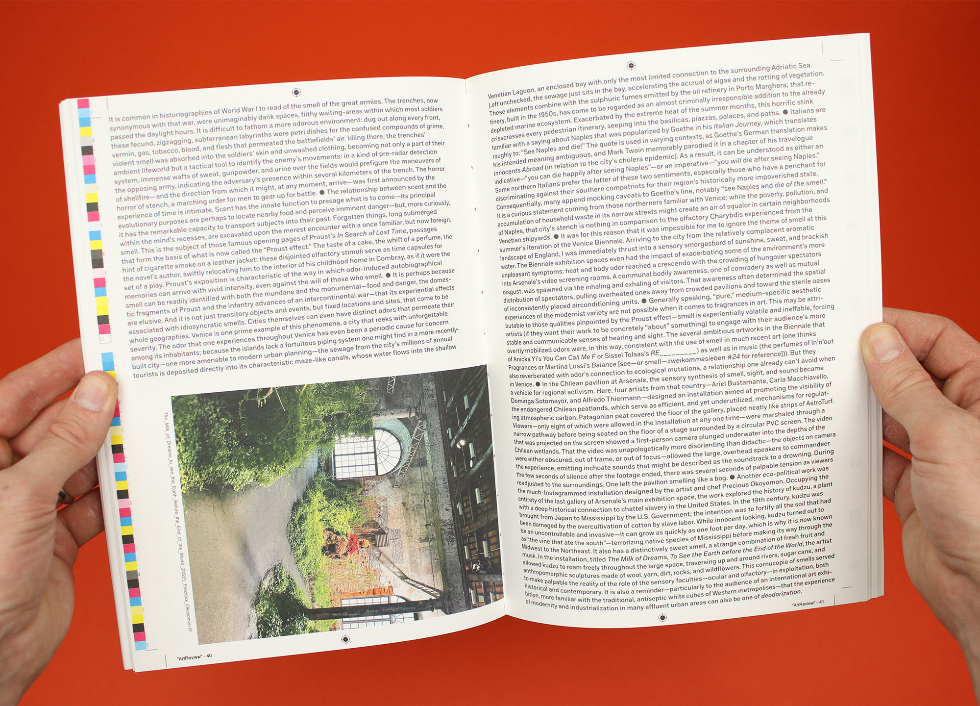
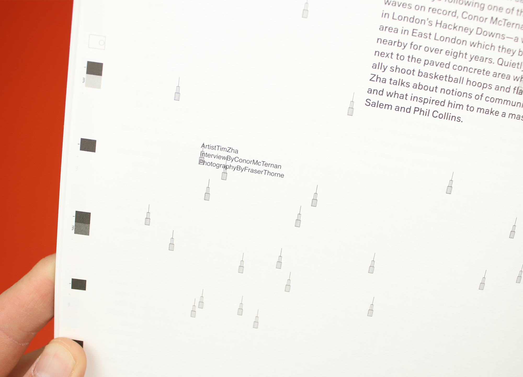
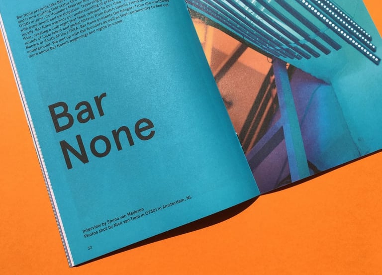
This new grey zone version of Zweikommasieben is no doubt cheaper to produce – as well as being smaller than before, it has also done away with using heavier stock for its cover. But it also feels like it’s having loads of fun, led by graphic designers Dorothee Dähler and Kaj Lehmann, who have chosen to keep the printers’ marks that would usually be trimmed off. This print-y innovation wins them a bit of extra space around the edges of the page, but moreover it provides a reference that they play with throughout the magazine, with lines, blocks and crosshairs scattered through the pages and writer and photographer credits rendered as filenames. (Scroll through the gallery above to see a few examples.)
By comparison, The Wire’s thriftiness feels more measured, with publisher Tony Herrington using his note on the masthead to explain: “It all started when we decided to shapeshift the dimensions of the magazine back to A4, a much more ergonomic and economic choice, we thought, than our previous outsize format, especially in these straitened times.”
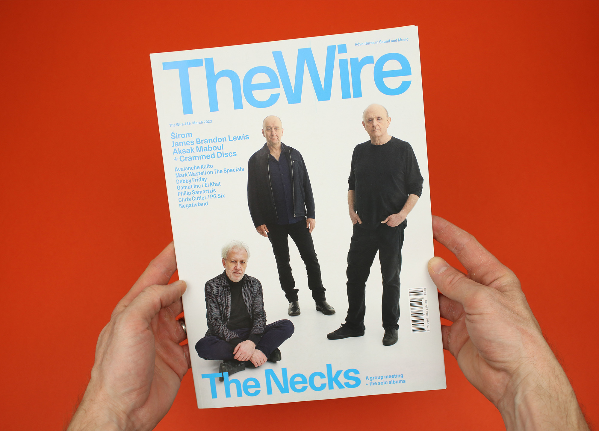
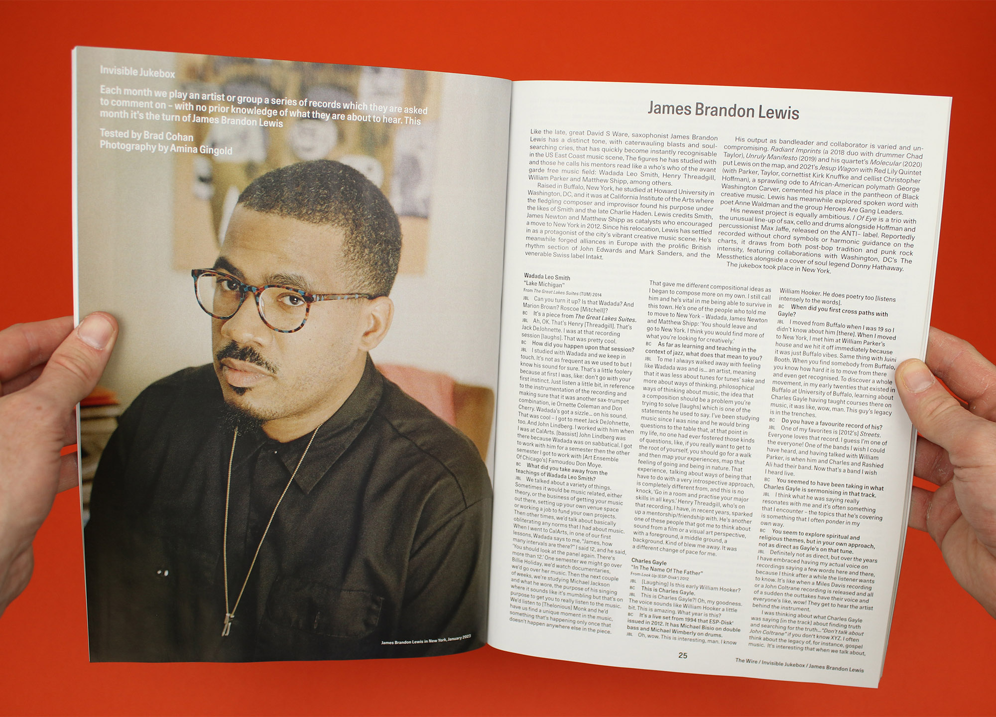
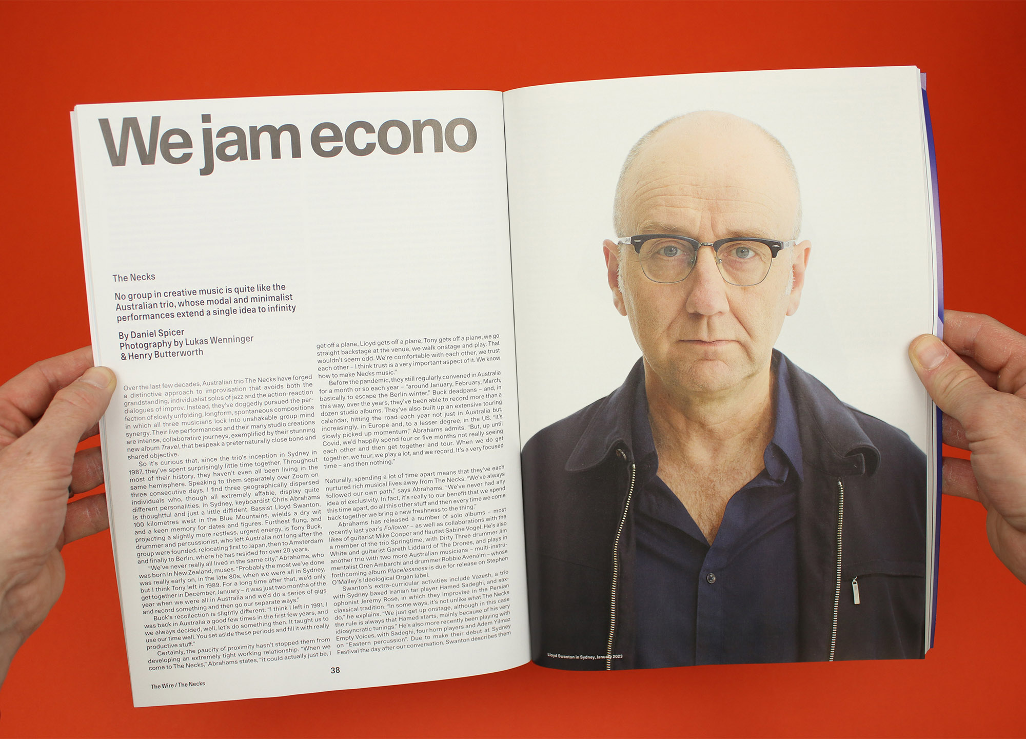
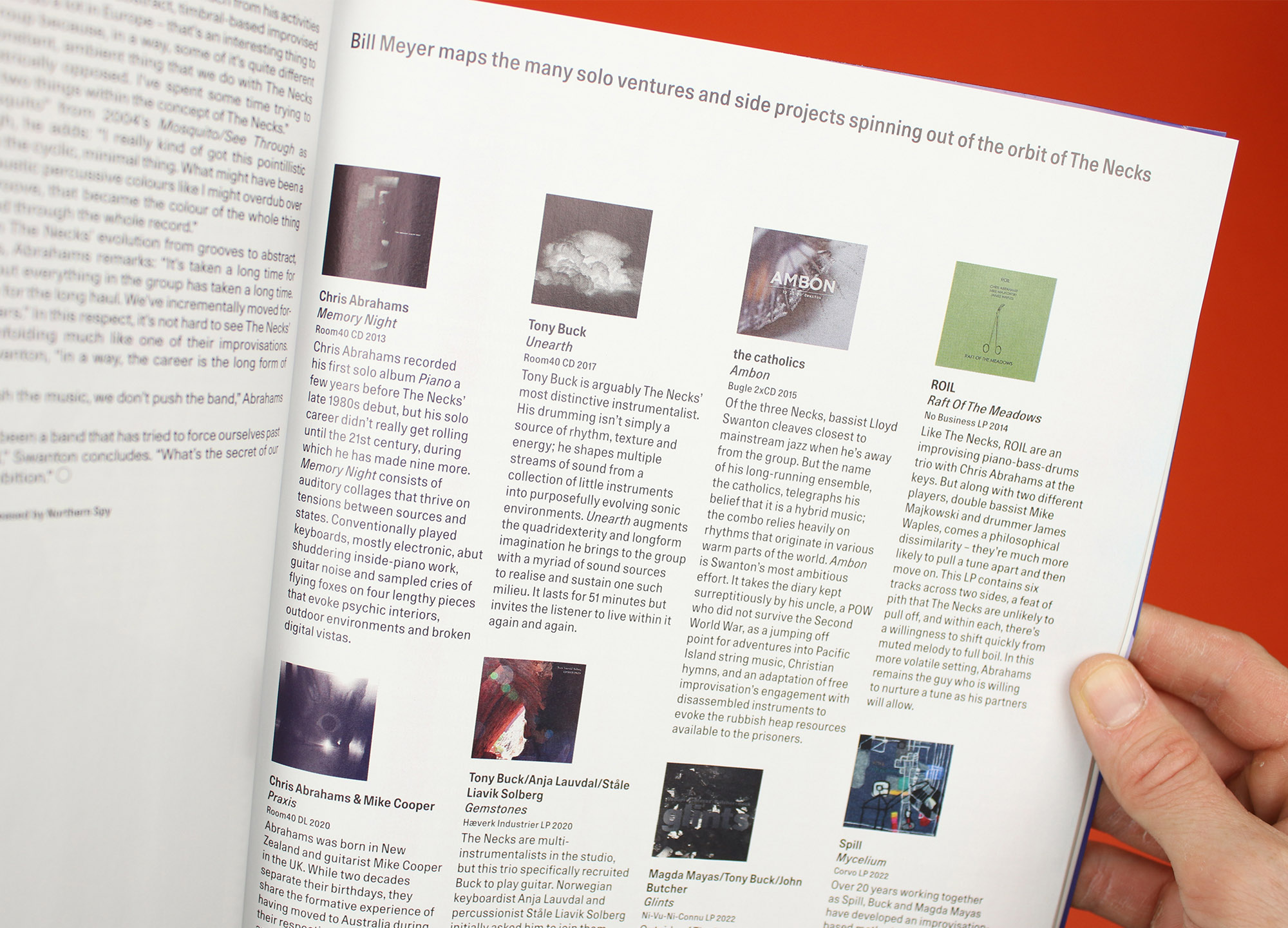
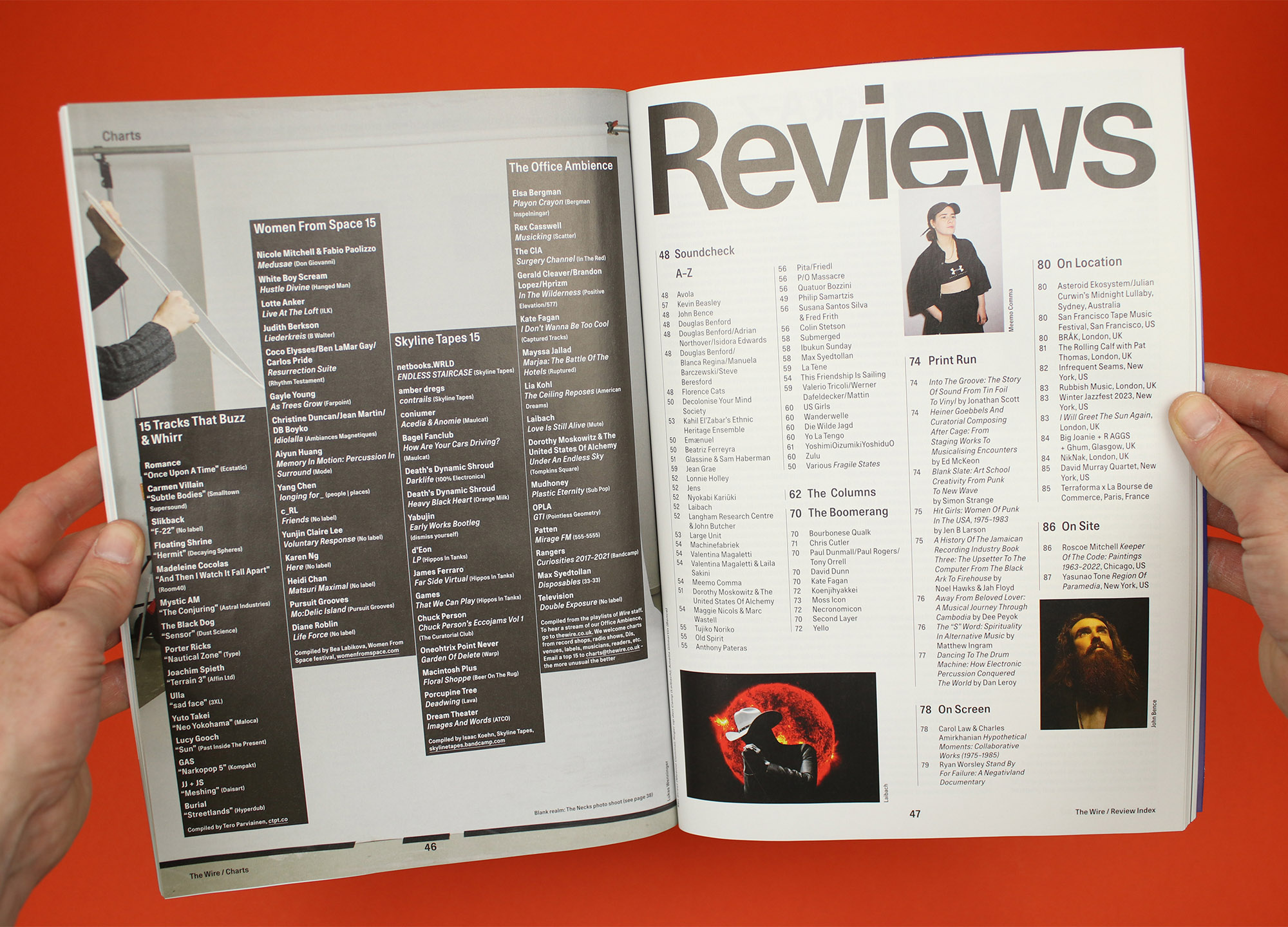
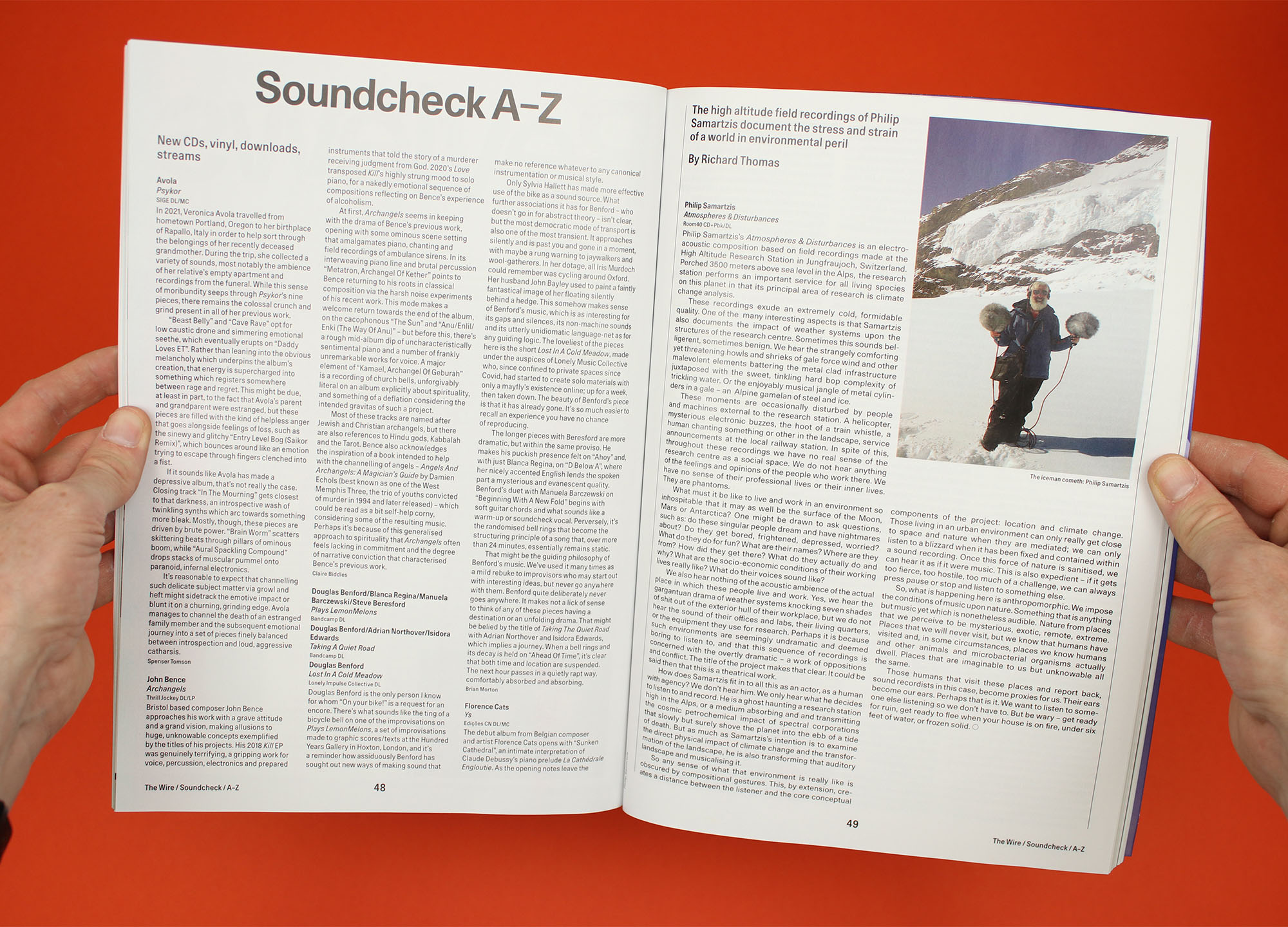
The reworked design is all about clarity and order, with a new version of Unica77 that was customised in collaboration with Swiss type foundry Lineto, running alongside big pictures of the artists themselves. For the most part it sits on a two-column grid, which can break into three columns, for example for the Soundcheck reviews section, or occasionally into four columns for listing album recommendations. The result is a flexible layout, which, they say, actually increases the overall type area, despite the slightly smaller pages.
The redesign was done by The Wire’s new art director Guillaume Chuard and it feels like it was built to last – the last major redesign was apparently more than 20 years ago, and this new version feels like it was built for similar longevity. I don’t imagine Zweikommasieben’s new look was produced with the same thoughts in mind – whereas The Wire is the Bible of alternative sound and music, Zweikommasieben is a playful passion project that exists in order to reflect the scene it loves so much.
It follows that whereas Zweikommasieben’s new design is bold and eye-catching, it probably didn’t ruffle too many feathers amongst its readers, who are used to seeing its ongoing experimentations in print. The Wire, on the other hand, has delivered a magazine to its subscribers every month for 40 years, and while many of them have welcomed the innovations, some of the comments on Twitter have been less generous. For what it’s worth I like this new, slimmer version of the magazine, and I think the lack of space between ‘The’ and ‘Wire’ on the cover is a smart way of introducing a bit of creative friction into this supremely controlled publication.
And before we get carried away with the austere simplicity of The Wire, I also like the sly piece of misdirection in its cover image, which seems to show Australian band The Necks photographed in the starkest studio shoot possible, only for the story inside to reveal that the three members were in fact photographed separately in Sydney and Berlin. It’s not a joke as such (in fact it’s really just a sensible way of showing three people who play together but don’t live near each other) but I like the way they’ve sneaked a little bit of magazine artifice into this apparently entirely earnest redesign.
Similarly, it’s worth noting that for all its cost-cutting measures, Zweikommasieben also includes a large, hand-placed orange sticker across the front and back covers. It looks great, and it’s a clever way of drawing attention to the exposed binding, but it must have added a considerable amount to the production costs – surely more than it would have taken to just have a regular cover. Reading these magazines, I find it reassuring that, even when there seems to be a totally clear rationale for the editorial and design decisions that have been made, there is still slightly more to the finished object than meets the eye.
thewire.co.uk
zweikommasieben.ch
