EDCH 2017: Five things from day one
Formerly known as QVED, this year’s EDCH editorial design conference kicked off yesterday in Munich. It will see 60 editors, journalists and photographers speaking, plus workshops, live performances and exhibitions — it’s a lot to take in four days, which is why we’re blogging daily digests so you can stay up to date with the best bits.
1. Creating a magazine through t-shirts
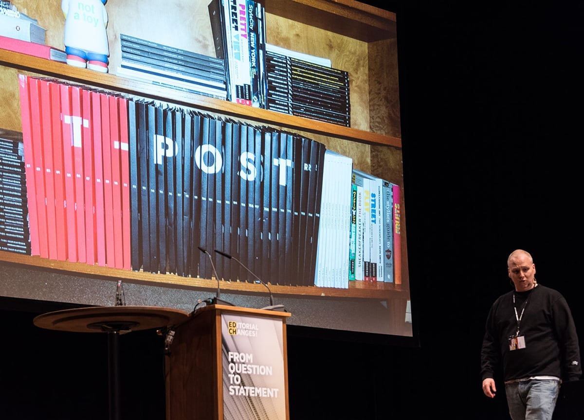
T-post | Peter Lundgren
In 2005, as everyone talked about the death of print, a creative agency in Sweden came up with a novel medium for print publishing. T-post, the magazine printed on a t-shirt, had just found a magic formula. With a bold graphic printed on the front and an accompanying article printed inside the t-shirt, founder Peter Lundgren (above) explained that when someone asks about the t-shirt you’re wearing, you have to re-tell the story in your own words, inevitably adding on your own details and thus becoming a “walking, talking billboard.” Their ‘death penalty’ issue hit a nerve on a global scale, and soon got the attention of TIME, The Wall Street Journal, and rapper Jay-Z.
But as Peter said, “business is 85% timing” and the viral buzz died down after six years. So the team tried to make it more like a collectible by adding a cardboard sleeve, and collaborating with big name icons like 90s photographer Ricky Powell. After three years, they hit another wall, and there was a need to make the magazine more accessible to a wider audience. So the product story was presented on the cover of the magazine, creating a classic magazine look and ‘cover stars’. Now, T-post is looking to launch a ‘waste management’ initiative to make their processes as sustainable as possible, showing the importance of continuous innovation in publishing.
2. How does Works That Work, work?
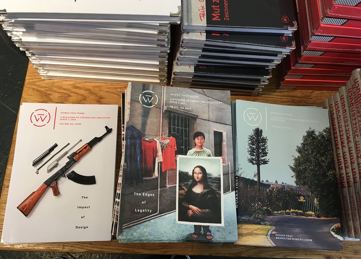
Works that Work | Peter Biľak
For those who don’t know, Works that Work is a design magazine dedicated to ‘unexpected creativity’ — and every aspect of the publication rings true to that ethos. Magazines are largely consumed through limiting categories like ‘men’, ‘women’, or ‘sports’, making for a restricting reading experience. But since a lot of magazines depend on advertising, the content can be affected by advertisers. Founder Peter Biľak (header image) explained how Works That Work wanted to cut down the dependency on advertising by creating a more direct publisher/reader relationship. So they have just 5% advertising, and depend on cover sales and subscribers for their income.
In terms of the content, they focus on “relevance”, instead of “recentness”. Design often comes with a price tag, but Peter argues that, “all that we do, almost all of the time, is design — for design is basic to all human creativity.” He showed examples of a traffic sign-less intersection: in the absence of design, traffic appeared to be more chaotic, but accidents dropped significantly as everyone slowed down and were more cautious.
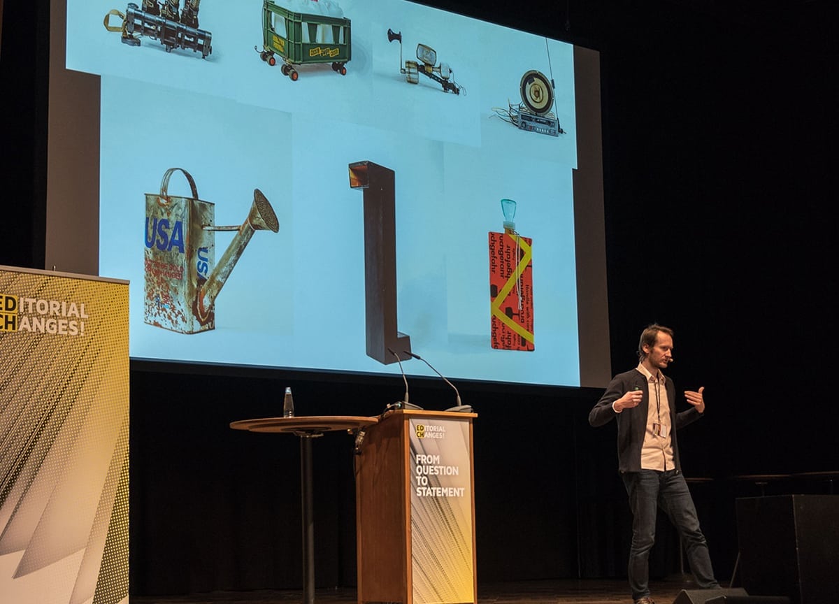
The prime opportunity for creativity, he thinks, is “the surplus of time and a lack of resources; people find untapped potential,” and for example he showed Works That Work’s coverage of unorthodox tools improvised during the siege of Sarajevo (above). We also learned about Bhutan’s unconventional ways of funding schools and roads for their country; through selling specialty stamps internationally (3D stamps, stamps printed on silk, plastic, and even a small LP, which plays a story narrated by the king of Bhutan) the country was able to build public facilities.
But distribution still costs a lot, so they introduced a ‘social distribution’ model. Watch the video below, but basically it asks readers to become distributors for the magazine — readers first show the magazine to their local bookstore, and if they’re interested, the reader buys the magazine at 50%, and sells it to the store for 65%. This model was especially successful in places not traditionally covered by distribution cycles. They even started an online log where people report the free space in their suitcase whenever they’re travelling, and can help deliver copies of the magazine.
3. The rise of the new serious in indie mags
Stack | Steve Watson
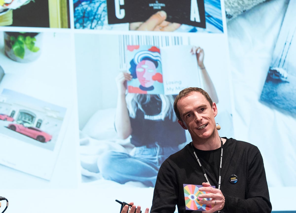
Steve Watson (below), founder of Stack, is seeing a rise in magazines with a more serious perspective. He noted that the investigative journalism done by the big newspapers is absolutely irreplaceable, but showed how small independent magazines are adding their voices to the conversation.
And they have something to say. Behind these magazines, there’s usually a publisher with a mission, who absolutely has to tell you about what’s going on (what’s not covered in the mainstream) and it’s often something very personal and intimate. They could also be a critical reviewer, who wants to give you a new perspective, and reveal something that’s happening in front of you, helping you see the world in new light.
And when indie publishers are purveyors of this ‘serious’ content, they have some advantages over their mainstream counterparts. First, they love nuance. Instead of distinguishing between truth or ‘alternative facts’, they often want to see if it’s a bit of both. Second, they’re not chasing clicks — most of these magazines don’t make money through advertising, and are more interested in authenticity, and making something for a small community.
Beginning in 2006 with Good magazine, he skimmed through the last decade, picking out magazines including Delayed Gratification, The Outpost, and Weapons of Reason. Peeps, the magazine we sent out to Stack subscribers last year, was founded by anthropologists who were frustrated that most of their findings were not covered in the mainstream, and more recently, we saw Migrant Journal, and Real Review. He finished by looking ahead to the launch of Anxy, the new mental health magazine due later this year, and we’ll no doubt continue to see many more of these small magazines with a purpose.
4. A city mag made in Seoul’s Hongdae-ap district
Street H | Sung-Hwan Jang
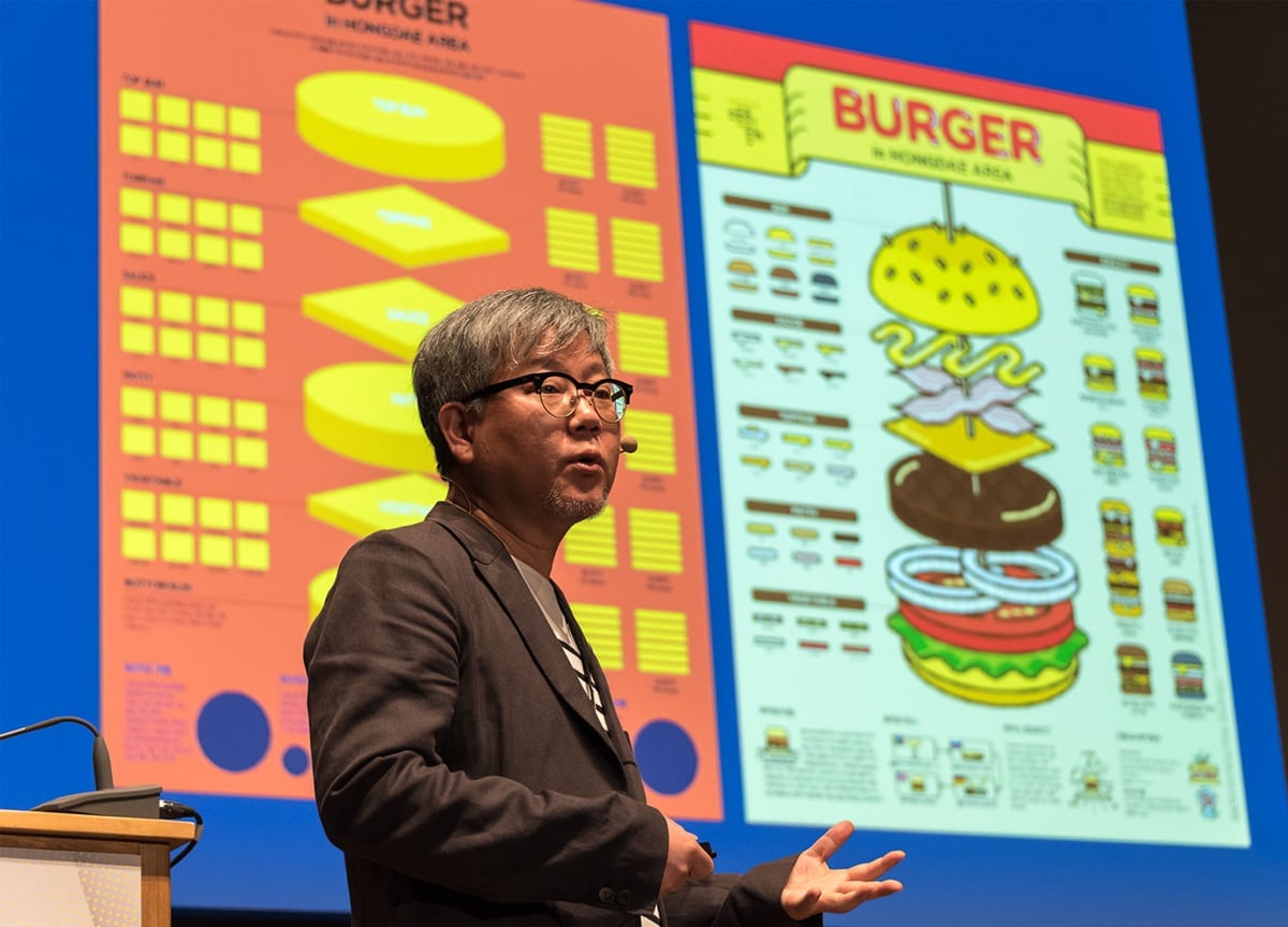
This year the conference has a special focus on South Korea, and we heard from interesting typographers, designers and editors in the publishing landscape of Seoul and beyond. Sung-Hwa (above) spoke about making a magazine for the Hongdae-ap district, a trendy Seoul hotspot that was expanding rapidly. (“If you like K-pop, this is the mecca,” he joked.) The rapid change and ambiguous identity of the neighbourhood caused his team to want to make a magazine as a recording device. He started seeing shops disappearing in the area, so puts an emphasis on archiving things that won’t exist forever. Landmarks became the cover stars of the magazine, and they also gamified tourism by rewarding ‘points’ for readers who tick off certain must-see places.
He finished by demonstrating their process for creating the infographics published in the magazine. Moving from mind mapping through to sketching, basic layouts and finished artworks, he showed how they’ve created graphics to map the changes in the area’s coffee shops, burgers and beers.
5. Re-designing Elephant Magazine
Elephant magazine | Astrid Stavro
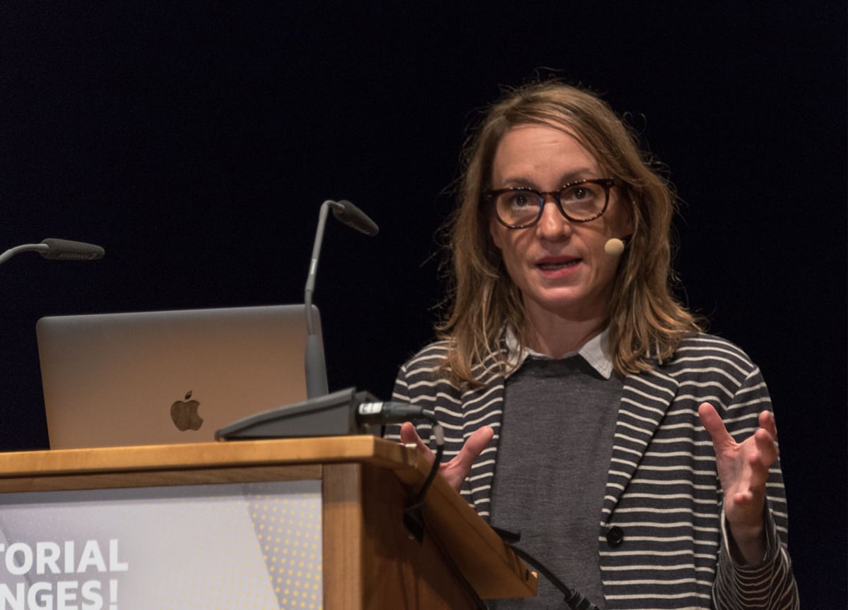
Based in Mallorca, design consultancy Atlas works for names like Mast chocolates and Camper, and creative director Astrid (above) spoke about the redesign of Elephant magazine, one of their clients. She works very hands-on, always sketching before going to the computer, often including lots of wood and metal work. The overarching theme of the redesign was to make the magazine more covetable, carefully crafted, more flexible and visually exciting.
The process started with a lot of research, and mood boards of inspiration covered the walls of the studio. They experimented with lots of typefaces, and when they received the content, completely “imbued” themselves with it. Sometimes, 300 images had to be narrowed down to eight. Working very physically, the studio’s floors are often completely covered with pages of the issue. They coloured in the old elephant logo, making it more bold and simple, and easier to recognise on social media; they updated the spine to feature the artists’ names, making it easier to archive and search issues.
You really get the feeling they’ve considered and tried absolutely everything they can think of — the typography interacts with the physicality of the artworks in the magazine, making them pop, reflecting it, being playful with it, or exerting power over it. The issue was realised after printing and binding 30 entire issues of mockups!
—
Keeping up with new magazines is easy — Sign up to Stack and we’ll deliver our favourite independent publishing to your door
