Stack Awards 2019: Cover of the Year
Can you judge a magazine by its cover? Simon Armstrong, book buyer for Tate Modern, and Jaap Biemans, who runs coverjunkie.com, are sifting through our biggest category — there are 20 mags in the mix this time because there were just too many good covers to narrow it down to our usual 15.
Scroll down for trousers, North Korean dictators and dancing grannys.
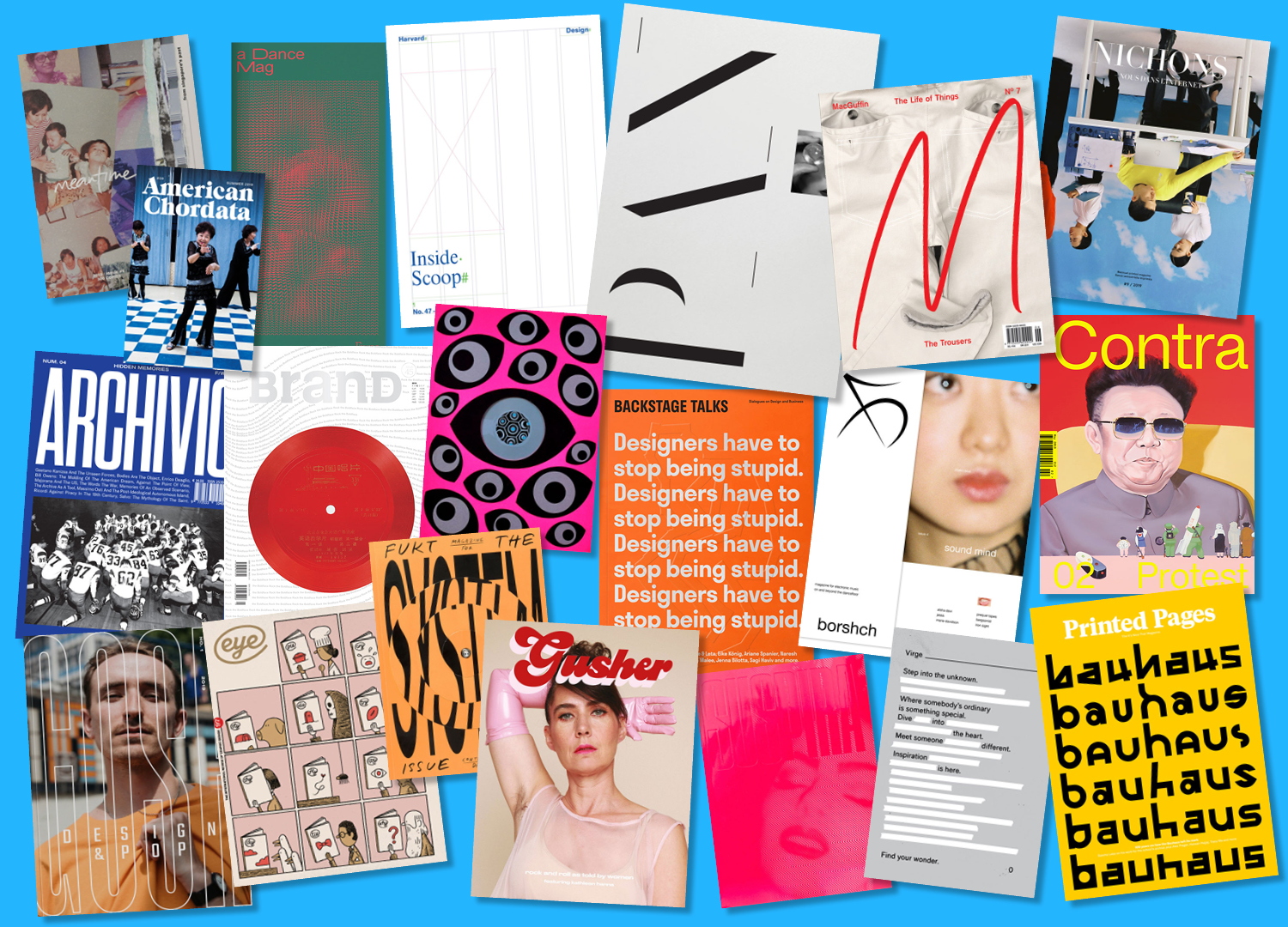
A Dance Mag | Beirut
Themed Furore, the inspiration for this issue of A Dance Mag is flamenco, the form that demands, above all others, that its performer confront and channel anger. The cover image looks, synesthetically, like sound. It also calls to mind the pulse of blood, or rage.
View this post on Instagram
American Chordata | Jersey City, NJ
It is impossible to look at this cover and not smile. Called ‘Dancing Grandmas’, it’s by AnRong Xu, who captured this photograph in his home community of NYC’s Chinatown on the Lower East Side.
View this post on Instagram
Archivio | Turin
A magazine that raids archives around the world to construct each issue, Archivio has built its latest edition around the theme ‘Unreal’. The cover image is by Bill Owens, part of his documentation of ordinary suburban America in the 60s and 70s. For Archivio, it encapsulates the sweet deception of The American Dream.
View this post on Instagram
Backstage Talks | Bratislava
There’s one line printed over and over again on the cover of this issue of Backstage Talks: “Designers have to stop being stupid”. Embossed very faintly on top is Eike König’s ‘Thinker’, a graphic reinterpretation of the famous Rodin sculpture of a man thinking (about how not to be stupid?).
View this post on Instagram
Borshch | Berlin
Borsch is a magazine about the power of music to purge. Fold over the cover flap to read a story about a particularly “dark, intense and uniting” experience at Berghain. Taken together with the cover image, of a woman transfixed by something out of view, it’s strangely hypnotising.
View this post on Instagram
BranD | Guangzhou
International brand design magazine BrandD has inserted a real Chinese LP from the 60s inside the cover of every single copy of their forty-fifth issue. Satisfyingly, each LP is playable — so you can take it out and put it on.
View this post on Instagram
Contra | London
Contra is a magazine about art and protest. The painting on the cover is by Korean artist Sun Mu, of Kim Jong Il wearing his trademark sunglasses.
Eye | London
The ninety-seventh issue of the international review of graphic design is a mag special, and features a comic about the subjective nature of magazine-reading. There are eleven imaginary readers, all reading a niche publication that rhymes with ‘Eye’ but directly relates to them: a cook reads ‘Pie’; a baby reads ‘Cry’; the grim reaper reads ‘die’ etc.
View this post on Instagram
Eye on Design | New York, NY
A riff on their traditional cover (one large centred eye), this issue features 14. It hints at the issue’s theme ‘Distraction’: more eyes = more distracting. Eye on Design was our 2018 winners so it’s exciting to see them enter again.
View this post on Instagram
Fukt | Berlin
The three rotating discs on the cover of Fukt’s ‘The System’ issue can either be used to disrupt the typography or bring it in order, just like the system.
View this post on Instagram
Gosh | Düsseldorf
That wonderful magazine name, “Gosh”, is stretched across the cover in modified grandmaster bold. This is the launch issue of the design and pop magazine, and its star is London producer and DJ, Ross From Friends.
View this post on Instagram
Gusher | Melbourne
Gusher is a music magazine written entirely by women and non binary people. Punk feminist icon Kathleen Hanna covers the third issue, wearing pink latex gloves.
View this post on Instagram
Harvard Design Magazine | Cambridge, MA
This issue of architecture publication Harvard Design Magazine is themed “Inside Scoop” — about interiors, and interiority. The InDesign grid referenced on the cover is a nod to the “inside” of the design process itself.
Macguffin | Amsterdam
“A garment that squeezes the testicles makes a man think differently”. That quote, from a 1976 Umberto Echo essay reprinted inside, is fertile ground for an issue. Dedicated entirely to “The Trousers”, there’s a delightful white pair on the cover.
View this post on Instagram
Meantime | Singapore
Meantime is a magazine about the love stories of ordinary people. Every cover has been hand torn individually, to embody the magazine’s spirit and content: the fragility of memory, and love.
Nichons-nous dans l’Internet | Paris
The story inside the magazine that this cover image, by Julian Song, is linked to, is printed right-way-up. Flipped upside down, the bright, meticulously ordered composition is intriguing. It looks like someone’s put it back on the shelf wrong.
View this post on Instagram
Pan & the Dream | New York, NY
The issue is themed ‘Pan’s Trip to the Moon’, and the cover (which is larger than human scale) is inspired by Georges Méliès’ 1902 fantasy film, A Trip To the Moon.
View this post on Instagram
Printed Pages | London
In this issue, Printed Pages celebrates the legacy of Bauhaus, the art school founded 100 years ago in Weimar Germany by architect Walter Gropius. The cover displays just 42 of the nearly 600 glyphs Pentagram partner Sascha Lobe and his team have created while designing their new identity for the Bauhaus Archiv.
View this post on Instagram
Suspira | London
Deliciously shiny and red, the Fetish Issue of feminist horror magazine Suspira is luscious. The Chromolux material has an undeniable latex feel to it.
View this post on Instagram
Virge | Tokyo
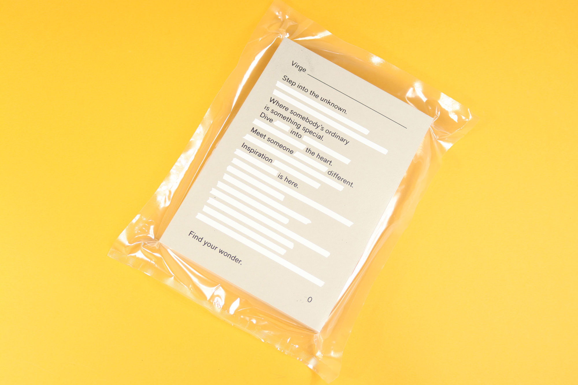
Virge arrives vacuum-packed to look like a suitcase. Technically this is a travel magazine, but it does not venture outside of Japan. Instead, every issue of the thick, book-like publication turns inward to document just one bit of the country.
Winners will be announced on November 14 at the Stack Awards ceremony at Somerset House. Tickets are available now.
