Your guide to… Printed Pages #13, by editor Owen Pritchard
Mention of online design magazine It’s Nice That often brings a smile to people’s faces. It might be their affinity for artists who create with witty irreverence of traditional formats, or works that erupt with cheer and colour — either way, readers know that scrolling through the site on any given day will leave them feeling a little more giddy and a lot more inspired.
Every six months, the team gathers the best content on the site to produce their print magazine, the aptly named Printed Pages, and for their 13th edition, an eye-to-eye grin shines from its glossy cover. As always, it’s a wonderful snapshot of some of the most creative illustrators, photographers, painters, animators, sculptors and designers. Read on for editor Owen Pritchard’s definitive guide to the issue.

1. We are sticking a smile on the newsstands
The cover of the issue is a statement of intent. We were talking about what message we wanted to send with this issue and looking at the tone of what was on the shelves at the moment. As a result, the magazine was put together in a spirit of optimism, celebrating the great work that is out in the world. Of course, it helps to stand out, and Ted Parker’s beaming creation was an obvious choice from the moment he sent it over.

2. The smiles continue inside
We sent a one-word brief to our friends and collaborators around the world: Smile. We had responses from photographers, illustrators, artists, animators and more. Bráulio Armado created a typographic work for us, which kicks off a 14-page visual feature that is a series of smiles. You can find work by the likes of Martin Parr, Rose Blake, Tim Lahan, James Jarvis, Emily Mei and more.

3. William Eggleston is a bit of a joker
We interviewed Willam Eggleston for the issue. He spoke from his home in Memphis, where he has lived for many years, and chatted about his life and work. He very kindly allowed us to send photographer Jody Rogac to visit and take some portraits. When she walked in, he turned to her and said “you have one shot.” Luckily, he was joking, and she was able to produce some beautiful images that run alongside archive photos from William himself.

4. We raided Heatherwick Studio’s model archives for a shoot
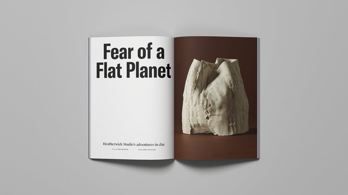
Heatherwick Studio is revered for its inventive projects, but we worked with them to show an altogether different, and unseen, side to the company. In the bowels of its King’s Cross studio exists a vast archive of its output, including models, maquettes, sketches and tests. Working with photographer Benjamin Swanson we shot the clay artefacts as still lifes and spoke to Thomas and his employees about how they develop ideas. The objects appear as artworks and offer a rare glimpse into the workings of the company.

5. The work of over 50 different creatives appears in the magazine
Putting together Printed Pages involves looking back through our entire output from the past six months – it’s always astonishing to see just how much great work people are producing, and we have to edit it down to fit in the 240 pages we have available. We look to balance a broad range of disciplines and inspire our readers, offering a take on the creative world that is entertaining, contemporary and uniquely ours.

6. It’s not just about the mag — we have some gifts for you too
With every issue we do, we try to give a little more. If you order direct from It’s Nice That, along with the issue you can receive a two-colour screen print by graphic artist James Jarvis; a poster designed by Tim Lahan that puts a happy spin on his Rocks paintings; a set of stickers by Kate Prior created for our International Women’s Day coverage and five exclusive postcards. And, because we care, we also put a handwritten thank you note in each package.


—
We sent out one of the first Printed Pages to Stack subscribers in 2014. Sign up to our subscription service and get a different independent magazine delivered each month


