Reading Magazines event overview
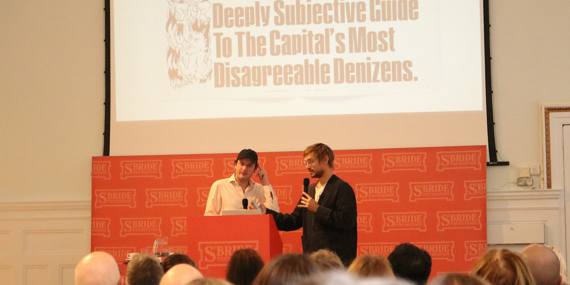
On Friday last week we spent the day at St Brides for our Reading Magazines event, presented as part of the London Design Festival, and supported by Fleet Street Quarter. The idea was to take a step back and consider the magazines that are being published today in the context of 300 years of magazine evolution. We began with the first printed thing that ever called itself a magazine, and crashed through the centuries and decades to arrive at some of our favourite 21st-century publishing.
Several themes emerged during the day, and I think the most striking was economics. There were several points when our speakers talked about moments in history when magazines became vastly more profitable: For example when paper became much cheaper; when taxes were abolished; or when the print union was broken in the 1980s. For anyone who has been involved with making magazines in the last 20 years, those sorts of changes seem like they come from a different world – it’s almost impossible these days to imagine costs going down instead of up.
We’re probably never going back to those days, but our speakers also showed why they’ll keep on finding ways to make print work. The Fence editor Charlie Baker spoke about introducing advertising as a way to help keep the cover price as low as possible. Erotic Review editor Lucy Roeber spoke about the freedom that print affords, giving her a way of publishing stories that would be censored or smothered online. And Elastic senior editor Meara Sharma spoke about the rich worlds that can be created within the pages of a magazine.
The following is an overview of the speakers and their presentations. We’ll share edited videos once we’ve had chance to pull them together, but for now I hope this gives a sense of the day…
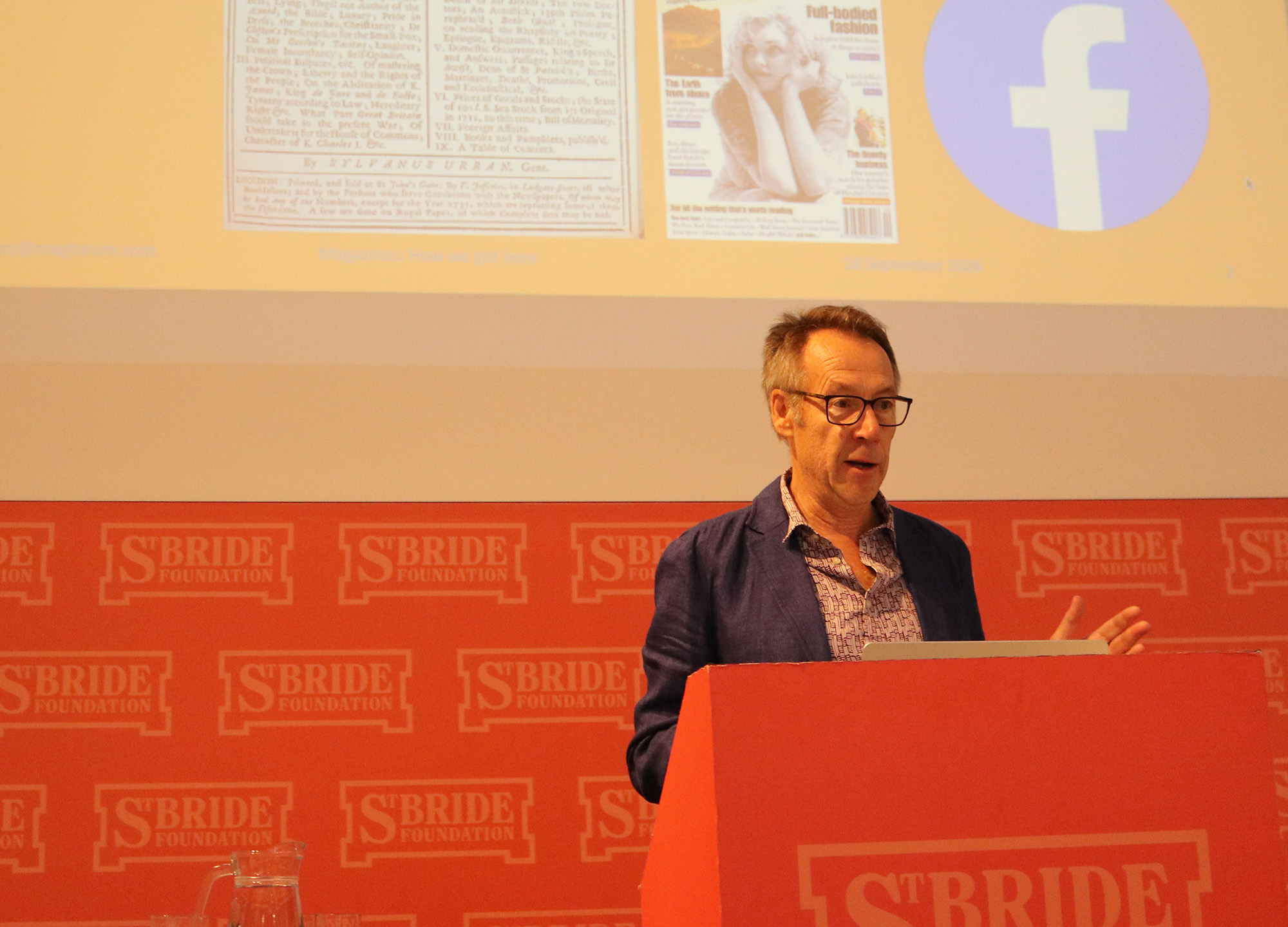
Magazine historian Tony Quinn is author of A History of British Magazine Design, and founder of Magforum. He began his history of magazines with The Gentleman’s Magazine, first published in 1731. It was the first publication to call itself a magazine, and, he said, it didn’t just name the new medium – it also set the formula for successful mainstream magazine publishing: “cheap copy, and controversy”. The Gentleman’s Magazine functioned by taking stories that had been published in other newspapers and journals, and repackaging the text for its readers – a model that was repeated in later years by other magazines like Tit-Bits, Reader’s Digest, and The Week.
He noted that technological and social developments helped to make magazines more popular and accessible. For example halftone printing allowed magazines to print illustrations and photos alongside text. Paper made from rags was replaced by paper made from wood pulp, which was much cheaper, lowering the cost of publishing magazines. And a series of education reforms in the 19th century made it compulsory for all children to go to school, massively increasing literacy across the UK, and creating a whole new working-class readership.
From the mid 19th century, magazines like The Economist were used to explore political ideas and became platforms to “challenge the status quo”. Publications began to cover increasingly specialised topics and magazine empires were born. During the First and Second World Wars, magazines flourished as tools to circulate news and raise the spirits of readers. Popularity increased, and Tony showed magazines reaching their peak in 1955, when half of all UK households subscribed to the Radio Times. But, he said, contained within that success was the beginning of the fall for magazines, because the massive popularity of the Radio Times reflected the growing influence of the TV, ushering in the age of the screen that would put magazine pages in the shade.
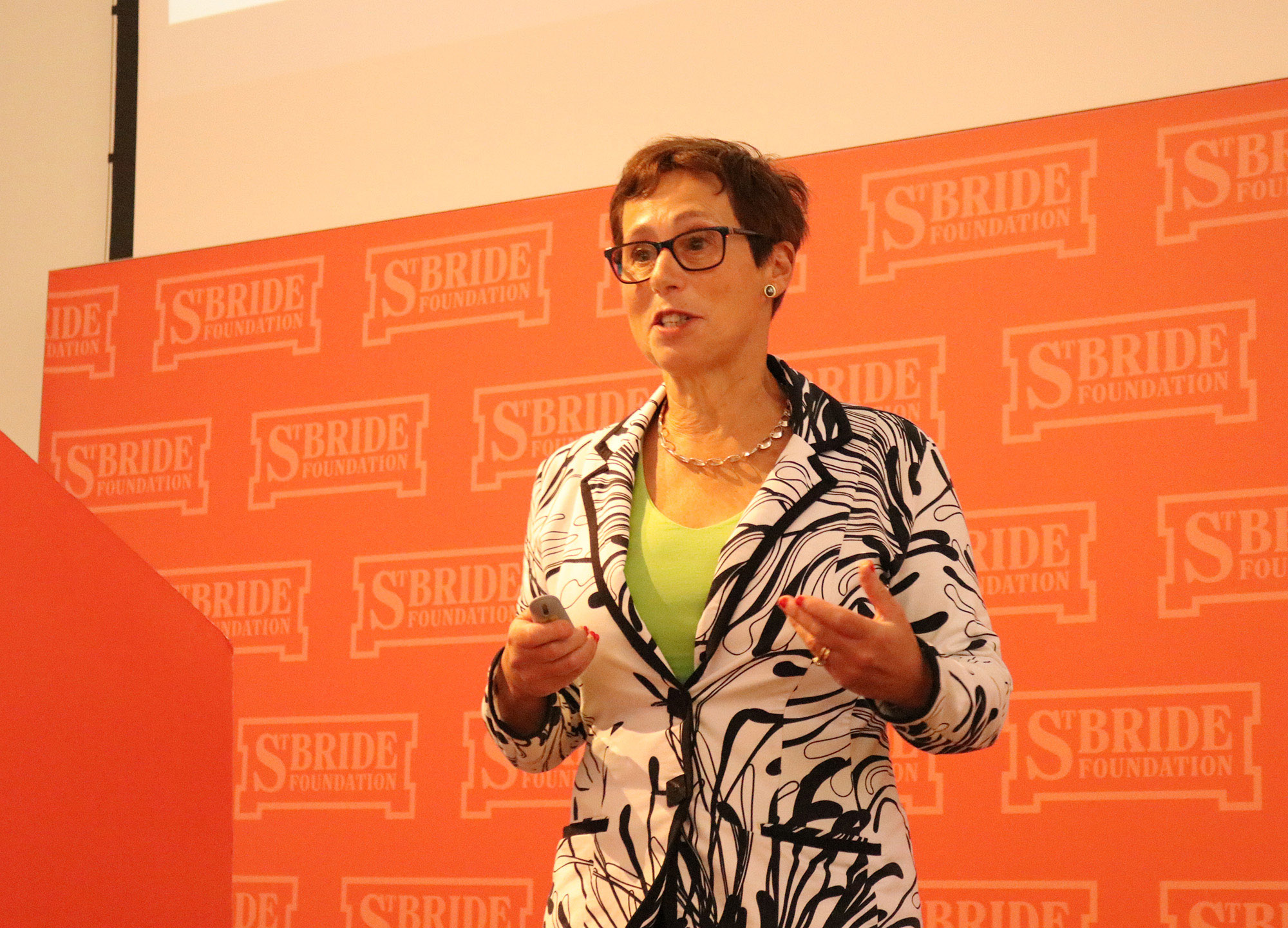
Dr Sharon Maxwell Magnus is Principal Lecturer in Mass Communications at the University of Hertfordshire, and she continued the story from the 1960s to 1990s through the lens of women’s magazines. From the traditionalist backdrop of the 1950s came Nova and Oz in the 1960s – they were magazines that dared to cover topics like pre-martial sex and racism, subjects that were considered radically taboo at the time. A recurring idea in Sharon’s talk was that magazine success is largely down to timing – a magazine’s longevity is directly related to its ability to reach its readers with stories that fit their lives. And while Nova and Oz were extremely popular amongst their readers, their cutting-edge content meant they were never destined for large-scale success.
In the 1970s, women’s magazines echoed the diverging ideas within the feminist movement. Cosmopolitan celebrated sexual liberation for the mainstream woman, whereas Spare Rib covered political criticism from the underbelly of society. As tastes changed, the 1980s saw commercially successful versions of their 1970s predecessors. However, the print industry faced the new challenge of having to compete with colour television. The result was a media market that was sliced up into ever more niches, and as Sharon said, “Everybody wanted a piece of a smaller pie”.
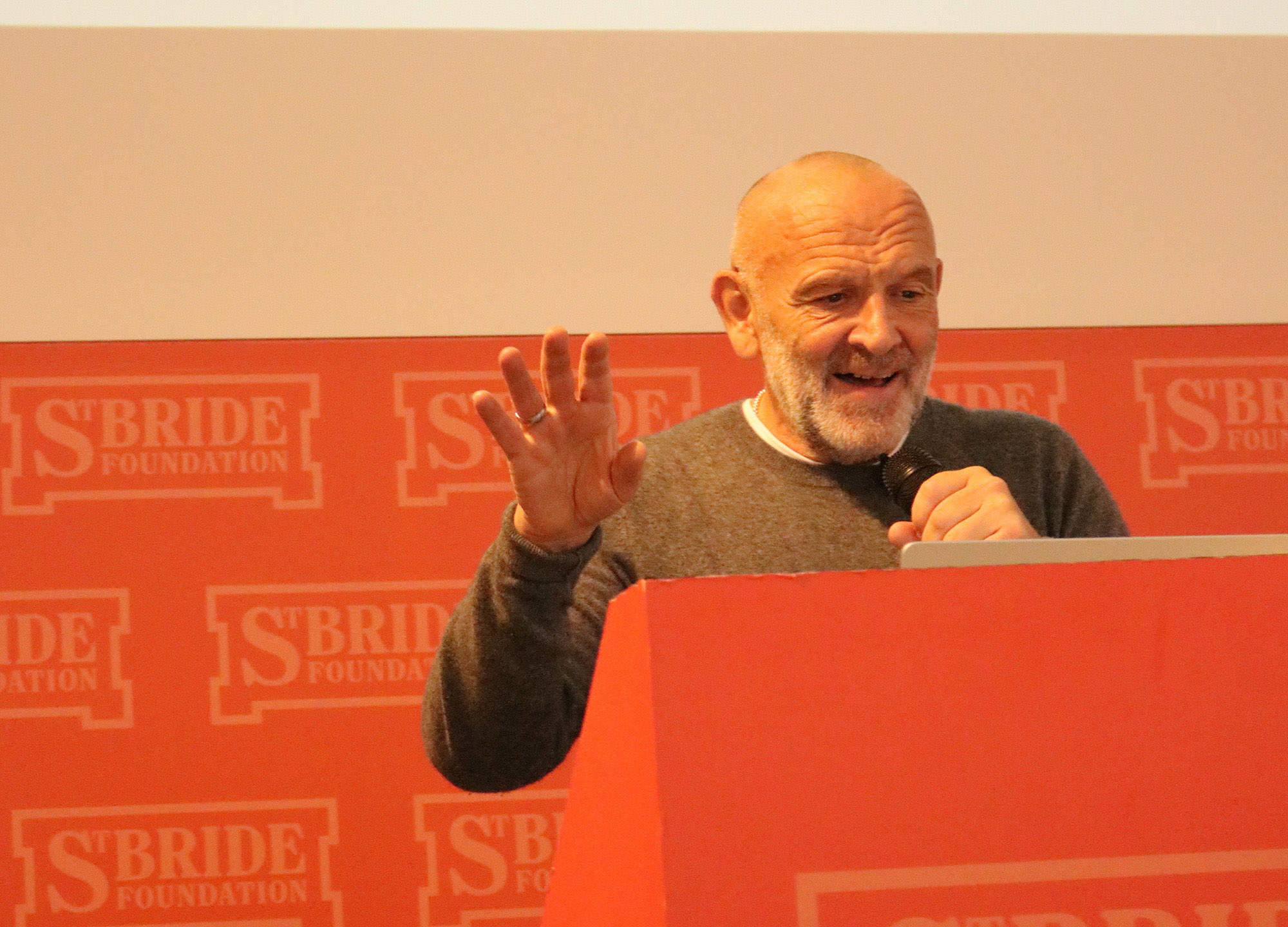
Scott King traced his career through a range of publishing projects from the 1990s onwards. Whilst originally interested in conceptual art, he took on the role of art director at i-D magazine at the age of 23, and stayed there for three years. (“In the end I’m not sure whether I was sacked, or I walked out.”) Seeking more artistic freedom, he started making CRASH!, inspired by Wyndham Lewis’s Blast, and from that he was hired to work as creative director on Sleazenation.
Showing iconic covers and funny, thought-provoking editorial pages, he connected up the interests that run through his work. For example he showed how news photography of English football hooligans could be repurposed as a fashion story, just by adding credits detailing what the men in the pictures were wearing. That sort of idea allowed his designs to subvert and criticise the “seemingly untouchable ideas” of mainstream print, exploring the relationships between subject, medium, and context.
He also reflected on his more recent publishing projects, like The Debrist Manifesto, in which he rebrands failures as successes. Developing Sharon’s point about the tensions between freedom of expression and commercial success, his satirical manifesto is based on the idea that mainstream acceptance spells the beginning of the end for any true artist: “If this style gains acceptance, or worse, ‘success’, you will effectively become a brand – for the Debrist, this is a disaster.”
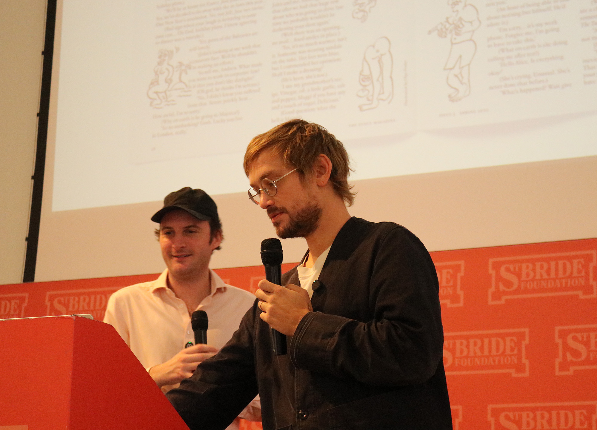
Charlie Baker, editor of The Fence, and Mathias Clottu, the magazine’s art director, discussed their process of “mining the archives” to modernise print for a contemporary audience. They showed how many of their formats are lifted from Spy magazine, allowing them to mix investigative journalism with fun, satirical edits. Mathias cited continental European publications like Le Quinzaine as sources of inspiration for The Fence’s visual identity, and the pair noted that the magazine is a product of both of their backgrounds: Charlie is English with an American father, and Mathias is Swiss, and The Fence today draws upon American, British, and European influences to present its immediately distinctive view of life in Britain and Ireland.
The two also discussed the need for magazines to adapt to survive in a digital age. Alongside designing a beautiful print edition, articles are also created with one eye on the traffic that comes from Instagram, and they showed how some of the Spy lifts in particular have found success as Instagram posts. The Fence has recently started to offer limited advertising placements in the magazine, all designed by Mathias to fit with the magazine’s aesthetic, and Charlie noted that while advertising has been part of the plan since the beginning, it’s only now that it has become feasible. He said the revenue will be used to offset costs and ensure that they can keep the cover price as low as possible for readers.
And the pair finished with a pub photo, showing a table with a few copies of The Fence scattered across it, plus a pint, a bowl of chips, and two pots, one of ketchup and one of mayonnaise. Pointing at the condiments, Mathias claimed the red ketchup and white mayonnaise were his inspiration behind The Fence’s famously sparse colour scheme. Whether or not you believe him is entirely up to you.
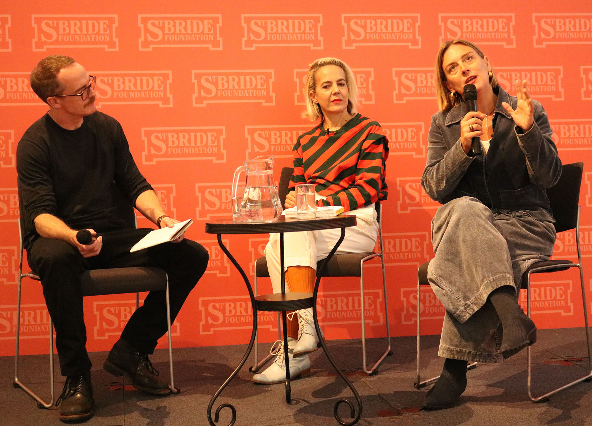
The Erotic Review was first published in the early 1990s and it has been through several iterations, from a newsletter through to an online-only publication. When current editor Lucy Roeber took it on she was determined to turn it into a beautiful piece of print, and she and art director Frith Kerr discussed how they transformed the magazine into a vessel that can explore desire. “As soon as she said that I was hooked,” said Frith, “because as designers what else are we doing but exploring desire?”
The pair explained their approach to the task, creating a visual language that imagines desire more conceptually and gives new readers the confidence to pick up the magazine. A key part of that is Give and Take, the strange, blobby, somehow bodily shapes that run through the magazine, inspired by letter forms but allowing for a freeing, illustrative approach. Playing with the weight and texture of the paper, and printing artworks in gorgeous detail, the magazine invokes sensuality as part of the reading experience.
Lucy also spoke about the freedom that print brings to the project. Erotic Review has faced censorship online, and has even struggled to secure a bank account because of unjustified associations with pornography. But print provides a home for their subtle and complex exploration of desire, giving them a way to connect with readers who really care about their editorial mission.
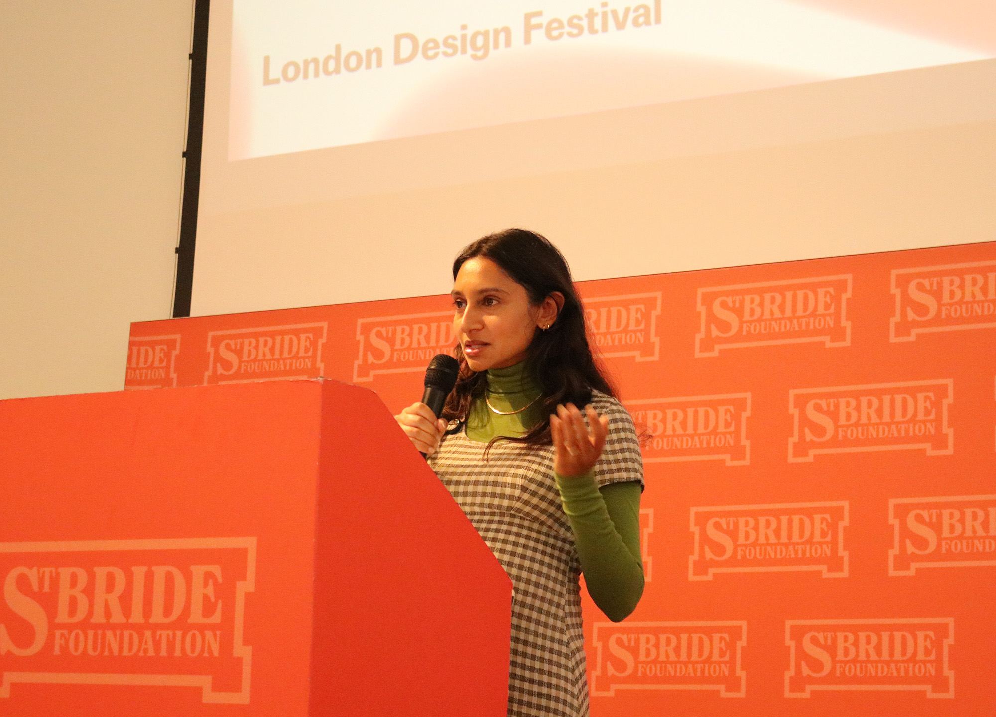
Meara Sharma, senior editor of Elastic magazine, discussed the process of subverting traditional print design to invoke an “ultra-sensory” experience within the magazine’s pages. Elastic is a celebration of psychedelic culture and fuses the worlds of literary and art publishing. The magazine’s version of psychedelia pushes back against the cliches of day-glo patterns and 1960s hippy culture, representing it instead as, “The ordinary, only slightly, weirdly off”.
Meara showed how the design approaches that task, breaking down individual spreads to show how words, phrases, images, and other elements are introduced to the reader, and repeated, or shown at vastly different scales, or allowed to pop up in unusual places. The result is editorial design that subverts conventional ideas of space and time, sucking the reader into its uncanny psychedelic world.
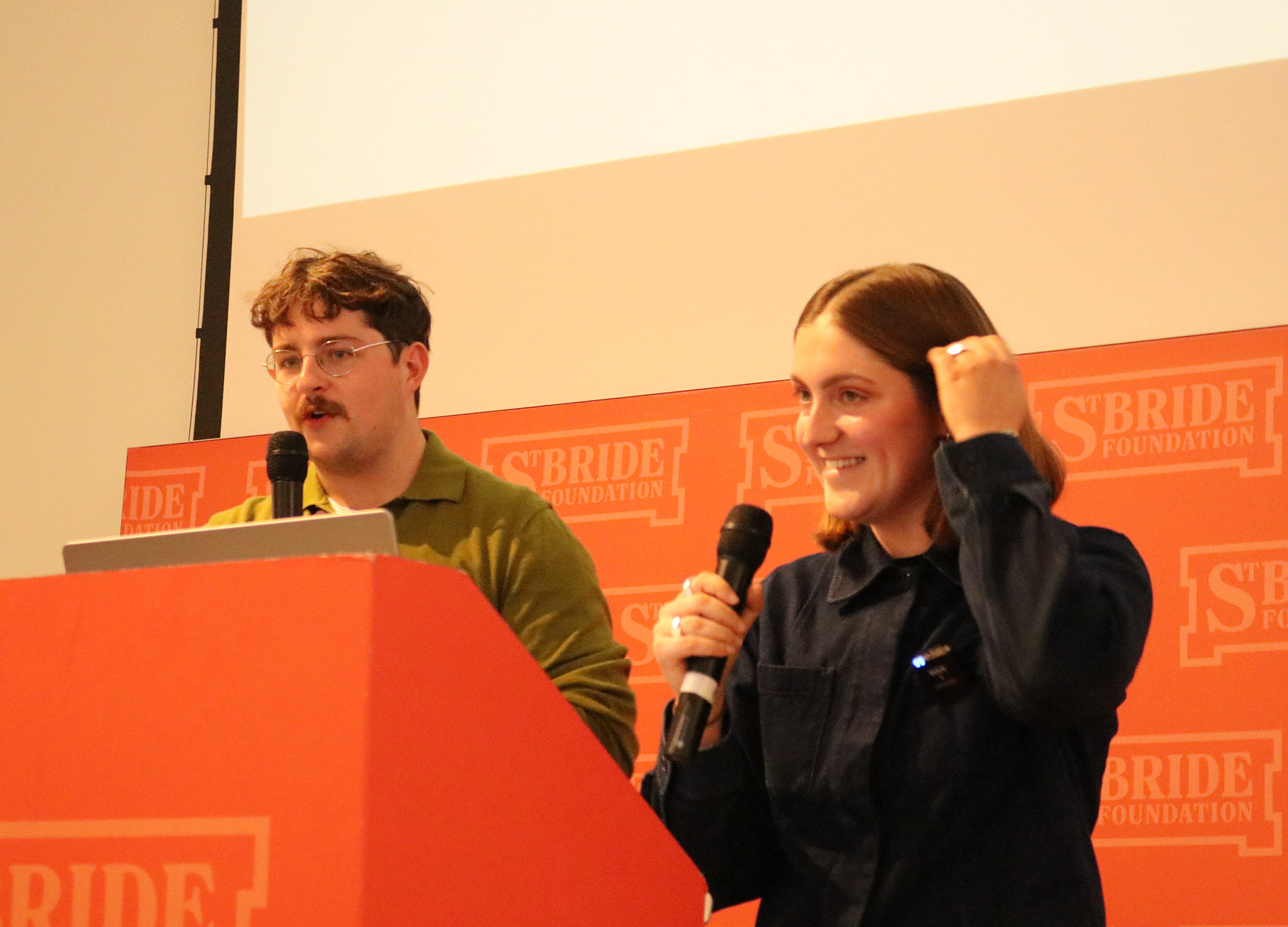
Alice Sherwin and Harry Bennett of Studio Ground Floor discussed their approach when commissioned to design Pilot, a magazine that takes a different conceptual approach to each issue. They explained that they began with the core conceptual idea, and constructed a set of rules around it, which they could then play with and break. So rather than starting with an aesthetic in mind, they pay attention to those rules, and the process itself, creating graphic design almost as a by-product of the structure and its hierarchies.
For example Pilot’s second issue is themed ‘Hardware’, and the design treats the magazine like a tool, stripping it back to its most functional format: Pages are big and chunky, and they’re bound with a pair of screw fastenings to lean into the industrial identity.
Issue four is themed ‘terra incognito’, which refers to spaces that have not been mapped, and they wanted to create an environment where the readers could get lost and then find themselves again, so they devised a trifold design, separating the text into one side of the magazine and the pictures onto the other. A series of abstract icons helps readers to figure out which pictures are intended to run alongside which pieces of text, and readers can choose to either read the words and pictures alongside each other, or encounter them completely separately. They also showed the process of binding the pages together, and the complex system of grid references that had to be hand-keyed so that readers could find their way through the magazine. It’s a crazily ambitious piece of avant garde publishing, and it felt like a fitting place for us to leave the evolution of magazine making. For now, at least.
Enjoy more of the best independent magazines – sign up to Stack and we’ll deliver a different publication direct to your door every month