A hole lot of fun
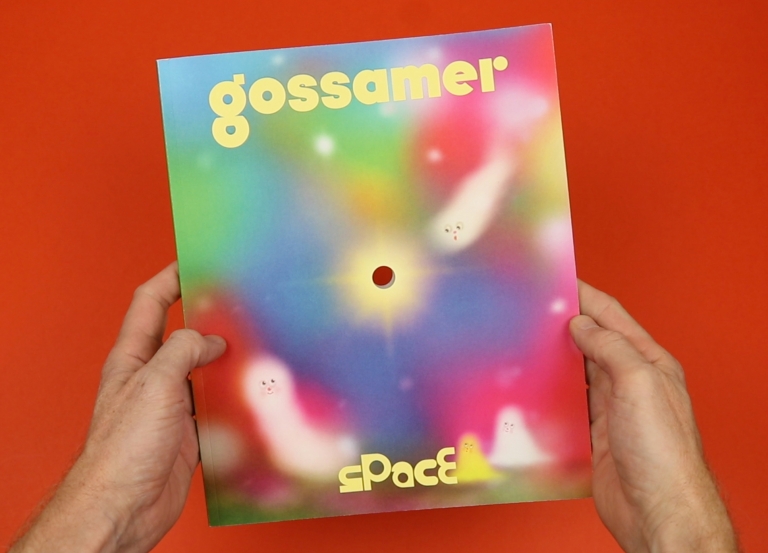
You can always tell when someone’s having fun making a magazine – there’s a playfulness that jumps off the page and charms readers with the sort of extra little touches you just don’t see elsewhere. I’ve been a big fan of Gossamer for ages now – the magazine, “For people who also smoke weed”, is consistently impressive with its excellent quality writing and gorgeous artwork, but its last couple of issues have taken another step up and stand out as really exceptional.
The last issue was themed ‘Touch’, and it came wrapped in a lovely soft, flocked cover that I’d find myself stroking absent-mindedly through the day. And the new issue is themed ‘Space’ and comes with a literal space drilled through the middle of the magazine. It’s a simple and clever idea, but what’s really impressive is the way they’ve used the hole and incorporated it into the graphic design, giving the pages an unusual focal point and interacting with the text and other page elements. Take a look at the video above to see it in action…
