“I’d rather make something good than make something fast”
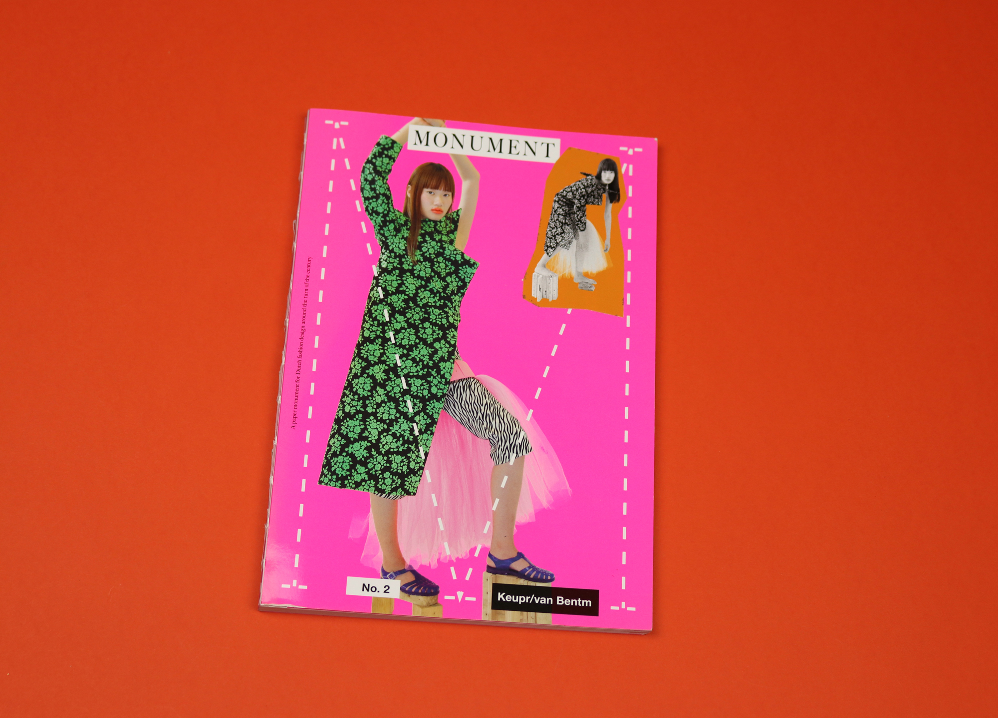
Monument is a series of fanzines dedicated to the ‘Dutch Wave’, a group of Dutch fashion designers who were active around the turn of the millennium. Made by Mary-Lou Berkulin, a stylist and former designer, the magazine provides a counterpoint to mainstream fashion and its obsession with the new, in that it deals with ‘old clothes’.
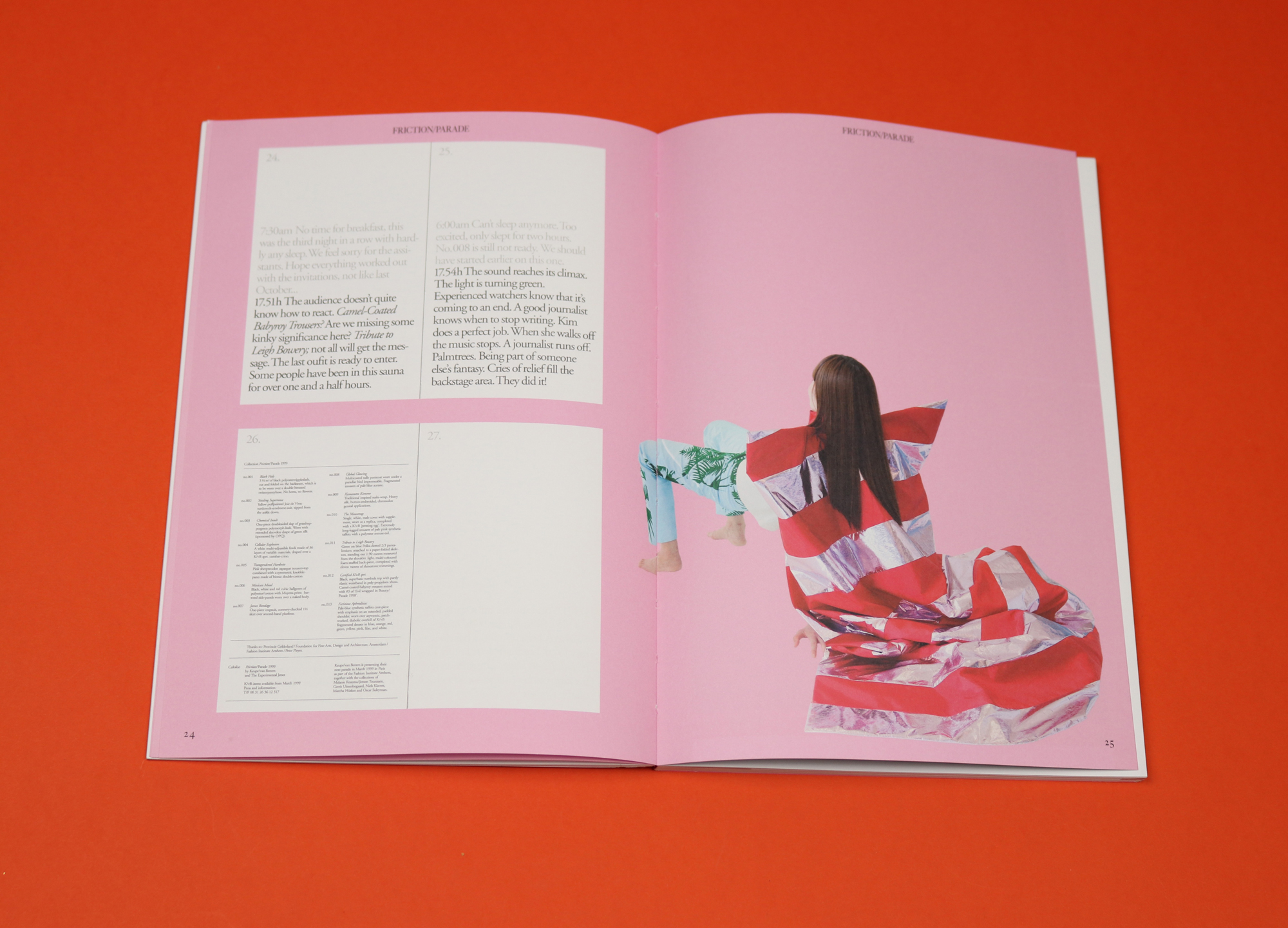
In this issue, Monument’s second, Berkulin explores the archives of Keuper/van Bentm, a visionary duo active between 1997 and 2001 whose many transgressive acts include creating an entirely fictitious collection (they sent out a booklet to buyers and journalists, describing in nerve-racking, minute-by-minute detail a fashion show that never actually happens).
Monument plays with time in similar ways. Berkulin has styled the clothes in the accompanying fashion shoots, making outfits that haven’t seen the light of day for 20 years feel startlingly new, and the Keuper/van Bentm story is told as though it’s happening in the present (eg. “Michiel decides to quit his production job”). This has the interesting effect of plunging the reader back into 1997.
Over email, Mary-Lou talked to us about the joy of subversive, makeshift aesthetics, and why it’s always better to make a magazine without deadlines.
Monument is intended as a way of permanently placing the Dutch Wave in our memory. Can you talk a little about the Dutch Wave, and why they are important to you?
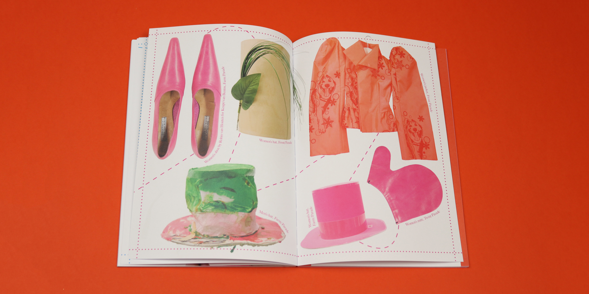
The ‘Dutch Wave’ (a term coined by journalist Stephen Todd after seeing many Dutch contestants win prizes at the International Fashion Festival in Hyeres, France in 1998) describes a group of designers who were at their peak when I was a fashion student at the Arnhem academy, so naturally, I got to know their work — via magazines and other media, via my teachers. Seeing their work for the first time, something clicked for me. See, when I started studying fashion, I was questioning my love for the industry, because there was such a large emphasis on the glamorous part, on creating a ‘dream dress’ or something like that. The Dutch Wave showed me that there are various ways of approaching fashion; that a beautiful hat can be made from tape and cardboard, that you can do your own photoshoot in a metre box. These kinds of makeshift aesthetics in fashion resonated with me. I want to share and express that fascination via Monument.
I found the idea of Michiel Keuper and Francisco van Benthum working with an alarm clock — sketching for five to 10 minutes only so as to use restriction as a creative tool — so inspiring. Do you use restriction as a creative tool in the making of the magazine?
No, I don’t do that with the magazine. I’m a fashion designer by trade, I had never made a magazine before. So I wanted to take my time to find out how as I went along. I occasionally work as a stylist on the side, and I can tell you that ‘restrictions’ are way too abundant in the modern-day magazine industry. For Monument, we also never work towards a hard deadline for printing — it’s done when it’s done. I’d rather make something good than make something fast.
Can you talk a little about the experience of going through the Keupr/van Bentm archive in the making of this magazine?
It’s always such a joy unpacking the designer’s archives, which (in the case of Keupr/van Bentm) was located in Berlin, where Michiel Keuper currently lives. As we take out the clothes, the stories unfold as well. It’s so good to see these designs, that I know from memory, in real life. And it’s very special to see the connection that the designers still have with these items. I got full access from Michiel, so he also sent me home with the photo archive — also the photos he took at the afterparties that went out of hand…
I love the design of the magazine. The way text moves in and out of bold in a single essay. Can you tell me why you chose to present in this way?
Let me quickly send Monument’s art director and graphic designer Karen van de Kraats a dm. She answers: “To highlight the voice of the designers we give the stage to, we decided to emphasise their words and quotes by using a bold font. As a contrast with the classic serif typeface of Monument’s identity, helvetica bold is used to reference the design aesthetics that can be found on Keupr/van Bentm’s invitations and lookbooks from the 90’s.”
I find Keupr/van Bentm’s commitment to concept rather than functionality really inspiring. Can you talk a little about that?
Before the Dutch Wave, the big designer brands were focused on re-releasing retro styles; it was not a very exciting time in fashion. So slowly, the attention shifted towards northern Europe; first the Belgians, and when their ‘trick’ (intentionally showing traces of the creation process) became mainstream, the attention moved towards the Dutch.
What is most interesting about this group, is that they were able to start their practice with the help of funding and subsidies provided by the Dutch government. Because of this, there was no immediate focus on making profit. This resulted not only in a very experimental and exploratory approach to clothing itself, but also to their approach and self-presentation. They were questioning the industry they were a part of. I think Keupr/van Bentm’s way of thinking can provide us with solutions to the current fashion system, which is in overdrive. We already have plenty of clothes, so how can we shape a fashion designer’s practice?
I also love the way you write about the past in the present tense. Why did you decide to publish text in this way?
I want it to sound like I’m telling you a story, or a good joke — I want you, as a reader, to become part of this story instead of putting emphasis on the fact that this happened in the past.
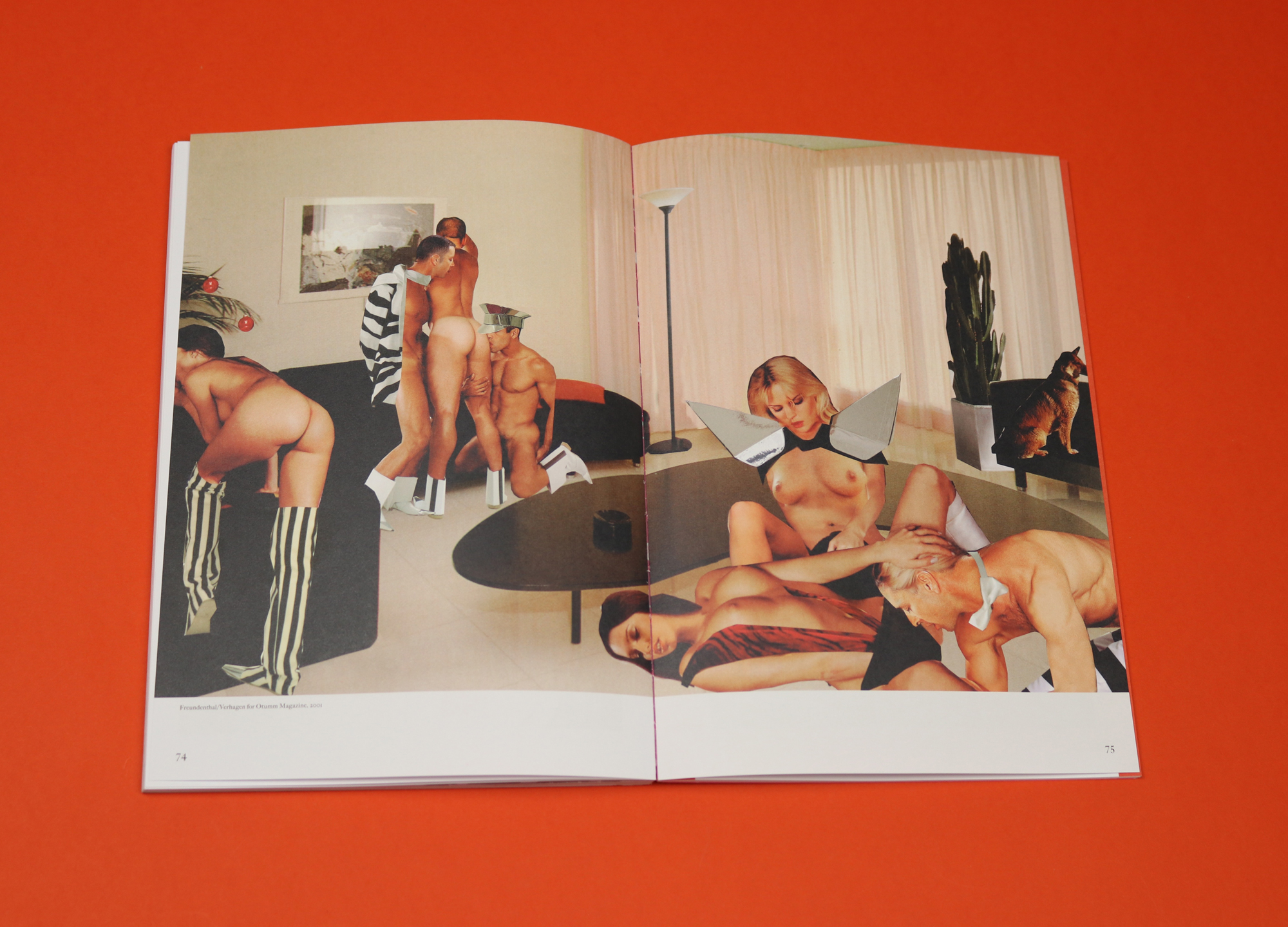
Perhaps my favourite spread in the magazine is a kind of X-rated collage by Carmen Freudenthal and Elle Verhagen. Can you talk a little bit about what that spread shows and why you wanted to include it?
Ha, that’s great! I just wanted to spice things up a little bit. But, all jokes aside, photography duo Carmen Freudenthal and Elle Verhagen were connected to the Dutch Wave. They created many amazing editorials for both national and international fashion magazines in those days. Their way of working, with collage techniques, is very laborious. Unfortunately, nowadays fashion photographers have to finish an entire series in one day, so Freudenthal/Verhagen barely make new editorial work anymore. By re-publishing their work I want to honour their archive, too.
Besides that, it’s a subtle (too subtle, I know) way of showing how, in the fashion magazine business, everybody is always looking to work with the same people. I think it’s a shame that Freudenthal/Verhagen (and other photographers) aren’t allowed the time to create something special anymore. Why are we amazed that big fashion titles are losing their audience?
You talk in the editor’s letter about the need to redefine the meaning of ‘fashion’, of elevating it from an ‘superficial money-making industry’. Is that possible?
Well, I make a modern fashion magazine about ‘old clothes’ — we’re not trying to sell you a new dress or something. The emphasis on creating a product in fashion is too big I think. A modern designer should first and foremost be able to observe, reflect and react to the industry instead of trying to become part of it with yet another product. It is fascinating how the meaning of the word ‘fashion’ means progress, while the system itself is actually very conservative.