Painted paper collages of Alpes-de-Haute-Provence in Les Others
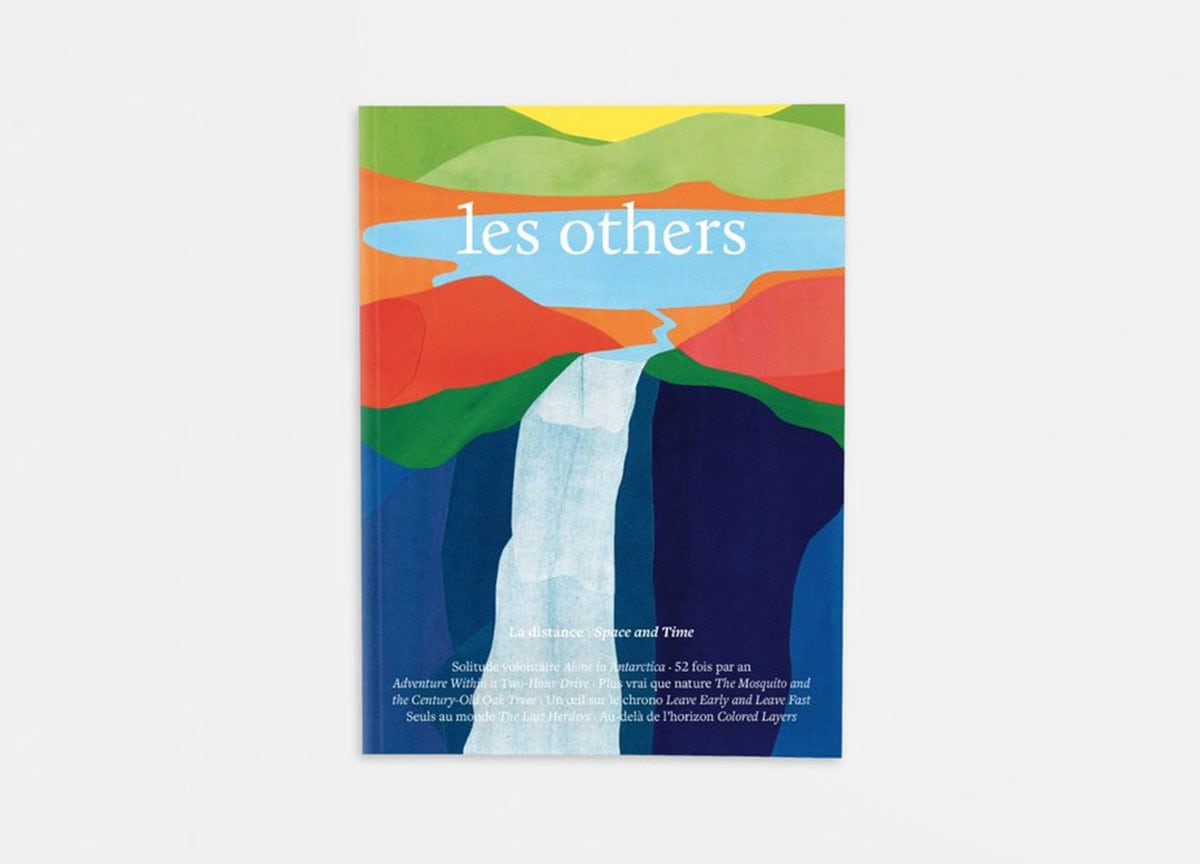
If you like magazines that offer wondrous escapism, Les Others would be one of our top recommendations. Filled with jaw-dropping photography and tales from wild, remote destinations, it will take you from the Mongolian plains to the top of Mount Everest.
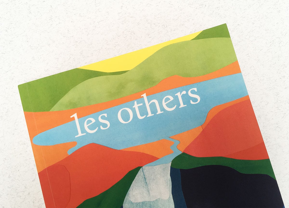
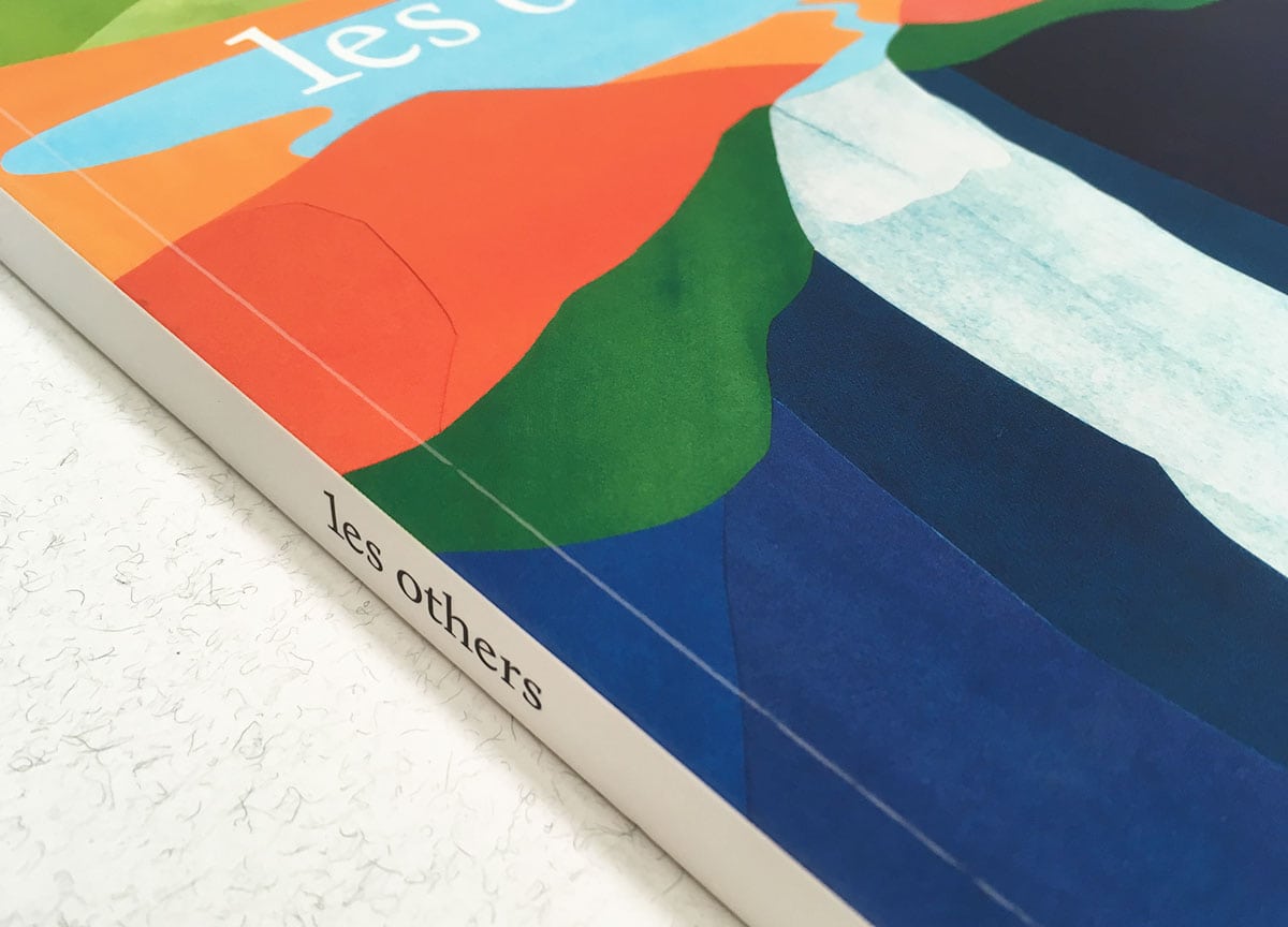
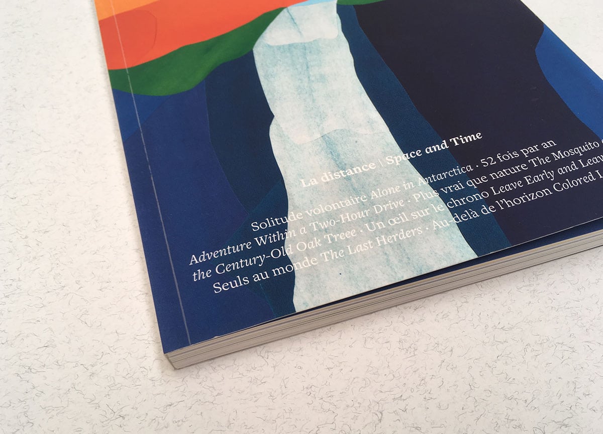
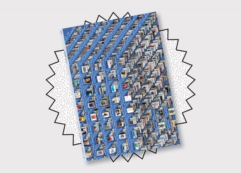
At issue seven, it is their first time to opt for a non-photographic cover. Instead, illustrator Jérémie Fischer has trekked the paths of France’s Alpes-de-Haute-Provence, packed his notebooks with sketches and panoramas, and created painted paper collages that draw attention to the colourful, layered landscapes of the region. Curious to find out more, we got in touch with co-founder and managing editor Nicolas Legras.
Tell us about the cover artist…
Jérémie Fischer is an author and illustrator based in Lyon, France.
What’s the collage about, and how did it embody your theme for the issue, Space and Time?
In this seventh issue we decided to explore the rich concept of distance, using space and time as two complementary perspectives to base our work on. This naturally brought us to question the notions of near and far in our modern era and to address multiple topics such as the Price of Anarchy, the close and historical links between literature and cartography and the representation of distance, both from an artistic and a scientific point of view.
Back in 2014, during a residence in Manosque, south of France, Jérémie worked on the idea of a landscape and started spending a large part of his time walking in the area to draw his inspiration from the surrounding environment. He travelled roads, paths and trails, observing the spaces and the horizons, questioning points of view, shapes and colours. This resulted in a series of collages based on painted paper cut-outs, which you can observe on the cover and in more detail inside the magazine.
This was Les Others’ first non-photographic cover. Was it difficult to decide on this cover? What were your reasons for choosing it?
You make a really good point here. Deciding on this cover has been the most difficult (and time-consuming) choice we had to make on this issue. For three years now we had worked with photographic covers and it’s quite safe to say another photograph would have been our readership’s first choice, if we had submitted this decision to a poll.
This is exactly why we chose to go for an illustration here. From issue one we’ve been trying to be a multidisciplinary magazine, trying to reconnect people with nature by presenting a new approach of travel and outdoor activities: accessible, sustainable and, what really matters here, inspiring. We believe presenting great pieces of art and creative projects is a very good way to reach this objective, as much as it is to work with great photographers from all over the world.
And it seems like our readership agrees: we have received nothing but much positive comments about this new cover!
Les Others has really impressive reach on social media — do you envision how the cover would look online, and does that influence your choice of the image?
I wouldn’t say we are thinking social media-wise when designing any part of the magazine. We’re more 100% focused on your actual reading experience. That said, we very well know the impact of a great image on social media, and we also are doing our best so that you choose to open our magazine prior to its neighbour in a bookstore. So yes, every cover’s choice is made with great care taking these two factors into account.
Tell us about the textural material used for the cover.
From the first issue, we have chosen to use soft touch coating for our covers. We believe the sense of touch is an integral part of the whole paper experience: from the texture of the cover to the different papers used inside, it is all part of the story we are trying to tell. Soft touch adds this velvety-soft feel to the cover that conveys exactly what we’re trying to be here: unexpected and welcoming at the same time.
What’s a standout magazine cover you’ve seen recently?
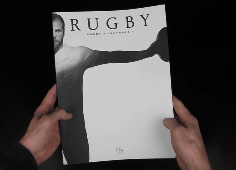
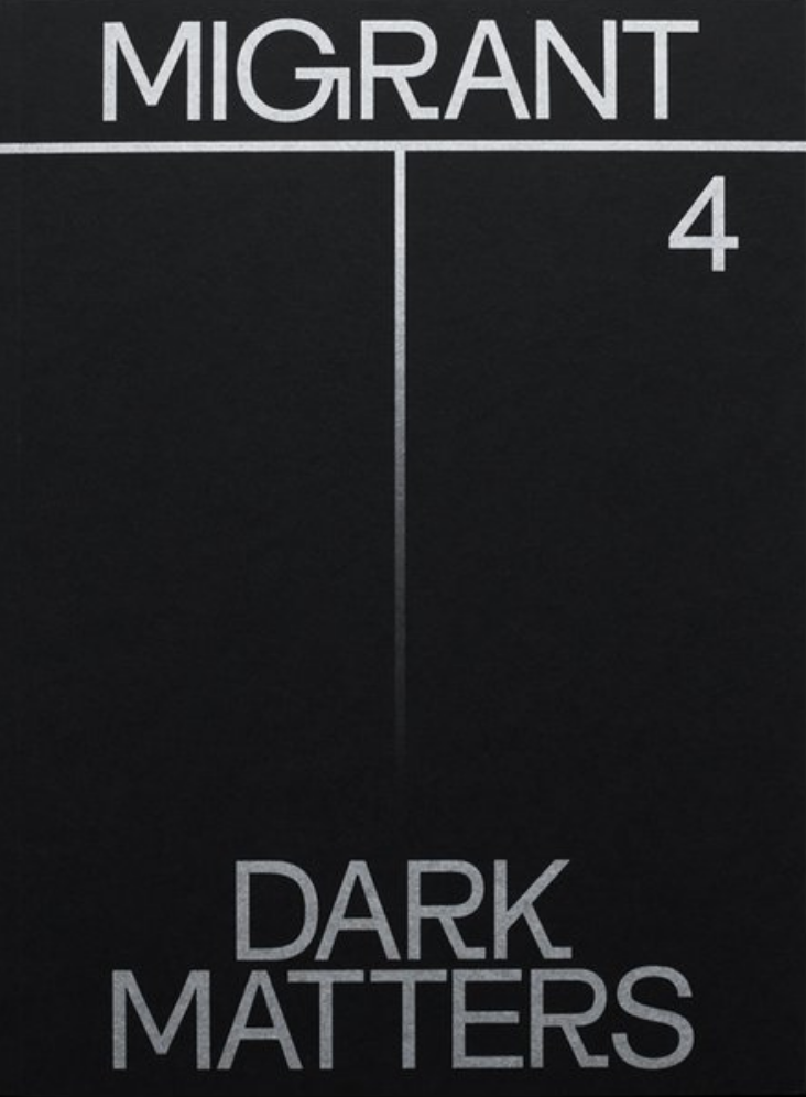
There are a lot of beauties out there but I’d say the most outstanding work I’ve seen lately is the cover of the fourth issue of Migrant Journal, Dark Matters (below). When it comes to design, these guys are doing an amazing job, from their tailor-made typeface to the great combinations of colours they use. And this new cover just hit me in the face the first time I saw it online.
Why should everyone buy a copy of issue seven?
Are you an explorer, a photographer or simply a wanderer wishing to explore the world along 208 pages of a bilingual magazine? Then you definitely should have a copy of issue seven at home! From Greenland to Antarctica through the desert plains of Mongolia, you will travel the world and get a glimpse of an answer to a series of fascinating questions… What is proximity and what is distance? Is the hike arising from the back of your garden worth less than the one located 2,000 miles away? How to deal with notions such as travel and exploration in a world where everything is at hand?
