Your guide to… Like The Wind magazine #13
Like The Wind magazine platforms stories by runners from all over the world. Due to the sport’s low barrier of entry — almost anyone can run anywhere, without equipment or prior planning — it captures a range of human experiences, from motivation to limit-pushing, that grow out of a love for running. We reached out to deputy editor Imogen Lees for her definitive guide to this issue, which includes a runner partaking in a half marathon in the North Korean capital of Pyongyang…
Cover design: making 13 ‘lucky’
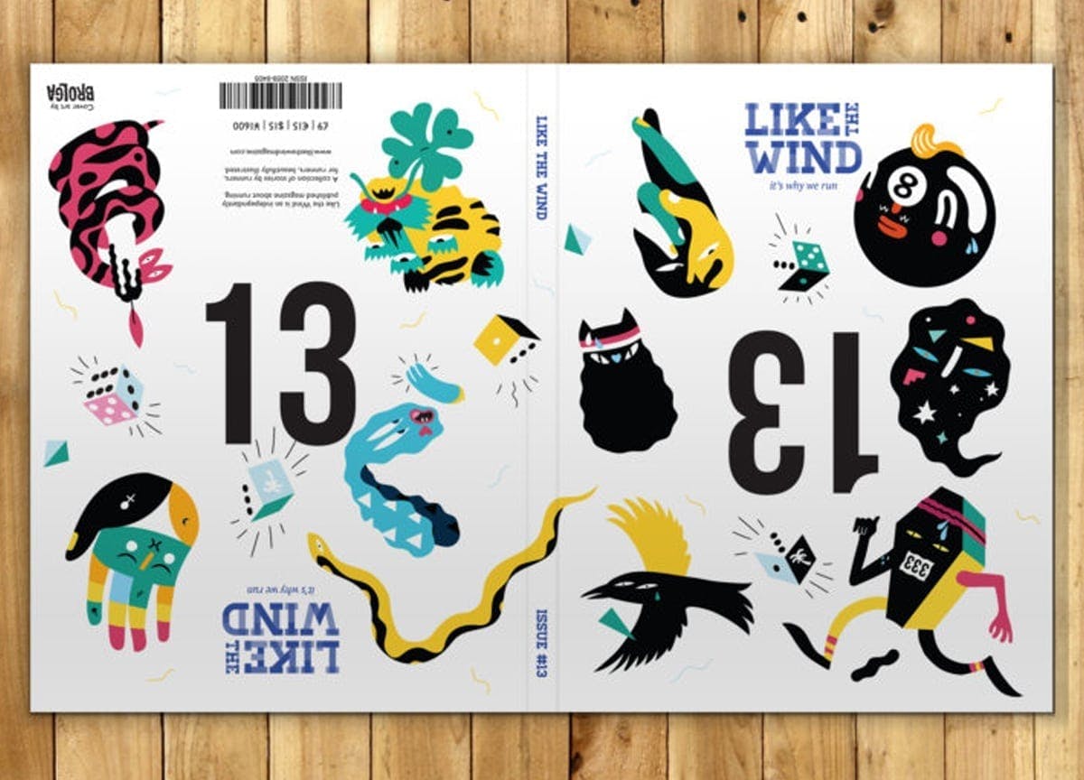
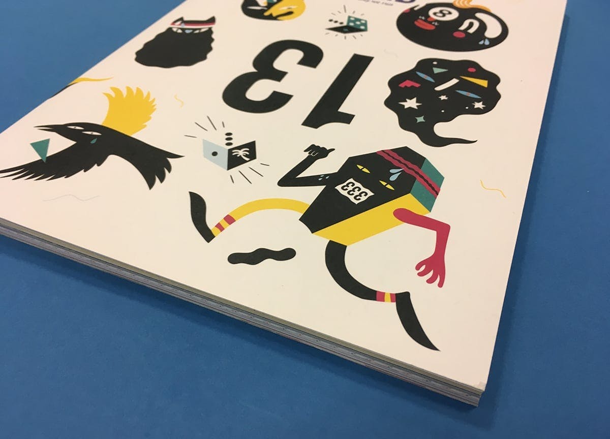
This is very superstitious… The number 13 is on the cover. Twice. Some runners (and cyclists) will actually wear their race bib upside down if they’re assigned 13 in order to negate the superstitious luck associated with that number. Because of course if it’s upside down it’s not 13! Inspired by this, our guest designer Alex Murphy came up with the idea of two magazines in one, printing half the book one way up and half “upside down”, with 13 printed upside down on both covers and surrounded by New York artist Brolga’s design work. Basically, there’s no right or wrong way to read the issue.
Korea move
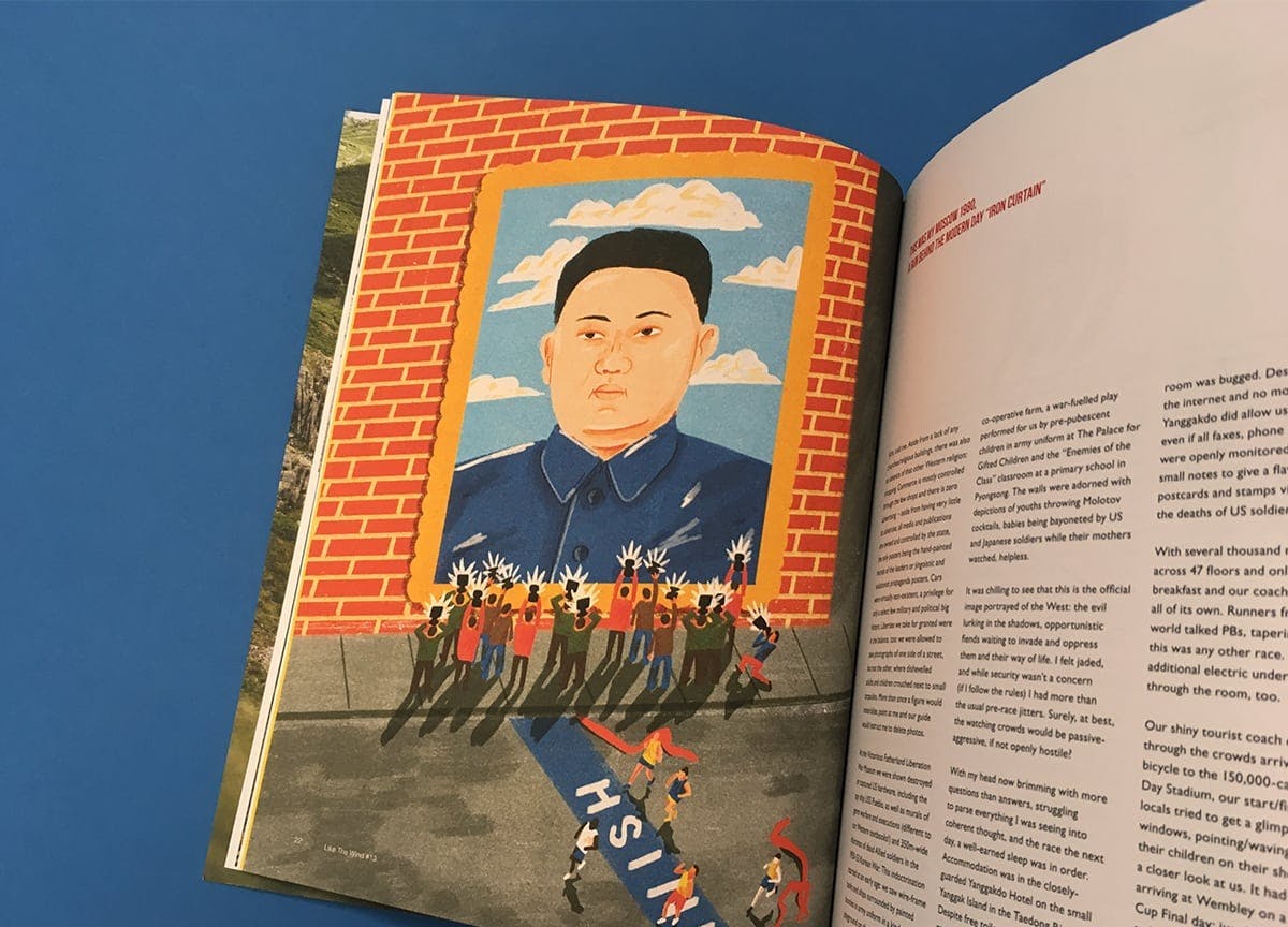
When we first read Luke O’Connor’s story about his experience at the Pyonyang half marathon, North Korea wasn’t making headline news as it is at the moment. Like so many of our writers, Luke sent us his story on spec, but as soon as we read his tale of visiting North Korea, which smoothly combined geography, humour, wry observations and a race report, we knew it was a definite ‘yes’ for the issue. Sonny Ross’s illustration was directly inspired by Luke’s words, bringing vibrant colour to the visuals, echoing Luke’s own vivid descriptions of his race journey (above).
Planning design motifs
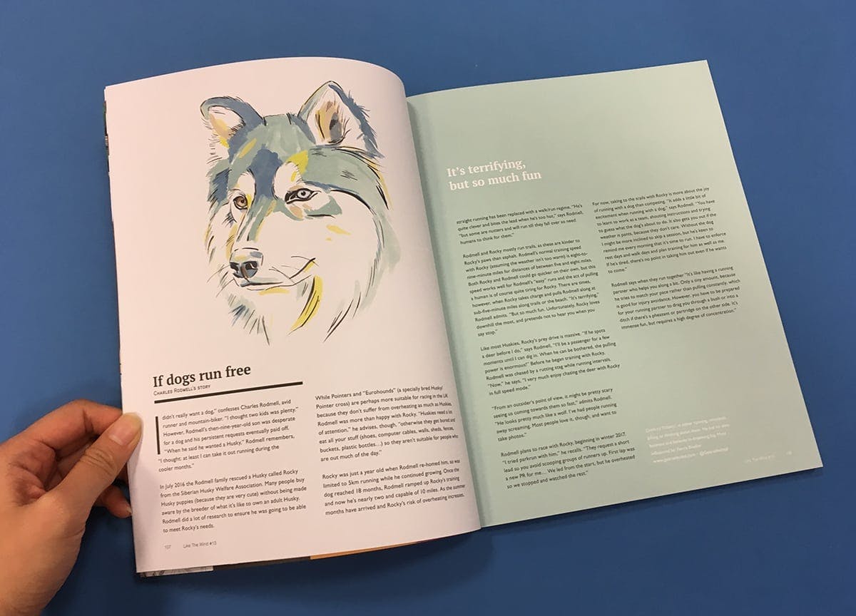
Like the Wind is as much about the voices of its contributors – stories and thoughts from ordinary runners all over the world – as it is about its design aesthetic. We decided in issue 13 to bring together pieces around common design motifs. We explored runners’ motivation and experiences of breaking three hours for a marathon and tied these personal achievements together with Franz Lang’s bright illustrations. A set of stories about unsupported running lends itself to dramatic monochrome photography, while our collection of pieces around the relationship between dogs and running breaks new design ground for us, with Benjamin Mills’ watercolour portraits (above).
Capturing the notoriously gnarly Barkley Marathons
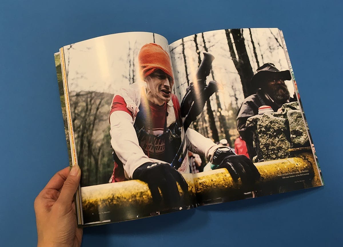
When internationally renowned photographer Alexis Berg offered us access to his candid images of the notoriously secretive and insanely tough Barkley Marathons (above), we practically bit off his lens. This admirably non-corporate event covers more than 100 miles of Tennessee’s gnarliest territory, breaking twigs and spirits over the course of its 60 hours. Berg’s shots capture not only the inhospitable terrain but also the physical and mental exhaustion of the participants. These guys aren’t posing for the camera; they’ve just pushed themselves way beyond their limits.
Running the Pan American highway
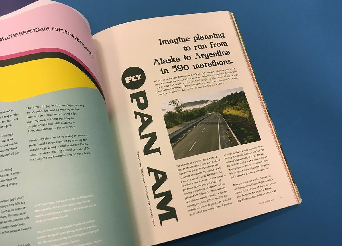
Right now, Belgian ultra-runners Weking Van Reeth and Sebastiaan Vandermolen are somewhere in South America, continuing their epic quest to run the length of the Pan American highway, starting in Alaska and basically heading downwards. Their story – from building their own camper vans to dicing with death on Mexican highways – is entertaining (and insane) enough in itself, but Alex’s design concept for their diaries, referencing the legendary US airline Pan Am and with a font and colour scheme reminiscent of a 1960s colour supplement, brings a further dimension to their words.
—
Get a refreshing independent magazine delivered to your door each month — Sign up to Stack from £7/month
